Stupidly, when I sent my tutor the note with my reasons for starting this course and what I wanted to achieve, I didn't keep a copy for myself. That was typical of my organisation when I began, well over two years ago, and comparing my early rambling blog entries, I'm relieved that my focus has improved.
I've spent a lot of time trying to establish a good working practise and a format for my work which suits me and can be easily cross referenced for my tutor to follow. I've ended up with all shapes and sizes of partly filled abandoned sketchbooks and I can't give up my notebook, incomprehensible to all but me. There were no OCA guidelines when I first set up my blog either. This was alright when I had a small number of posts, but as the number grew, I couldn't find what I was looking for if I needed to refer back to something, never mind my tutor. Just when I thought I'd updated my blog so that it was all labelled and orderly, my feedback was that I was becoming too reliant on my blog. It had become invaluable for me to organise my thoughts and the scribbles from my notebook but I hadn't appreciated that this was to the detriment of my visual ideas. Hopefully, I've got the balance better for this final assignment.
It's taken me some time to get used to working chronologically in a book. I like to work experimentally on different surfaces and I was ending up with a good deal of loose sheets and samples. My earlier work is stuck into a large book and ordered the best I could manage, so there's no flow of ideas to see and it does resembles a scrap book more than the working sketchbook/journal I now know is needed. Therefore, keeping a theme book has been the start of good habit for me.
Visiting degree shows was also extremely useful, to observe the standard of work and presentation. Though I've generated plenty of ideas, I haven't always made the best choices to develop. As I finish this course, I do feel I have a much better understanding of interpreting a brief and of making good selections.
Though I'm nowhere near finding my personal voice, largely down to study visits and the wide variety of exhibitions I've reflected on, I'm able to understand and explain what I do or don't like about a piece of work now. I can increasingly link my emerging ideas to pieces of work I've seen, or techniques I've tried on workshops. When I think about what my future work will be, I do feel that it will be colourful. Selecting colour combinations feels natural to me and is something I appreciate all the more after researching Kaffe Fassett.
Regarding techniques, printing is what I've thoroughly enjoyed, from letterpress to cyanotypes, screen printing to rust marks. I strongly suspect that my optional Level 1 module will be printmaking. I've also enjoyed working with paper, whether stitching onto it, working in mixed media or making books.
Assignment 4 in particular, improved my understanding of the properties of fibres and I feel more able to predict how a yarn might behave by the look and feel of it. This has been useful since I own a large stash of donated, unlabelled yarns and threads. I also discovered how handling different materials can affect my mood and enthusiasm for the project.
Certainly the most unexpected consequence of this course is how engrossed I became learning about textile history, ethics, sustainability and technological advances in textiles. I'd never studied history before, but the OCA study visit to Cotton: Global Threads really sparked my interest. When I came to appreciate the effects that the textile industry had on my own ancestors, albeit indirect, the subject was brought to life for me.
Another highlight was Assignment 3 Research Point, when I visited the Centre for Textile Excellence in Huddersfield. I was fascinated to realise how unrecognisable the textile industry will be in the very near future. I learnt about fabrics being impregnated with unique DNA for anti-counterfeiting, saw structures created on a 3-D weaving machine that the aerospace and motor industries are very excited about and I learnt about multiple laser surface enhancement. TMLSE uses laser and plasma technology to alter the properties of fabrics, making them technically superior using significantly less resources so will have massive environmental benefits in future textile production.
There have been times where I've been confused about what's expected, frustrated by limited time and workspace, and temporarily deflated by useful honest feedback. However, far more often, I've felt enthusiastic and motivated. I feel that I've taken responsibility for my learning and found opportunities through workshops, groups and exhibitions to complement the course. Though it's taken twice as long as I anticipated, I've learned and experienced far more than I expected and I'm proud of myself for making it to the end.
Showing posts with label Reflective Commentary. Show all posts
Showing posts with label Reflective Commentary. Show all posts
Monday, 3 February 2014
Wednesday, 18 December 2013
Assignment 4: Reflective Commentary & Progress Towards Final Project
Once again I've been surprised by how engrossed I became in the Research Point and am actually disappointed this is the final one. I'll look forward to seeing what the subjects are when I begin the next course. One of my highlights was receiving positive and encouraging comments from all of the artists I contacted, particularly the e-mail asking for a link to my blog, which Kaffe Fassett would like to read!
The research point, and the Imagine arts series I've been watching whilst weaving, also led me to think about my own work and make further investigations. Kaffe Fassett and Judith Kerr for example, really stressed the importance of being an almost obsessive observer and I enjoyed reading how, though now in his 70s, Fassett is still inspired by his visual memories, even going as far back as his childhood. Increasingly, I find I'm linking back to something I've seen or done earlier in the course that might not have seemed relevant or useful at the time, such as the Nike Savvas 'Liberty and Anarchy' Exhibition I related to the structures exercise.
Sue Reno, a quilt artist I researched, uses cyanotypes in her work. I experimented with photograms and sun prints earlier in the course and she inspired me to find out more so I booked a cyanotype workshop. I learnt techniques on how to prepare papers, did further print experiments, identified when prints are ready ('pregnant snow cloud' is a phrase I'll always remember!) and came home with ideas on what I'd like to try in future, such as painting solutions onto silk or cotton and trying substances like bleach or tea to see if and how this alters the colour. Contacting the Museum of Film and Photography in Bradford to arrange access to their archives to see the notebooks of Anna Atkins is something I'll do next year for myself and other OCA students.
Here's a few shots of my cyanotype prints developing and the results.


Below are some of my photographs, copied onto acetate and held flat with an inexpensive clip frame. This resulted in much crisper, detailed images than my previous sun prints.


This last print was created by placing the prepared printing paper under a quick sketch I made directly onto acetate using a black marker.

During this assignment I've really appreciated how important the properties of the materials I'm working with are to my enjoyment of the process. I've experienced frustration braiding and weaving with scratchy, inflexible yarns. The sensation of gritty rust dust on my fingers, staining my nails and working surfaces has been unpleasant along with the eye-watering acidic smells when preparing for rust printing. In contrast there's been smooth silk and soft merino yarns which feel wonderful under my fingers and the excitement and anticipation of revealing the contents of a rusty buried package that immediately makes the disagreeable parts of the preparation stage worthwhile. Opening the parcels feels like Christmas, when you almost don't want to unwrap a beautifully wrapped present as you don't know whether you'll be delighted or disappointed.
Here's the results of the experiments I began in Project 8, Stage 2, six weeks on. The left package was in the greenhouse in the same polythene packet that I've successfully used for previous rust prints. The right hand package is freshly dug up after burial.


I'd wrapped various yarns around each layer that I could use should I decide to incorporate stitching. Any stitching will be by hand as the rust could damage my machine.

I love the range of shades; from the subtle peach to strong rusty browns I got from soaking in white vinegar and the lilac/grey that resulted from tea.


When I unwrapped the fabric lace layer, something new and exciting was underneath - this sparkling turquoise square!

Initially I thought the turquoise silk I'd added had bled somehow but then realised it was the caused by that small mystery square of Metaltex I'd popped in. The square itself also had some beautiful autumnal markings on both sides but it is now very brittle and too crumbly to be useful.


I thought there was a good chance the intensity of the turquoise mark would change by washing or over time so took a few more shots to record it. I'm glad I did. As the fabric dried a hole developed in one side. I've found this often happens as the rusted fabrics dry and shrink. They become more fragile, particularly the highly crusted areas where there had been close contact with the object and especially if it's a delicate fabric that's been left a long time for a strong print. I'm hoping that, by nuno felting, as well as adding texture to the patterns and colours, this will give the stability and durability a delicate open weave fabric would need to function when incorporated into a useful object.


The tiny dark grey patterns made by the grid itself are my favourites. I think I should be considering some way of highlighting the most interesting areas of any prints I use.


I linked some of the other exercises in this Assignment to my theme and this has given me clearer ideas on the direction my final piece is likely to take. In Part 4, Textile Structures, as well as the exercises, I continued experimenting with felt-making and also tried paper-making. Both are additional methods of creating a surface. (I'll shortly be writing a report on the paper-making for OCASA, along with Letterpress and Bookbinding. These were a series of three workshops I arranged for OCA visual arts students following a successful application to access the funding pot for student-led activities. Links to follow soon.)
Below are some of my handmade papers which I've letterpress printed with words found on manhole covers. Here I was making rust marks on it, trying torn up Brillo Pads and tea. I've also made some papers with snippets of rust printed threads and fabrics incorporated and have begun binding the papers into a book.

My final piece is due to my tutor on 31st January, which is not long at the rate I can manage alongside family and working life, so I'm grateful I've been progressing my theme alongside assignment 4.
The research point, and the Imagine arts series I've been watching whilst weaving, also led me to think about my own work and make further investigations. Kaffe Fassett and Judith Kerr for example, really stressed the importance of being an almost obsessive observer and I enjoyed reading how, though now in his 70s, Fassett is still inspired by his visual memories, even going as far back as his childhood. Increasingly, I find I'm linking back to something I've seen or done earlier in the course that might not have seemed relevant or useful at the time, such as the Nike Savvas 'Liberty and Anarchy' Exhibition I related to the structures exercise.
Sue Reno, a quilt artist I researched, uses cyanotypes in her work. I experimented with photograms and sun prints earlier in the course and she inspired me to find out more so I booked a cyanotype workshop. I learnt techniques on how to prepare papers, did further print experiments, identified when prints are ready ('pregnant snow cloud' is a phrase I'll always remember!) and came home with ideas on what I'd like to try in future, such as painting solutions onto silk or cotton and trying substances like bleach or tea to see if and how this alters the colour. Contacting the Museum of Film and Photography in Bradford to arrange access to their archives to see the notebooks of Anna Atkins is something I'll do next year for myself and other OCA students.


Below are some of my photographs, copied onto acetate and held flat with an inexpensive clip frame. This resulted in much crisper, detailed images than my previous sun prints.


This last print was created by placing the prepared printing paper under a quick sketch I made directly onto acetate using a black marker.

During this assignment I've really appreciated how important the properties of the materials I'm working with are to my enjoyment of the process. I've experienced frustration braiding and weaving with scratchy, inflexible yarns. The sensation of gritty rust dust on my fingers, staining my nails and working surfaces has been unpleasant along with the eye-watering acidic smells when preparing for rust printing. In contrast there's been smooth silk and soft merino yarns which feel wonderful under my fingers and the excitement and anticipation of revealing the contents of a rusty buried package that immediately makes the disagreeable parts of the preparation stage worthwhile. Opening the parcels feels like Christmas, when you almost don't want to unwrap a beautifully wrapped present as you don't know whether you'll be delighted or disappointed.
Here's the results of the experiments I began in Project 8, Stage 2, six weeks on. The left package was in the greenhouse in the same polythene packet that I've successfully used for previous rust prints. The right hand package is freshly dug up after burial.
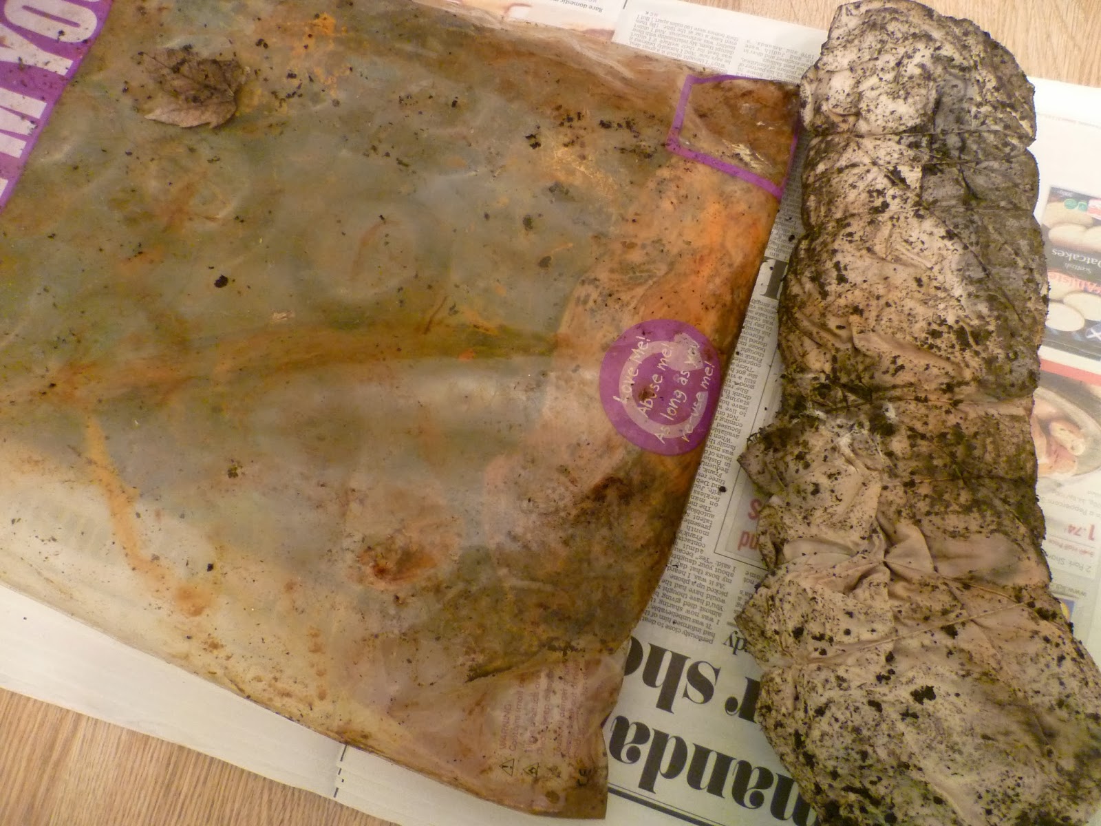
The outer layer of the buried package was the largest cloth. I've tentatively planned to incorporate this into my final piece as it has a fairly open weave so should be suitable for the nuno-felting I have in mind. Once I've found out how to do it and made some test samples that is!

I'd wrapped various yarns around each layer that I could use should I decide to incorporate stitching. Any stitching will be by hand as the rust could damage my machine.

I love the range of shades; from the subtle peach to strong rusty browns I got from soaking in white vinegar and the lilac/grey that resulted from tea.

These were the cloths underneath. I was fascinated by the grey silk square that makes me think of some winged creature like a bat or moth. I've never had a result this dark before. Was this just a co-incidence, or caused by chemicals in the soil? The cloths here were freshly dug up and soaking wet, so the shades were slightly lighter once dry. I was a little nervous washing the cloths but washing is necessary to neutralise them (and remove the smell!). Having done it before, I was reasonably confident the prints would remain and they have.

I also wanted to capture how the grid weaving had changed before I disposed of it. There's not much left. It's a very fragile and unfriendly object to handle now - brittle, grainy and sharp.


This was the greenhouse package ready for unravelling. (Just noticed piece of lace on the right is same one I used for cyanotype print above.)

When I unwrapped the fabric lace layer, something new and exciting was underneath - this sparkling turquoise square!

Initially I thought the turquoise silk I'd added had bled somehow but then realised it was the caused by that small mystery square of Metaltex I'd popped in. The square itself also had some beautiful autumnal markings on both sides but it is now very brittle and too crumbly to be useful.


The interlaced rectangle I had wrapped hadn't changed in any interesting ways itself but I love how the pattern from the nails has transferred onto the fabrics.

I thought there was a good chance the intensity of the turquoise mark would change by washing or over time so took a few more shots to record it. I'm glad I did. As the fabric dried a hole developed in one side. I've found this often happens as the rusted fabrics dry and shrink. They become more fragile, particularly the highly crusted areas where there had been close contact with the object and especially if it's a delicate fabric that's been left a long time for a strong print. I'm hoping that, by nuno felting, as well as adding texture to the patterns and colours, this will give the stability and durability a delicate open weave fabric would need to function when incorporated into a useful object.


Finally I unwrapped the other stitched grid. Again the most interesting result was the marks transferred onto the silk fabric rather than any changes to the sample.

(I visited the Silk Museum in Macclesfield with the Embroiderer's Guild a few weeks back and my purchases from the bargain bucket of silk samples have come in very useful.)

The tiny dark grey patterns made by the grid itself are my favourites. I think I should be considering some way of highlighting the most interesting areas of any prints I use.


I linked some of the other exercises in this Assignment to my theme and this has given me clearer ideas on the direction my final piece is likely to take. In Part 4, Textile Structures, as well as the exercises, I continued experimenting with felt-making and also tried paper-making. Both are additional methods of creating a surface. (I'll shortly be writing a report on the paper-making for OCASA, along with Letterpress and Bookbinding. These were a series of three workshops I arranged for OCA visual arts students following a successful application to access the funding pot for student-led activities. Links to follow soon.)
Below are some of my handmade papers which I've letterpress printed with words found on manhole covers. Here I was making rust marks on it, trying torn up Brillo Pads and tea. I've also made some papers with snippets of rust printed threads and fabrics incorporated and have begun binding the papers into a book.
My final piece is due to my tutor on 31st January, which is not long at the rate I can manage alongside family and working life, so I'm grateful I've been progressing my theme alongside assignment 4.
Monday, 24 June 2013
Assignment 3: Reflective Commentary
This has been my favourite assignment so far and I'm pleased that I've finished it much quicker than the previous two. I think this is partly because I found it to be written in a more straightforward way and partly because I enjoyed the freedom of working experimentally. I liked just trying out techniques with no particular images in mind, then looking at the results to see what ideas it generated. I've found I've related the results to existing drawings and it's inspired ways to revive what's not gone so well. In the past I have struggled choosing the right source drawings for projects but the more techniques I try, the more I feel able to decide what is suitable.
I also thoroughly enjoyed the research point exploring the diversity of textiles and became far more engrossed than I'd anticipated. My visit to the Huddersfield Centre of Textile Excellence was so enlightening and brought home the importance of understanding the structure of textiles. Learning about the possibilities of anti-counterfeiting and multiple laser surface enhancement technologies that will change the textile industry beyond recognition in the not too distant future was mind blowing.
I'm finding my learning blog invaluable. I'm organising my thoughts as I write, forming opinions, coming up with ideas and I regularly refer back to older posts for information and inspiration.
My theme book has caused me some issues. Sometimes I think I've made the wrong decision in choosing family history because of the lack of things I have in front of me to draw. However, having read ahead, I can see that the source for my final assignment piece doesn't necessarily have to come from my theme book if there's something else more suitable. I've also begun to think more laterally on the subject. For example, there's no reason why I can't look into an ancestors occupation. I've discovered one was a sail maker, so maybe I could investigate some of the knots used in sail making during Assignment 4 when I look at ropes, plaits and braids? Another was a book binder and ever since the Leeds Book Fair study visit I've become interested in learning more about book binding. I've made some small sketch books, created book covers and thought about ways to present work in a book format.
One of the little books I've made is called a meander. I was intrigued that out of one page of A4 paper, there appears to be so much surface area. Rather than make a book with blank pages to draw on I decided to make an existing drawing into a book. I've also secured some funding from OCASA and arranged a series of three book related workshops for OCA students, so later this year we can learn paper making, print onto the paper we make and then bind it into a book.
I also thoroughly enjoyed the research point exploring the diversity of textiles and became far more engrossed than I'd anticipated. My visit to the Huddersfield Centre of Textile Excellence was so enlightening and brought home the importance of understanding the structure of textiles. Learning about the possibilities of anti-counterfeiting and multiple laser surface enhancement technologies that will change the textile industry beyond recognition in the not too distant future was mind blowing.
I'm finding my learning blog invaluable. I'm organising my thoughts as I write, forming opinions, coming up with ideas and I regularly refer back to older posts for information and inspiration.
My theme book has caused me some issues. Sometimes I think I've made the wrong decision in choosing family history because of the lack of things I have in front of me to draw. However, having read ahead, I can see that the source for my final assignment piece doesn't necessarily have to come from my theme book if there's something else more suitable. I've also begun to think more laterally on the subject. For example, there's no reason why I can't look into an ancestors occupation. I've discovered one was a sail maker, so maybe I could investigate some of the knots used in sail making during Assignment 4 when I look at ropes, plaits and braids? Another was a book binder and ever since the Leeds Book Fair study visit I've become interested in learning more about book binding. I've made some small sketch books, created book covers and thought about ways to present work in a book format.
 |
| Collagraph print block used as a cover for print collection, stitched book cover, hand made sketch books |
 |
| Acrylic paint marks made into meander book after visit to Scarborough beach |
Wednesday, 30 January 2013
Assignment 2 - Design and Print A Sample Review
Do you feel you made a good selection from your drawings to use as source material for your design ideas? Which interpretations worked best and why?
Yes, I'd tried screen printing as part of 'Experiments with Printing and Painting' so I knew that the bold shapes with clean edges would work well. I'd decided to select a square design so that I could use it to make repeats. Initially I enlarged the squares and selected the two that I though would work well together as the lines seemed to flow from one shape to the next. I then altered them by hand so the thicknesses matched and there were no 'cut off' edges. Now, whichever way the squares were orientated, the shapes would flow seamlessly.


Which fabrics did you choose? What particular qualities appealed to you?
I was keen to layer the prints so wanted a plain light background that would not be distracting or distort the colour of the ink on this occasion. I did try a patterned background in my experiments but preferred and reverted back to plain. The fabrics were cotton and linen. I liked the closely woven cotton for a single print which the ink soaked into to give clean lines, flat colour and a clear contrast. For layering the prints I liked experimenting with a slightly more open weave as the colour beneath would show through and create texture. It was interesting to notice how the surface became less porous with each layer and how some fabrics required more pulls with the squeegee to get a good print.

(Reflect on some of these questions)
Is the scale of marks and shapes on your samples appropriate to the fabric? Would any of your ideas work better on a different type of fabric - for example, sheer, textured, heavyweight? Why? Do the marks seem well placed, too crowded or too far apart? Were you aware of the negative shapes that were forming in between the positive shapes? What elements are contrasting and what elements are harmonising in each sample? Is there a balance between the two that creates an interesting tension?
I think that for the size of the square, the bottom right print shown above appears to be on the right scale and has a nice balance whereas the top two would need to be in a block of at least four adjacent to each other to feel right. The bottom left does not have enough negative areas to make the shapes clear. It made for a good background but when this was used on top of another design, it obscured it far too much. I was aware of the negative shapes appearing, particularly in the bottom left as they looked like little hearts. The repeating design on this is slightly on the diagonal which creates some tension but I feel would be better either square or with a more slope rather than somewhere in between. I don't know enough about screen printing techniques yet but it might be interesting to repeat the bold designs on a sheer fabric. I can imagine the same scale being used for a long curtain with the light coming through the negative areas.
How successful do you think your sample is? Do you like the design? Have you recreated or extended your ideas from the previous sample so that there is a visible development between the two? Does your repeating design flow across the surface, without obvious internal edges, or do the shapes and marks in your single unit sample relate well to the size and shape of the fabric? Do they make an interesting composition on this larger scale?

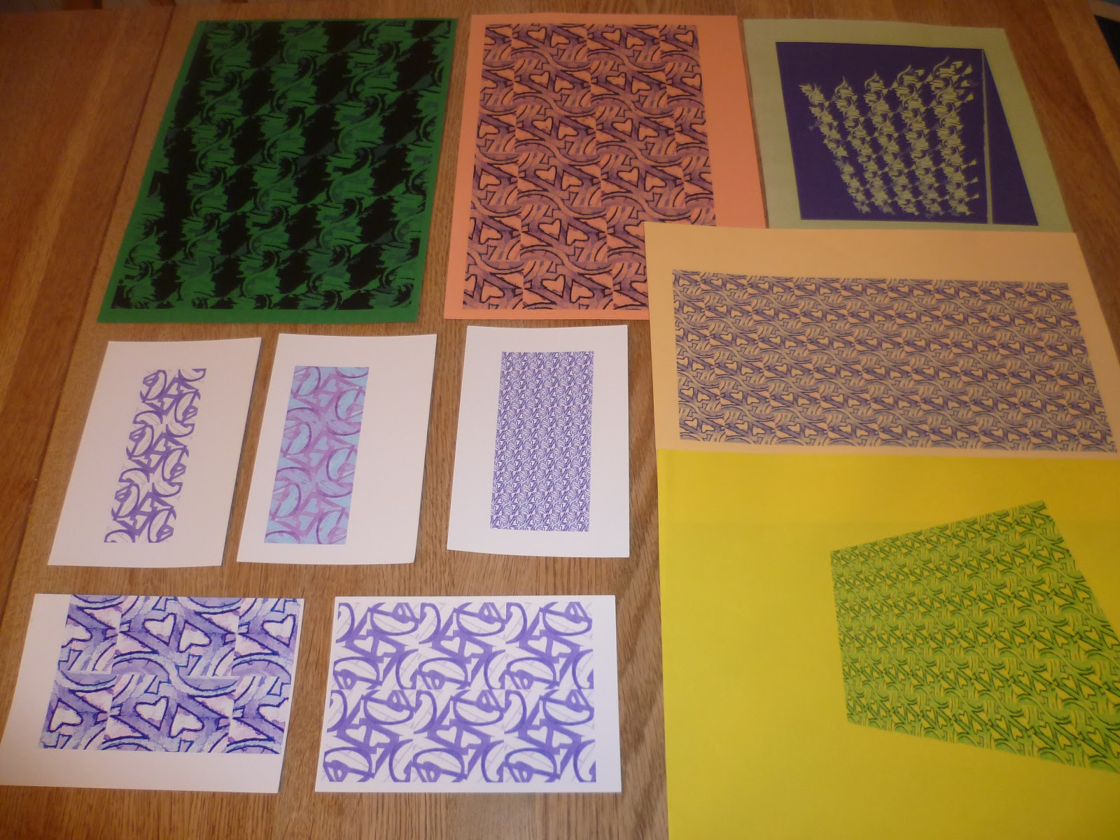
I like elements from all four samples on the top right. I like the scale and the clear colour contrast of the orange top middle print, however the repeats only flow seamlessly in one direction rather than both which is slightly irritating. I like the movement and the colour combinations in the print below it. It feels happy and reminds me of the big prints of a 1970s summer. This is the one I would like develop further if I had time, sticking with the colours but butting and rotating the original design to make a larger screen.
In the print to its right (more vibrant in real life!), I like how the ink has translucence and the colours have mixed so the original negative areas from the bottom layer have turned red or orange

This final sample I like overall, the scale as it is, the colour balance and the formation of new shapes. It evokes memories of cutting out shapes to make paper snowflakes as a child.

Yes, I'd tried screen printing as part of 'Experiments with Printing and Painting' so I knew that the bold shapes with clean edges would work well. I'd decided to select a square design so that I could use it to make repeats. Initially I enlarged the squares and selected the two that I though would work well together as the lines seemed to flow from one shape to the next. I then altered them by hand so the thicknesses matched and there were no 'cut off' edges. Now, whichever way the squares were orientated, the shapes would flow seamlessly.
Which fabrics did you choose? What particular qualities appealed to you?
I was keen to layer the prints so wanted a plain light background that would not be distracting or distort the colour of the ink on this occasion. I did try a patterned background in my experiments but preferred and reverted back to plain. The fabrics were cotton and linen. I liked the closely woven cotton for a single print which the ink soaked into to give clean lines, flat colour and a clear contrast. For layering the prints I liked experimenting with a slightly more open weave as the colour beneath would show through and create texture. It was interesting to notice how the surface became less porous with each layer and how some fabrics required more pulls with the squeegee to get a good print.
(Reflect on some of these questions)
Is the scale of marks and shapes on your samples appropriate to the fabric? Would any of your ideas work better on a different type of fabric - for example, sheer, textured, heavyweight? Why? Do the marks seem well placed, too crowded or too far apart? Were you aware of the negative shapes that were forming in between the positive shapes? What elements are contrasting and what elements are harmonising in each sample? Is there a balance between the two that creates an interesting tension?
I think that for the size of the square, the bottom right print shown above appears to be on the right scale and has a nice balance whereas the top two would need to be in a block of at least four adjacent to each other to feel right. The bottom left does not have enough negative areas to make the shapes clear. It made for a good background but when this was used on top of another design, it obscured it far too much. I was aware of the negative shapes appearing, particularly in the bottom left as they looked like little hearts. The repeating design on this is slightly on the diagonal which creates some tension but I feel would be better either square or with a more slope rather than somewhere in between. I don't know enough about screen printing techniques yet but it might be interesting to repeat the bold designs on a sheer fabric. I can imagine the same scale being used for a long curtain with the light coming through the negative areas.
 |
| Layering prints - the large patterns (top middle) still look exciting and have a good balance of negative space but look at the print below it where the original is almost completely obscured |
How successful do you think your sample is? Do you like the design? Have you recreated or extended your ideas from the previous sample so that there is a visible development between the two? Does your repeating design flow across the surface, without obvious internal edges, or do the shapes and marks in your single unit sample relate well to the size and shape of the fabric? Do they make an interesting composition on this larger scale?
I like elements from all four samples on the top right. I like the scale and the clear colour contrast of the orange top middle print, however the repeats only flow seamlessly in one direction rather than both which is slightly irritating. I like the movement and the colour combinations in the print below it. It feels happy and reminds me of the big prints of a 1970s summer. This is the one I would like develop further if I had time, sticking with the colours but butting and rotating the original design to make a larger screen.
In the print to its right (more vibrant in real life!), I like how the ink has translucence and the colours have mixed so the original negative areas from the bottom layer have turned red or orange
This final sample I like overall, the scale as it is, the colour balance and the formation of new shapes. It evokes memories of cutting out shapes to make paper snowflakes as a child.
Project 4 Review - Developing Design Ideas
Did you manage to make space move?
Yes. Compare the static Pictures 1 and 4 with the energy of 2 and 3. In 1 and 4 the arrangement of black squares is more 'peaceful'. Energy is centred because of the symmetry and regular sized gaps between the squares. Also because the edges are parallel to the large square. Pictures 2 and 3 have movement. It feels like you want to put back and stack the shapes escaping out of the box like a box of cards that's been dropped. The eye wants to move around the space in the square. The same applies with the lines.

What are your thoughts about the drawings you did in Stage 3?
I was pleased to be able to find more potential in the original garden gate stitched sample that I had reworked in the Stitched Collage Workshop. Now that I was happier with improvement in the texture, I wanted to further explore the dynamic shapes that I had always liked, created by the curved lines crossing straight. Using differently shaped viewing frames, I decided I liked the balance better in the circles and squares and thought that the squares had most potential as I could create so many variations in repeats.

Were you able to use your drawings successfully as a basis for further work? Are there any other things you would like to try?
Yes. I scanned the drawing which was really helpful to experiment with. I could quickly create repeats and change the scale and colour. I wanted to try prints and was about to do a 'Make a Mark' workshop at West Yorkshire Print. This would be an opportunity to develop the drawings and work toward a final screen printed sample for this assignment. My drawings would be my starting point.
Now that you have a good working method, do you feel confident that you can carry on working in this way independently?
Yes, I've found that I can now 'see' shapes and interesting compositions more quickly and easily. The drawing below of a sliced shell at the Turing exhibition was selected from a series of 1 minute sketches. Though I'm not always getting it quite right yet, I've been trying to apply the principles I've learnt to practise arranging some of the drawings in my sketchbook in a more interesting way.


Yes. Compare the static Pictures 1 and 4 with the energy of 2 and 3. In 1 and 4 the arrangement of black squares is more 'peaceful'. Energy is centred because of the symmetry and regular sized gaps between the squares. Also because the edges are parallel to the large square. Pictures 2 and 3 have movement. It feels like you want to put back and stack the shapes escaping out of the box like a box of cards that's been dropped. The eye wants to move around the space in the square. The same applies with the lines.
What are your thoughts about the drawings you did in Stage 3?
I was pleased to be able to find more potential in the original garden gate stitched sample that I had reworked in the Stitched Collage Workshop. Now that I was happier with improvement in the texture, I wanted to further explore the dynamic shapes that I had always liked, created by the curved lines crossing straight. Using differently shaped viewing frames, I decided I liked the balance better in the circles and squares and thought that the squares had most potential as I could create so many variations in repeats.
Were you able to use your drawings successfully as a basis for further work? Are there any other things you would like to try?
Yes. I scanned the drawing which was really helpful to experiment with. I could quickly create repeats and change the scale and colour. I wanted to try prints and was about to do a 'Make a Mark' workshop at West Yorkshire Print. This would be an opportunity to develop the drawings and work toward a final screen printed sample for this assignment. My drawings would be my starting point.
Now that you have a good working method, do you feel confident that you can carry on working in this way independently?
Yes, I've found that I can now 'see' shapes and interesting compositions more quickly and easily. The drawing below of a sliced shell at the Turing exhibition was selected from a series of 1 minute sketches. Though I'm not always getting it quite right yet, I've been trying to apply the principles I've learnt to practise arranging some of the drawings in my sketchbook in a more interesting way.
Tuesday, 15 May 2012
Project 3 Review - Colour
 |
| 12 Colour Wheel machine embroidered on soluble fabric |
I wanted to understand why it's almost impossible to paint a colour circle from only three colours so I tried it. I started with the primary colours, then mixed these together to get the secondary colours then filled in the segments in between to get a 12 colour circle. I found it tricky to get the get the proportions right as it wasn't just a matter of using the paint 1:1. For example, to make green, I needed mostly yellow and just a little blue. The graduation of the wheel wasn't quite right. I had a too big a jump from yellow to yellow-orange then all the segments from here to red-purple were too close. I also had real trouble mixing a purple so after the wheel I tried all my combinations of red and blue and found from my paints the best combination probably would have been scarlet + cobalt, whereas vermillion + cobalt gave a brown.
 |
| Colour wheel painted with acrylics: Scarlet + Ultramarine+ Lemon Yellow |
I read some good articles on colour theory and particularly liked this one by artist Peter Straub: Colour Theory Simplified. It's a really well presented all round explanation of the principles of colour theory and I learned the difference between value (lightness or darkness) and intensity (brightness or dullness) as something can be dark and bright or light yet dull.
Portrait artist Roger Simpson gives some good explanations of how warmer colours like reds and oranges appear to come towards you while cooler blues and purples tend to recede. For example, the nose and cheeks on a portrait would need warmer colours to give the impression they protrude than the ears, which recede. The artist points out that generally there are more cool colours in a portrait and he thinks this is also true of landscapes. He talks about the importance of achieving the right overall balance of warm and cool colours to give relief and contrast.
Peter Saw
 |
| Matching paint to a fabric |
 |
| Matching paint to an image |
 |
| Matching paint to 3-D objects |
Were you able to use colour expressively?
I tried to use a combination of marks and colour to express feeling, then quizzed my nine-year old on what the marks made her think of. She got them bang on, so I think that was a success!
 |
| Gloomy/Cheerful |
 |
| Soft/Sharp |
 |
| Calm/Excited |
Can you now see colour rather than accepting what you think you see?
I've spent a lot of time recently peering closely at objects and asking my family, 'Look, can you see the purple in that?' I think it's the first time I've given much thought to how backgrounds can take on a tinge of the object and drawn them in. I tried drawing some clematis outside on a changeable day, and drew in the shadows that were clearly, and surprisingly purple on the white page. Frustratingly, they kept lightening and deepening as the sun came in and out.
 |
| Noticing shadow |
I really enjoyed putting the colour bag together, because I had real pleasure closely observing the seascape images I was strongly drawn to, with their jewel-like sea greens. Had I filled the bag from memory, I don't think I would have put in the bright oranges or cool dusky pinks that I clearly saw when inspecting them closely.
 |
| Making a colour bag for a seascape |
I don't know how clearly this will come across on the photos but on Colour Perception exercise one, I observed that green, pink and turquoise looked much lighter on the red background than yellow. Most noticeable was pink that looked so much paler on red than any other colour. Comparing pink on red to pink on orange, the pink looks almost purple on an orange background. Pink on a purple background looks far warmer, and more yellowy.
 |
| Effects of changing a background colour |
Next I repeated the exercise using olive green and scarlet small squares. Again the yellow background made the smaller squares appear darker. The olive green looks fresher and brighter on purple than yellow. The small scarlet square looks orange and bright on the deep red background, dirtier on peach and even more so on orange.

On the little grey square immediately I could see the violet tinge on the yellow background. Then I looked harder and began to notice that they were certainly all different and the more I looked, the more I saw: first a reddish tinge on green, next bluish on the peach, then I saw it on orange, then I saw yellow on purple.

During the squares exercise, I noticed I seemed to be more responsive to changes concerning yellow and began to wonder, does everyone see colour the same as me? I found an interesting website on colour psychology by the company Colour Affects. They say that the answer to my question is unknown but there is a theory that the effect of colour on us is caused by the energy entering our body. There have been experiments where blind people have all been easily able to identify colour with their fingertips and colour-blind people have proved to be sensitive to colour psychology.
The page on colour psychology explains that there are four psychological primary colours – red, blue, yellow and green. It goes on to describe the positive and negative psychological properties of eleven basic colours. For example with red, positive characteristics include courage, strength, friendliness, energy and excitement. Negative are defiance, aggression and strain. It describes the property of red that makes it appear closer than it actually is and how being the longest wavelength makes it a powerful colour which grabs our attention.
Although red has the longest wavelength, yellow is the most visible and emotionally stimulating and the strongest colour psychologically, which explains why I was drawn to this colour. Color Matters says that the yellow family of colours gets our attention faster than any other colour and 'lateral peripheral vision for detecting yellows is 1.24 times greater than red. The colour is most visible under dimmer conditions. School buses and many road building machines are yellow. They are safer as more easily seen in bad weather. My dad says that the yellow green golf balls are easiest to see, which you maybe wouldn't expect on green grass. Last year I changed my yellow car for a dark purple one and now no-one in town waves to me anymore!
I chose not to buy new gouache paints specifically for the project so I tried acrylics for the colour wheel, watercolours for recording colours accurately and a mixture of media for expressing colour moods including chalk pastels and some of my children's left over 3-D fabric paint. I usually prefer acrylics as I tend to paint quickly but I found that they dried too quickly when I was trying to get the colours right for the colour wheel. Then I had trouble mixing up an identical colour. I noticed that the three different colours I used behaved differently. Lemon yellow applied smoothly and evenly to give a flat surface whereas ultramarine was very grainy and I had to layer it to try to get a flat finish. For accurate colour mixing I preferred watercolours. They did not dry too quickly, and I found it easier to get accurate shades as I could dilute them with water to lighten as well as mixing.
 |
| Mixing watercolours |
How successful were the colour exercises in stages 5 & 6? How did they compare to the painting exercise?


Observations of the stitches on black were that the background fabric definitely makes the blue and red seem darker; and when I look at the densely packed areas of stitch such as the French knots, the colours look much more vibrant than in the sparser areas. A line of blue stitching between rows of red stands out more than a line of blue on it's own. The pastel colour knots look far more effective on the black background than the blue, red and green, which look rather dirty. Varying the distance between stitches and the size of stitch seems to give more energy and movement than areas of even stitching. I tried using a strand of each colour for some of the French knots which I thought was an effective way to graduate colour. I decided I'd done quite enough knots by then and thought I'd try the alternative machine embroidery exercise for my sample.
I tried two types of fabric. There was Romeo, a heavyweight transparent film and Aquatics Aquasol. I preferred the Aquasol as it was a more stable surface to stitch on and my threads tangled less often. On the other hand, with the Romeo I could see when the threads had tangled underneath and deal with it straight way without so much unpicking. Romeo was also better for trapping fibres as I could see what was where. Aquasol dissolved in water much more readily and with less residue than the Romeo, which was rather gloopy and sticky. Which is best, depends on your project.

First I worked with primary colours on the Aquasol with the stitch width and length set to zero, using the pedal and moving the hoop backwards and forwards to control the direction and speed. I added secondary colours, then black and white, tried zig-zag stitch and experimented with different colours on the bobbin to the reel. As I became more confident with the technique I began to make more deliberate marks and had a thoroughly good time creating this sample. After dissolving the background and drying the sample, I placed it on different coloured backgrounds to see which colours seemed to pop out.
 |
| I gradually became more confident with the technique and was able to control the stitches better |
 |
| Black thread on reel and red on the bobbin using a zig-zag stitch. Effect was different depending on whether I moved the hoop backward and forward or side to side. |
 |
| Ready to dissolve |
 |
| I trimmed the Aquasol close to the edge and it dissolved very quickly under cold running water |

 |
| Trying different coloured backgrounds |


Next I had a go trapping some threads and semi-opaque fabrics between layers of Romeo and using a metallic thread. The thread kept breaking so this spoiled my enjoyment. The sample turned out OK and looks best placed against the window. The lacier areas are more successful and I quite liked the effect of the trapped organza ribbon that was snagged by the stitches.
 |
| Threads and translucent fabric were trapped between layers of Romeo and machine embroidered with metallic thread |
I decided to try to make a stitched 12 colour wheel using 6 threads. I had to work systematically, going round in a circle, changing the bottom thread for the second segment, then the top for the next, then the bottom and so on to make sure I got the right proportion of colour. I also found that if I stitched too slowly, too much of the bottom thread showed so it was a bit tricky to control the stitches near the centre, having to work quickly in a small area. I was quite pleased with the final result and the colour graduation. Perhaps it could have done with a little more purple on the blue-purple but not too bad overall.
 |
| Working systematically |


Choosing an image for a sample proved difficult as I realised that I don't really do pastels, most of my images have strong colours. I found a old drawing I did of my Dad's watering can rose and decided to try this. Unfortunately my machine thread stash was rather limited so I had to improvise with the colours. I think the stitches represent the chalky, mottled texture with ridged circles quite well, although the colours are deeper and there should be more contrast between the can and the holes.

I had a bit of Aquasol fabric left so I decided to have another go working from a photo I took of the salt marsh at Parkgate last month. I wanted to get a contrast between the movement of the grasses and the total flatness of the still water. I found some slate blue organza ribbon with a slight shimmer for the water and took a trip to the haberdashery to try to find some sewing thread colours. There were plenty of greens to choose from but I couldn't find anything near to the pinkish beige of the grass (although the photo does look a lot more pink printed than the original image) so I had to choose something of a similar tone. I used a back and forwards motion slightly varying the direction to try to emulate the dense grass, making sure the edge of the ribbon was covered. The ribbon had to be sandwiched between two layers of Aquasol as when I tested it laying on top, it created a horrible tangle as soon as I tried to stitch over it. The final sample is quite different from the other lacier pieces but I found the soluble fabric was a good way to stabilise the stitching surface of a delicate background fabric.


Is there anything you would like to change or develop?
I would like to combine hand and machine stitching on soluble fabric. In the salt marsh sample for example, I think some long random stitches and some loose ends on the surface would give movement to the grass. I would also have a much better choice of coloured thread.
Subscribe to:
Posts (Atom)