Wednesday 18 December 2013

Assignment 4: Reflective Commentary & Progress Towards Final Project

Once again I've been surprised by how engrossed I became in the Research Point and am actually disappointed this is the final one.  I'll look forward to seeing what the subjects are when I begin the next course.  One of my highlights was receiving positive and encouraging comments from all of the artists I contacted, particularly the e-mail asking for a link to my blog, which Kaffe Fassett would like to read!  

The research point, and the Imagine arts series I've been watching whilst weaving, also led me to think about my own work and make further investigations.  Kaffe Fassett and Judith Kerr for example, really stressed the importance of being an almost obsessive observer and I enjoyed reading how, though now in his 70s, Fassett is still inspired by his visual memories, even going as far back as his childhood.  Increasingly, I find I'm linking back to something I've seen or done earlier in the course that might not have seemed relevant or useful at the time, such as the Nike Savvas 'Liberty and Anarchy' Exhibition I related to the structures exercise.

Sue Reno, a quilt artist I researched, uses cyanotypes in her work.  I experimented with photograms and sun prints earlier in the course and she inspired me to find out more so I booked a cyanotype workshop. I learnt techniques on how to prepare papers, did further print experiments, identified when prints are ready ('pregnant snow cloud' is a phrase I'll always remember!) and came home with ideas on what I'd like to try in future, such as painting solutions onto silk or cotton and trying substances like bleach or tea to see if and how this alters the colour.  Contacting the Museum of Film and Photography in Bradford to arrange access to their archives to see the notebooks of Anna Atkins is something I'll do next year for myself and other OCA students.

Here's a few shots of my cyanotype prints developing and the results.


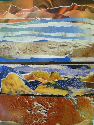
Below are some of my photographs, copied onto acetate and held flat with an inexpensive clip frame.  This resulted in much crisper, detailed images than my previous sun prints. 


This last print was created by placing the prepared printing paper under a quick sketch I made directly onto acetate using a black marker.


During this assignment I've really appreciated how important the properties of the materials I'm working with are to my enjoyment of the process.  I've experienced frustration braiding and weaving with scratchy, inflexible yarns.  The sensation of gritty rust dust on my fingers, staining my nails and working surfaces has been unpleasant along with the eye-watering acidic smells when preparing for rust printing.  In contrast there's been smooth silk and soft merino yarns which feel wonderful under my fingers and the excitement and anticipation of revealing the contents of a rusty buried package that immediately makes the disagreeable parts of the preparation stage worthwhile. Opening the parcels feels like Christmas, when you almost don't want to unwrap a beautifully wrapped present as you don't know whether you'll be delighted or disappointed. 

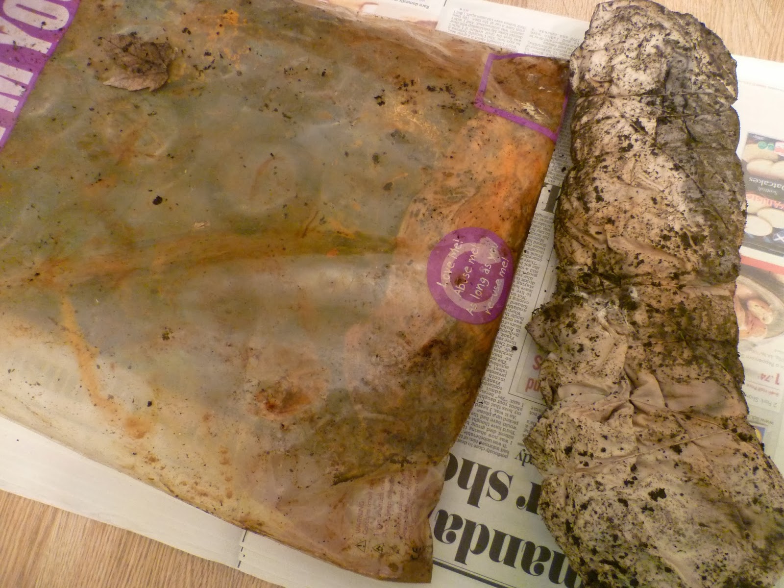
Here's the results of the experiments I began in Project 8, Stage 2, six weeks on. The left package was in the greenhouse in the same polythene packet that I've successfully used for previous rust prints.  The right hand package is freshly dug up after burial.


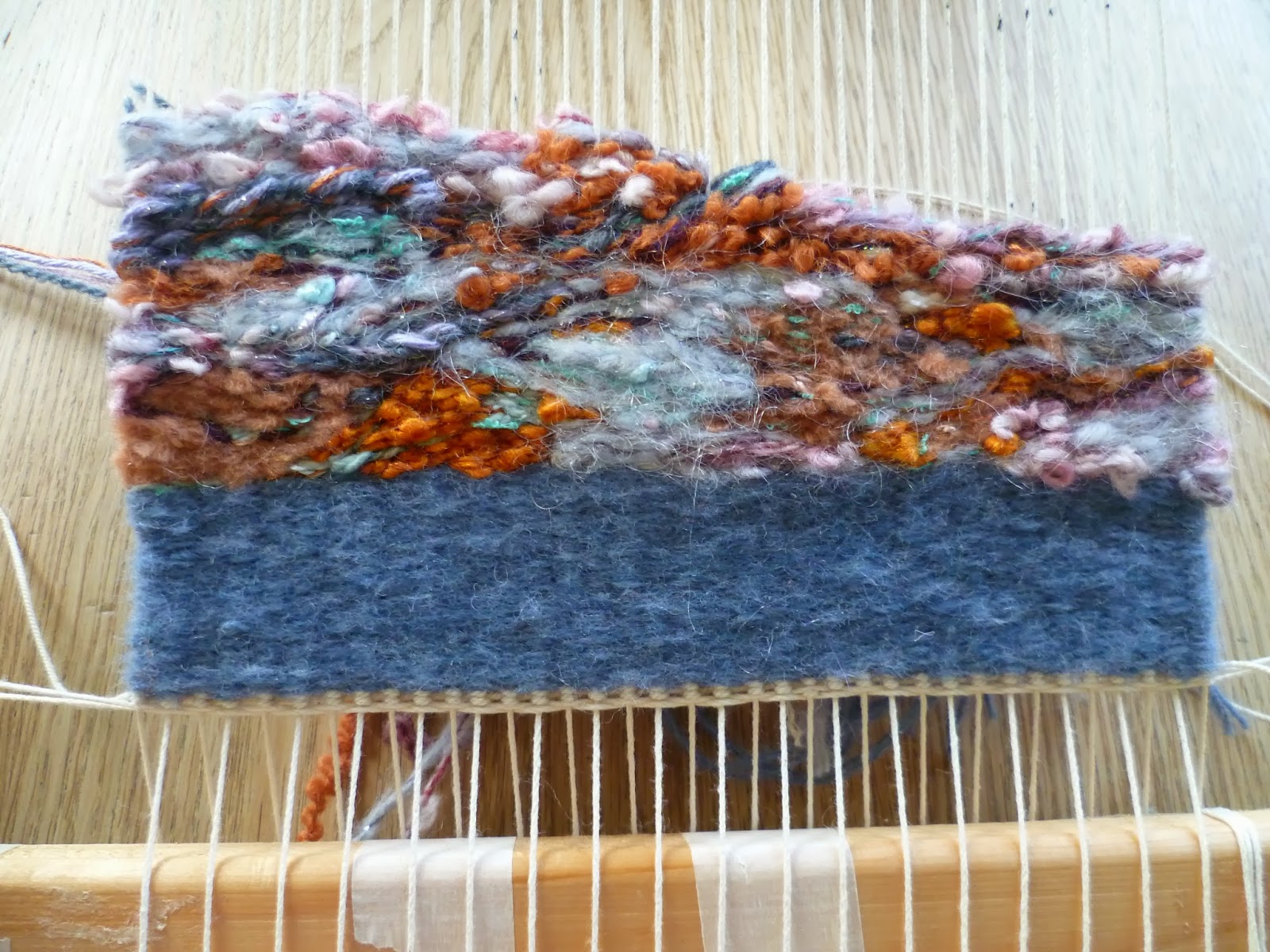
The outer layer of the buried package was the largest cloth.  I've tentatively planned to incorporate this into my final piece as it has a fairly open weave so should be suitable for the nuno-felting I have in mind. Once I've found out how to do it and made some test samples that is!


I'd wrapped various yarns around each layer that I could use should I decide to incorporate stitching.  Any stitching will be by hand as the rust could damage my machine.   


I love the range of shades; from the subtle peach to strong rusty browns I got from soaking in white vinegar and the lilac/grey that resulted from tea.


These were the cloths underneath.  I was fascinated by the grey silk square that makes me think of some winged creature like a bat or moth.  I've never had a result this dark before. Was this just a co-incidence, or caused by chemicals in the soil?  The cloths here were freshly dug up and soaking wet, so the shades were slightly lighter once dry. I was a little nervous washing the cloths but washing is necessary to neutralise them (and remove the smell!).  Having done it before, I was reasonably confident the prints would remain and they have.  


I also wanted to capture how the grid weaving had changed before I disposed of it.  There's not much left.  It's a very fragile and unfriendly object to handle now - brittle, grainy and sharp.    


This was the greenhouse package ready for unravelling. (Just noticed piece of lace on the right is same one I used for cyanotype print above.)


When I unwrapped the fabric lace layer, something new and exciting was underneath - this sparkling turquoise square! 


Initially I thought the turquoise silk I'd added had bled somehow but then realised it was the caused by that small mystery square of Metaltex I'd popped in.  The square itself also had some beautiful autumnal markings on both sides but it is now very brittle and too crumbly to be useful. 


The interlaced rectangle I had wrapped hadn't changed in any interesting ways itself but I love how the pattern from the nails has transferred onto the fabrics.  
 

I thought there was a good chance the intensity of the turquoise mark would change by washing or over time so took a few more shots to record it. I'm glad I did. As the fabric dried a hole developed in one side.  I've found this often happens as the rusted fabrics dry and shrink.  They become more fragile, particularly the highly crusted areas where there had been close contact with the object and especially if it's a delicate fabric that's been left a long time for a strong print.  I'm hoping that, by nuno felting, as well as adding texture to the patterns and colours, this will give the stability and durability a delicate open weave fabric would need to function when incorporated into a useful object.


Finally I unwrapped the other stitched grid.  Again the most interesting result was the marks transferred onto the silk fabric rather than any changes to the sample.


(I visited the Silk Museum in Macclesfield with the Embroiderer's Guild a few weeks back and my purchases from the bargain bucket of silk samples have come in very useful.)


The tiny dark grey patterns made by the grid itself are my favourites.  I think I should be considering some way of highlighting the most interesting areas of any prints I use.  


I linked some of the other exercises in this Assignment to my theme and this has given me clearer ideas on the direction my final piece is likely to take. In Part 4, Textile Structures, as well as the exercises, I continued experimenting with felt-making and also tried paper-making.  Both are additional methods of creating a surface. (I'll shortly be writing a report on the paper-making for OCASA, along with Letterpress and Bookbinding.  These were a series of three workshops I arranged for OCA visual arts students following a successful application to access the funding pot for student-led activities.  Links to follow soon.)

Below are some of my handmade papers which I've letterpress printed with words found on manhole covers.  Here I was making rust marks on it, trying torn up Brillo Pads and tea. I've also made some papers with snippets of rust printed threads and fabrics incorporated and have begun binding the papers into a book.


My final piece is due to my tutor on 31st January, which is not long at the rate I can manage alongside family and working life, so I'm grateful I've been progressing my theme alongside assignment 4.


Tuesday 17 December 2013

Assignment 4 - Project 9, Stage 4: Developing Design Ideas Into Weaving

There's a choice of approaches for this stage.  Either linking to the Analysing Colour, Texture and Proportion exercise and transforming piece of source material into tapestry, or working intuitively to describe a word in weaving.  As I felt my first sample was intuitive, I decided on the first option here.  Also the image I wanted to use was the same as I'd used in Feltmaking Experiments and one I'm considering developing for my final project.  I thought that the more I study this image and capture it in varying techniques, the more closely I'll be observing and understanding it before my final piece.

I'd already done wrappings in the analysis exercise.  However once I'd done the graph paper stripes and considered the proportions, I wasn't convinced that there's be enough of some of the yarns to complete the weaving. I also wanted to have some varying thicknesses so I could blend colour in some areas and add more variety of texture.      

 
From my stash I selected alternatives for each yarn and tied them to a numbered card to use as a key.


One idea that I'm really glad I had, as it saved a lot of time looking for the right shade, was to add the yarns to clear bags which I labelled and put in a large box.
 
 
I also found that squared tracing paper was really helpful for placing over the image when planning the design as I had such a large number of colours. I thought that to interpret my design though, I wouldn't have to be too precise with shape placement.  I planned three main bands with the craggier, raised area at the bottom, a slightly smoother central section then a darker upper section.


When I was done, I warped up the loom to the width of the image, using a ruler to make sure the knots were horizontal.  


I completed a few centimetres of plain weave that will be turned back for presentation.  As I was doing this I considered whether I might have rust dyed the warp threads so that they could have deliberately been left visible in parts of the weaving or perhaps knotted and hanging underneath.  However this would have taken days or weeks I did not have.  I've also noticed how my fabrics have sometimes become brittle and holey after rusting so perhaps they would become too weak and break during weaving.  Maybe painting or dyeing them would work better?   


I completed the bottom section with more hairy and slubby yarns using eccentric weave and areas of Soumak, to make it appear raised.  When I began on the central section, I immediately liked the contrast of the texture, which had changed to something flatter with a slight sheen due to the inclusion of a ribbon yarn.  However after a few rows I was regretting the slight variegation in the yarn I'd chosen.  When I began to add the lilac shapes, they weren't standing out as much as I'd hoped.  The background was too distracting and light in colour.  However, I'd gone a bit far to start unpicking, I didn't think I had a suitable alternative yarn at home and the advice in the project guide is to wait until the design is completed before judging it. I did though; decide to make some adjustments to the yarn selection I had planned for immediately above the bumps, to stick with a similar texture for the whole area.  I'm pleased with this decision as I think it makes it more cohesive as a section.      


Before the top section, there's an area of dark, deep cracks where I've used dark brown and purple yarns.  I've varied between single and multiple rows of weave to make the lines look broken in some places, solid in others.  This section also has spots of white which looked right as I was weaving but once pushed down either disappeared, looked flat rather than rounded, or they seemed to end up in the wrong position.  I re-worked some of these by wrapping the warp end a few times.  I'm not sure that this would be the correct technical method to add spots but it seemed to work.  


I added more areas of Soumak to this area to create the ridges and made some gentle curves to follow.   

 
The upper area of the image is mainly blue and lilac with small touches of oranges and turquoise.  The rusting metal has a slight sparkle and here I introduced a metallic thread. I combined thinner yarns and worked with a number of butterflies on the go.  Every so often, I dropped one of the strands at the back and picked up another from a neighbouring weft hoping that this would result in the colours blending rather than standing out as spots.  
 
 
Finally, I wove a few plain rows.  Like the blue bottom border, these will be unseen once folded back and stitched as a hem. This time, I felt more confident that the whole thing wasn't going to fall apart and unravel as I cut it from the loom and trimmed the threads!


Standing back and considering the finished sample, it's not quite how I envisaged.  The three areas which look quite distinct on my image are less clear cut. The central right area that I had concerns about still irritates me and in hindsight, I wish I'd followed my instincts and dealt with it then by picking it out and replacing the variegated yarn with something self-coloured but still smooth - combining some embroidery floss with 3mm ribbon would have worked I think.
 
Though some of my yarns have been stubborn about sitting flat or curving nicely, I'm pleased I managed to select from my existing collection for Project 9, rather than spending on specialist rug wool. Something I learnt from Kaffe Fassett when compiling the Textile Artist Research Point is the infinite variety of colour that can be created by combining what you have available.  I felt weaving is similar to how he describes his tapestry, as painting with wool, though as you can only weave bottom up, it does need some planning if you are following an image.  I was happy with my source material which I could follow fairly loosely and think if I had worked a design with sharp edges that had to be precise, it might feel a bit limiting, like painting by numbers! 
 
I found the graph paper planning tedious, though once I'd started weaving; I really appreciated having the chart to refer to.  There were still decisions to make on sequences and texture, but having the colours already plotted simplified everything.  I'm sure that there's a better relationship to the original image as a result of the planning.
 
Although the central area was not captured quite as I intended, overall I am happy with the sample and its proportions. Having spent a lot of time recently observing rusty objects, for me, it does capture 'rust' in colour and texture, even though I'm using soft materials to convey something hard.  Close up, I can see and feel the change the in texture of each area and I've found I much prefer the dynamics created by eccentric weaving over plain weaving.    
  
It was interesting to weave the same image I used for wet felting and needle felting in Stage 8 and compare results.  Weaving is more predictable and cannot be rushed but it is something I'd try again.  Perhaps because it is winter and it's cosy to sit by the Christmas tree and fire, that it's easier to enjoy the quiet contemplative time and I liked getting into a rhythm on the larger sections.  Handling so many fibres has improved my understanding of their properties and I've particularly enjoyed making unusual combinations and seeing how differently a yarn can appear once beaten down and condensed.   


Sunday 15 December 2013

Assignment 4/5 - Theme Book Drawings

My frame is warped up again ready for the final stage of Assignment 4, but I felt like I needed a break from weaving before I began again. I've been thinking a lot about my final project and wanted to spend time working on my rust theme.  It's been very tempting to dig up the rusted objects I wrapped and buried during Experimenting with Structures but I know the longer they are left the better to achieve strong prints, so instead I joined up with the workbook group run by local textile artist Anne Brooke.  Weaving's been quite a solitary experience and I wanted some company. 

As we were meeting indoors and all my rusted objects are busy printmaking, I searched on Pinterest for 'Rust' and printed a few images to attempt capturing their colour and texture using some of my favourite mediums: acrylic paint and paper.

For this first image, I printed through a plastic doily using orange paint then sponged on gold and browns for depth of colour.  I was debating how to achieve the crusty edges of the blue peeling paintwork and Anne gave me a piece of teabag paper to try that she'd bought at the Knitting and Stitching Show. I painted it, then scrunched and tore it and ran my nails around the edges to make them craggy and irregular.  Teabag paper seemed a bit resistant to glue and it took a great deal to stick it down!


Since I photographed this, I've added touches of darker blue paint to highlight the raised areas.  I may add some acrylic wax to the blue surface too and add further detail with pen.
 
Anne had a wide range of materials for us to try and I created this page below using only a finger stamp with a simple design of circular dots. I dragged the paint down using the stamp then added the blue and brown texture by varying the angle of the stamp and the load of paint.  


Obviously I hadn't captured the rust colours well before adding the blues and browns so I worked over the top with pencil crayon.  This helped take back the brightness a little and the crayon caught the raised areas of the dots, making them two tone and more dimensional.


A while back I bought damaged coffee table books with satellite images taken from above earth and these are my favourite source of paper for mixed media.  I love the textures of the topography and used strips of the images for this paper collage.  


Some of the edges looked a bit harsh I felt, so I used the same dotty finger stamp to print and blur them, adding texture.

 
When I stood back later and looked at this, it felt familiar.  Eventually I realised that there was actually quite a strong resemblance to my weaving, which I'd always considered seascape rather than rust inspired, though of course rust is rife at the seaside.  I was weaving the colours and shapes by instinct before I'd ever seen this image though. Surely the similarities are more than a co-incidence? I assume that I've chosen this image because I still had the weaving in my mind. 
  
 
Below are some more of my Theme Book pages created during the last few weeks to generate ideas:
 
When I was on holiday, to the embarrassment of my family, I began noticing and (risking my life standing in the road) photographing the surprising variety of patterns on manhole covers. Before long, the kids were joining in with the spotting though; "Here's a new one Mummy!", "Ooh, have you seen this one yet Mummy?"  On this page I was trying out some spray inks and sponging and overprinting with shapes carved from erasers.  I've thought about making a photo collage of the patterns and drawing boxes with different manhole patterns in each square to see how the simple shapes sit when adjacent to another.
 

This next page is still to be added to.  I like the simple shapes of rusted rivets, and the washers that I've been using in some my rust printed fabrics.  These stamps are made using a button stuck on the end of a wine cork dipped in acrylic paint and I like how they don't come out quite cleanly giving a sense of disintegration.


Below is an oil pastel drawing of a rusty beam under a bridge I saw in Slovenia.  I struggled to achieve the raised effects of the peeling paint until I stuck on small pieces of torn, crumpled paper. I like how the surface of oil pastels can be scraped away to reveal a colour underneath, a technique which I've used to show textures of surface cracks. They can also be used thickly and blended for smooth areas and lightly on their side for a powdery effect.