Friday 25 May 2012

Sunny Days and Perseverance

As the weather has been so fine and still, after weeks of rain, I decided to jump to the print experiments exercise of Stage 4 and get out my sun print paper.  I'd ordered it after seeing some prints in a magazine and the colours reminded me of Aboubakar Fofana's indigo dyed fabrics that I saw at the Whitworth Museum visit. The process was incredibly easy. 

In the pack were small pieces of light blue paper.  All you need to do is pin it to something at the corners to make it easier to carry outside without disturbing the objects (I used a mouse mat) then put some objects on top and take it all outside to expose in the sunlight.  You need to work quite quickly and have your objects ready to place as the paper can begin to expose inside.  After about 2 minutes the paper turns light blue, you bring it back inside immediately then soak it in cold water for a minute and leave to dry flat.  The images sharpen and darken as they dry with the object shape left in the negative.

Some of My Sun Print Experiments
I particularly like the print taken from my lacy machine embroidery sample. This reminds me of jumping into a pool of water.  The button print is interesting as some of the buttons were semi-opaque and the variation in colour depth gives the print a three-dimensional effect. For one of my prints I didn't realise there were two pieces of paper stuck together and I ended up with an additional much more subtle print from the page underneath.  The process was quick and enjoyable and I think I'll order some more paper for when I come to develop my designs and try to create more deliberate images.

Last time I went on holiday, I decided I was going to defy those people who told me that left-handers shouldn't bother learning to crochet. However after the 4 hour plane journey I had produced a single granny triangle that was supposed to be a square and it seemed those doubters were right.  My second attempt was slightly better but I still couldn't describe the shape I produced!

Attempt 2 - still very wrong!
That was a year ago and my last attempt.  However when someone at knitting group appeared this week with some Tunisian crochet hooks and described it as a cross between knitting and crochet, I was interested, assuming I'd be half way there as I can already knit.  With another flight coming up next week, I'll need something to occupy myself and it won't be the end of the world if the airline confiscates a cheap plastic hook.

Tunisian Crochet - Attempt 1.  I eventually worked out which hole to go into to get parallel edges. Small samples can be worked on a regular crochet hook.
I'm pleased as I've pretty much got the hang of one stitch now and made myself a little left handed tutorial for a sample in case I forget:

1. Make a slip knot then a chain of 10 stitches + 2 for turning chain.


2. Push the hook front to back into the third chain from the hook. (I was shown the 4th and other instructions say the 2nd so I split difference - I need to try it to see which works best). You can go through just the front, or front and back to minimise the curl. Yarn round hook and pull through so 2 stitches are on the hook. 

3. Go into the next chain, yarn round hook and pull through. Continue to the end of the chain until 10 stitches are on the hook.


4. Wrap yarn round the hook and pull through one stitch. Wrap yarn round the hook and pull through two stitches. Continue until one stitch remains.


5. Make 1 turning chain then insert the hook from left to right into the first clear vertical bar at the front of the work (a little way in, not the bit right at the very end or the edges will be wonky like on my 1st attempt). Yarn round hook and pull through to create another stitch on the hook.


6. Push the hook behind the front of the next vertical bar from left to right, take the yarn round the hook and pull through. Repeat until you have 10 stitches on hook. (Last vertical bar is harder to identify. It appears a little lower and is at the very end of the work.)


7. Repeat steps 4-6 until you have the required length.


The back of the work looks a bit like reverse stocking stitch. The fabric produced is dense with a tendency to curl forward. (Yarn used was Patons Sorbet with a No. 7 (4.5mm) hook so the fabric would be slightly less dense with recommended 5.5mm hook.)


Tuesday 15 May 2012

Project 3 Review - Colour

12 Colour Wheel machine embroidered on soluble fabric
Were you able to mix and match colours accurately?
I wanted to understand why it's almost impossible to paint a colour circle from only three colours so I tried it.  I started with the primary colours, then mixed these together to get the secondary colours then filled in the segments in between to get a 12 colour circle.  I found it tricky to get the get the proportions right as it wasn't just a matter of using the paint 1:1. For example, to make green, I needed mostly yellow and just a little blue.  The graduation of the wheel wasn't quite right.  I had a too big a jump from yellow to yellow-orange then all the segments from here to red-purple were too close.  I also had real trouble mixing a purple so after the wheel I tried all my combinations of red and blue and found from my paints the best combination probably would have been scarlet + cobalt, whereas vermillion + cobalt gave a brown.
Colour wheel painted with acrylics: Scarlet + Ultramarine+ Lemon Yellow

I read some good articles on colour theory and particularly liked this one by artist Peter Straub: Colour Theory Simplified. It's a really well presented all round explanation of the principles of colour theory and I learned the difference between value (lightness or darkness) and intensity (brightness or dullness) as something can be dark and bright or light yet dull.

Portrait artist Roger Simpson gives some good explanations of how warmer colours like reds and oranges appear to come towards you while cooler blues and purples tend to recede. For example, the nose and cheeks on a portrait would need warmer colours to give the impression they protrude than the ears, which recede.  The artist points out that generally there are more cool colours in a portrait and he thinks this is also true of landscapes.  He talks about the importance of achieving the right overall balance of warm and cool colours to give relief and contrast.

Peter Saw gives a detailed tutorial for mixing watercolours. Like the course material, he recommends adding a complementary colour to produce a more natural dulling effect, rather than grey or black, to keep colours fresher.  He gives an example of adding a little orange to green if you wanted to paint a blue green tree. This tutorial also gave a more detailed explanation of why it is difficult to produce a full spectrum of colour using a single red, blue or yellow. Most contain traces of pigment from one or both of the other primaries so are not actually pure primary colours.  If a mix contains a significant trace of all three primaries it will be subdued, whereas only two primaries will produce a bright colour.  As my palette was too restricted, it would be impossible to produce full spectrum of colour.  An 'optimised palette' should have a warm and cold version of each primary.  For example if I mixed cadmium red with ultramarine, my purple would not be bright enough.  Cadmium red is warm with a trace of yellow pigment.  Ultramarine is also warm with traces of red. Therefore, as all three primaries are present, there will be an element of dulling.  If I added Alizarin Crimson (a cold red with traces of blue) to Ultramarine, I should get a brighter purple as only red and blue pigments are present.

So (after spending considerably longer than the hour suggested for this preparation exercise!), I went onto the matching paint exercises.  The time spent however seemed to pay off as I could then confidently mix my colours.

Matching paint to a fabric

Matching paint to an image

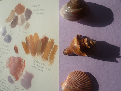
Matching paint to 3-D objects

Were you able to use colour expressively?
I tried to use a combination of marks and colour to express feeling, then quizzed my nine-year old on what the marks made her think of.  She got them bang on, so I think that was a success!


Gloomy/Cheerful

Soft/Sharp

Calm/Excited

Can you now see colour rather than accepting what you think you see?
I've spent a lot of time recently peering closely at objects and asking my family, 'Look, can you see the purple in that?'  I think it's the first time I've given much thought to how backgrounds can take on a tinge of the object and drawn them in.  I tried drawing some clematis outside on a changeable day, and drew in the shadows that were clearly, and surprisingly purple on the white page.  Frustratingly, they kept lightening and deepening as the sun came in and out.


Noticing shadow

I really enjoyed putting the colour bag together, because I had real pleasure closely observing the seascape images I was strongly drawn to, with their jewel-like sea greens. Had I filled the bag from memory, I don't think I would have put in the bright oranges or cool dusky pinks that I clearly saw when inspecting them closely.


Making a colour bag for a seascape 

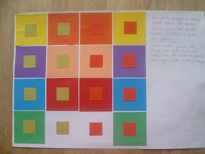
I don't know how clearly this will come across on the photos but on Colour Perception exercise one, I observed that green, pink and turquoise looked much lighter on the red background than yellow.  Most noticeable was pink that looked so much paler on red than any other colour.  Comparing pink on red to pink on orange, the pink looks almost purple on an orange background.  Pink on a purple background looks far warmer, and more yellowy.

Effects of changing a background colour

Next I repeated the exercise using olive green and scarlet small squares.  Again the yellow background made the smaller squares appear darker.  The olive green looks fresher and brighter on purple than yellow.  The small scarlet square looks orange and bright on the deep red background, dirtier on peach and even more so on orange.


On the little grey square immediately I could see the violet tinge on the yellow background.  Then I looked harder and began to notice that they were certainly all different and the more I looked, the more I saw: first a reddish tinge on green, next bluish on the peach, then I saw it on orange, then I saw yellow on purple.  


During the squares exercise, I noticed I seemed to be more responsive to changes concerning yellow and began to wonder, does everyone see colour the same as me? I found an interesting website on colour psychology by the company Colour Affects.  They say that the answer to my question is unknown but there is a theory that the effect of colour on us is caused by the energy entering our body.  There have been experiments where blind people have all been easily able to identify colour with their fingertips and colour-blind people have proved to be sensitive to colour psychology.

The page on colour psychology explains that there are four psychological primary colours – red, blue, yellow and green.  It goes on to describe the positive and negative psychological properties of eleven basic colours.  For example with red, positive characteristics include courage, strength, friendliness, energy and excitement.  Negative are defiance, aggression and strain.  It describes the property of red that makes it appear closer than it actually is and how being the longest wavelength makes it a powerful colour which grabs our attention.


Although red has the longest wavelength, yellow is the most visible and emotionally stimulating and the strongest colour psychologically, which explains why I was drawn to this colour.  Color Matters says that the yellow family of colours gets our attention faster than any other colour and 'lateral peripheral vision for detecting yellows is 1.24 times greater than red.  The colour is most visible under dimmer conditions.  School buses and many road building machines are yellow.  They are safer as more easily seen in bad weather.    My dad says that the yellow green golf balls are easiest to see, which you maybe wouldn't expect on green grass.  Last year I changed my yellow car for a dark purple one and now no-one in town waves to me anymore!
Did you prefer working with watercolour or gouache paints? What was the difference?
I chose not to buy new gouache paints specifically for the project so I tried acrylics for the colour wheel, watercolours for recording colours accurately and a mixture of media for expressing colour moods including chalk pastels and some of my children's left over 3-D fabric paint. I usually prefer acrylics as I tend to paint quickly but I found that they dried too quickly when I was trying to get the colours right for the colour wheel.  Then I had trouble mixing up an identical colour.  I noticed that the three different colours I used behaved differently.  Lemon yellow applied smoothly and evenly to give a flat surface whereas ultramarine was very grainy and I had to layer it to try to get a flat finish. For accurate colour mixing I preferred watercolours.  They did not dry too quickly, and I found it easier to get accurate shades as I could dilute them with water to lighten as well as mixing.

Mixing watercolours

How successful were the colour exercises in stages 5 & 6?  How did they compare to the painting exercise?


Observations of the stitches on black were that the background fabric definitely makes the blue and red seem darker; and when I look at the densely packed areas of stitch such as the French knots, the colours look much more vibrant than in the sparser areas.  A line of blue stitching between rows of red stands out more than a line of blue on it's own.  The pastel colour knots look far more effective on the black background than the blue, red and green, which look rather dirty.  Varying the distance between stitches and the size of stitch seems to give more energy and movement than areas of even stitching.  I tried using a strand of each colour for some of the French knots which I thought was an effective way to graduate colour. I decided I'd done quite enough knots by then and thought I'd try the alternative machine embroidery exercise for my sample.

I tried two types of fabric.  There was Romeo, a heavyweight transparent film and Aquatics Aquasol.  I preferred the Aquasol as it was a more stable surface to stitch on and my threads tangled less often.  On the other hand, with the Romeo I could see when the threads had tangled underneath and deal with it straight way without so much unpicking. Romeo was also better for trapping fibres as I could see what was where. Aquasol dissolved in water much more readily and with less residue than the Romeo, which was rather gloopy and sticky.  Which is best, depends on your project.   


First I worked with primary colours on the Aquasol with the stitch width and length set to zero, using the pedal and moving the hoop backwards and forwards to control the direction and speed.  I added secondary colours, then black and white, tried zig-zag stitch and experimented with different colours on the bobbin to the reel.  As I became more confident with the technique I began to make more deliberate marks and had a thoroughly good time creating this sample.  After dissolving the background and drying the sample, I placed it on different coloured backgrounds to see which colours seemed to pop out.

I gradually became more confident with the technique and was able to control the stitches better

Black thread on reel and red on the bobbin using a zig-zag stitch.  Effect was different depending on whether I moved the hoop backward and forward or side to side.

Ready to dissolve

I trimmed the Aquasol close to the edge and it dissolved very quickly under cold running water


Trying different coloured backgrounds


Next I had a go trapping some threads and semi-opaque fabrics between layers of Romeo and using a metallic thread.  The thread kept breaking so this spoiled my enjoyment.  The sample turned out OK and looks best placed against the window.  The lacier areas are more successful and I quite liked the effect of the trapped organza ribbon that was snagged by the stitches.

Threads and translucent fabric were trapped between layers of Romeo and machine embroidered with metallic thread

I decided to try to make a stitched 12 colour wheel using 6 threads.  I had to work systematically, going round in a circle, changing the bottom thread for the second segment, then the top for the next, then the bottom and so on to make sure I got the right proportion of colour.  I also found that if I stitched too slowly, too much of the bottom thread showed so it was a bit tricky to control the stitches near the centre, having to work quickly in a small area. I was quite pleased with the final result and the colour graduation.  Perhaps it could have done with a little more purple on the blue-purple but not too bad overall. 

Working systematically


Choosing an image for a sample proved difficult as I realised that I don't really do pastels, most of my images have strong colours.  I found a old drawing I did of my Dad's watering can rose and decided to try this.  Unfortunately my machine thread stash was rather limited so I had to improvise with the colours.  I think the stitches represent the chalky, mottled texture with ridged circles quite well, although the colours are deeper and there should be more contrast between the can and the holes.


I had a bit of Aquasol fabric left so I decided to have another go working from a photo I took of the salt marsh at Parkgate last month. I wanted to get a contrast between the movement of the grasses and the total flatness of the still water.  I found some slate blue organza ribbon with a slight shimmer for the water and took a trip to the haberdashery to try to find some sewing thread colours.  There were plenty of greens to choose from but  I couldn't find anything near to the pinkish beige of the grass (although the photo does look a lot more pink printed than the original image) so I had to choose something of a similar tone. I used a back and forwards motion slightly varying the direction to try to emulate the dense grass, making sure the edge of the ribbon was covered.  The ribbon had to be sandwiched between two layers of Aquasol as when I tested it laying on top, it created a horrible tangle as soon as I tried to stitch over it.  The final sample is quite different from the other lacier pieces but I found the soluble fabric was a good way to stabilise the stitching surface of a delicate background fabric.      


Is there anything you would like to change or develop?
I would like to combine hand and machine stitching on soluble fabric.  In the salt marsh sample for example, I think some long random stitches and some loose ends on the surface would give movement to the grass.  I would also have a much better choice of coloured thread.