Thursday, 28 March 2013

Assignment 2 - Silk Painting, Batik and Wet Felting

Back in Assignment 2, 'Experiments with Printing and Painting' there is an optional section on silk painting.  I'd seen that my local adult education centre was offering a 4 week textile class that included silk painting so I decided to wait and try it there rather than buy all the expensive materials.  Other techniques we were going to learn were feltmaking and batik.

We began with batik which is essentially drawing with liquid wax.  The wax hardens to create a resist before colour is added.  After looking at photographs, handling some stunning pieces of batik textile and pinning our cotton fabric tightly to a frame, we had a quick demo and a practise on paper.  I discovered that the controlling the flow of hot wax was a tricky business, particularly with six of us all dipping at arms length in a communal pot.  Too hot and there's a constant dribble, too cold and the tjanting tool would clog.  With this and the limited time frame in mind, I looked through images for a simple source of inspiration where the unintentional blobs could be part of the design.  Silver birch trees with a lovely wintry light seemed appropriate, especially as temperatures outside were freezing.


Conscious of timescales, I was working in rough lines quickly and freely, and it didn't take long for the wax to harden on the fabric when I put it outside in the cold temperatures.  Even so, it could have done with a bit longer.  When I scrunched the wax, attempting to create the cracked texture of the bark, it wasn't quite brittle enough in the thicker areas.  Next I painted on the coloured dye which needed to be worked in really well with the brush to get into the cracks. Once the piece was completely dry, it came off the frame and was ironed between sheets of blank newspaper to remove the wax (protect iron with extra sheets of newspaper).  Every time I thought all the wax was out, because there didn't seem to be anything more coming onto the paper and the fabric felt soft, it would cool down and stiffen again.  The tutor said running under warm water might get the wax out completely, though there was a risk of some colour coming out if wasn't fully fixed. Some colour did wash out so the end result was less vibrant.  I wouldn't use warm water again but I've still got a good background for embellishing.
 
 
On the second session, the batik wax was out again and we could begin a piece that would be dip dyed in three different colours.  I'd brought an image of a glass paperweight I particularly liked from my inspiration file and hoped I could achieve something of the colour blends and transparency. I needed to think back to Assignment 1 and colour theory to work out which areas to wax out for the first dip.  It turned out to be a large area and I soon gave up with the tjanting and tried brushing and spooning the wax on.  Next I plunged my piece into a bucket containing a tepid solution of yellow dye (Colourcraft Procion) and salt. The fabric had to be soaked for at least 30 minutes. Mine was first in and had an extra 15 minutes over the others and resulted in a noticeably deeper colour.  It looked most unpromising as I rinsed it out using the cold tap until the water ran clear.  The soggy fabric was left to dry until the following week when the wax could be ironed out ready to start again.


By week three, we were ready to prepare the batik for a second dip in red.  I spooned wax  onto the circular shape which was to be mainly green, blue and yellow, leaving much of the background that I'd decided would be mainly red. This time my fabric was last in the bucket and I was disappointed that the red looked wishy-washy.  However the tutor explained that the first dip is always most vibrant and when I ironed out the wax the pink shades began to look redder.


On the final week I wanted to be seeing a definite difference between the marks on the background and the paperweight shape. I used the tjanting to draw in little veins and used a spoon and brush to thickly cover the background, working quickly so the wax would have as long as possible to cool and I could give it a good scrunch before plunging it into the final blue dye.  I rinsed it and gave it a waft with the hairdryer before taking it home to dry properly.  After the previous experience I was more patient ironing out the wax and was pleased to see the colours looking bright.  I'm not sure that the result was what I was anticipating - I was expecting to see more definite marks - but I really like how the colours have blended and I definitely get the feeling of glass and transparency from the original image.


While the batik was drying and dyeing, I had time to experiment.  I waxed another piece and had a play with painting on colour again, this time trying to let the vibrant colours bleed and blend into each other. I thought in future I'd like to try combining the dip dye and painting and also try batik on patterned fabric.


We were all given white merino wool tops to have a go at wet felting.  There were some small amounts of colour we could add.  I decided to choose seascape colours so I could add the felt to the colour theme bag that I made in Stage 4 of Assignment 2.

 
First I pulled apart the wool tops and layered them at right angles to each other inside a bubble wrap sandwich (bubbles up to increase friction).  This was placed in a shallow plastic tray (cat litter tray would do) with a piece of thin cotton fabric on top.  Washing up liquid was squeezed on followed by very hot water.  Wearing rubber gloves, I worked this well into the fabric and as the wool began to felt, I used a rolling pin and spud masher to agitate everything more roughly. Every now and again I topped up the hot water and turned the felt over. After a more than half an hour of constant mashing and bashing, the fibres no longer came away with a gentle tug, the felt was ready to squeeze out and leave to dry.
 
 
Below is the finished felt, along with another smaller piece I made from some leftovers.  When I looked at the reverse, it reminded me of the waterfall drawings I did and I think I should try to develop the drawings into felt samples.    
 
 
Although the felt is quite thick, because the landscape outside is bright and snowy, I found  the fibre network quite beautiful when held up against the window.  I would never have associated something so woolly with the transparency but it's similar tonally to the tissue and dye on acetate drawing I did of my polished blue stone.
 
 
Finally, silk painting. First I tried out the paints on a piece of silk with a pre-printed outline that was really effective at keeping the paint within the design.  Essentially it was colouring in, but it was a good way to start something that was completely new to me. I found only a tiny amount of silk paint went a very long way and that the paint dried paler than I was expecting, so two or three layers were needed. To get a paler colour the paint was simply diluted.  I enjoyed mixing my colours, which seemed to stay fresher and clearer when mixed than the acrylic paint I am used to. On the larger areas I found it quite difficult to get a flat colour.  If I used too much paint it would flood over the boundaries of the design but if I tried to go slower and more carefully, the colour would start drying and I'd end up with a kind of watermark where the wet and dry areas met.  I tried sprinkling coarse sea salt on the wet silk.  The salt soaks up some of the paint to give a mottled effect.  However I wasn't sure how to get the salt off again.  Maybe I had too much paint on but it seemed to stick to the surface.  When I tipped it my paint ran.  In the end I waited till it was dry and brushed the rest off.


Next I had a go drawing directly onto silk with a tube of gold gutta.  I'd been to see the Lion King at the theatre, which was a wonderful visual experience and I wanted to create an African style design to remember it by.  Like the batik wax, I found it difficult to control the flow of gutta.  Getting a regular thickness on my line was tricky and once it dried and I started painting I realised my lines were broken in places as the paint was bleeding through.  I also noticed that where I'd pinned the silk to the frame there were runs in the silk.  Altogether I enjoyed felting and batik much more and found my experience of silk painting frustrating, unforgiving and fiddly.  However, I'm not ready to discount the technique yet as I think it would lend itself to the watery seascapes and transparency I love. The adult education centre is hoping to run a silk painting class soon so I've signed up.  I've invested in some specialist 3 point silk pins and found plenty of online video tutorials.


Monday, 25 March 2013

Workshop - Claire Tinsley: Bonded Impressions

At the Halifax Branch of the Embroiderer's GuildClaire Tinsley, founder of patchwork and quilting supplier Hannah's Room, came to give us a talk, followed by a workshop.  'From Scraps to Accolade' was the story of the quilts she has made over the years, beginning with the patchwork cot cover she made for her new baby, the dress she made herself for a wedding when she was a hippy and a large bed quilt she made while trying out the Trapunto technique.

Claire's first quilt - made before she realised that quilts have wadding!
She still remembers where each scrap of fabric originated.
Some years on, when Claire was immobile, recovering from a car accident, she began to take a more serious interest in quilting and entered her first competitions.  It took a little time to get to grips with the strict rules and some of her early entries were dismissed with comments regarding 'inappropriate hanging' (tabs on a pole), 'incorrect tension' and 'inappropriate background' (hand-dyed). Undeterred, Claire continued to be experimental with her techniques in the traditional world of quilting.  Even when one of her quilts won 1st prize at Harrogate there was criticism from some camps because she had incorporated hand painting!
 
These days, Claire is a judge herself and winner of numerous prestigious awards nationally and internationally.  She had brought along many of her stunning quilts to demonstrate some of the techniques she uses.
 
This is a close up of a quilt that won 1st in the painted section at Malvern. The theme was 'In the Woods'. Claire painted and printed on yellow dyed calico and used a cut back applique technique. She chose purple lame for the background to give a dramatic contrast. 
 
Detail from the 'Hidden Treasures' quilt created for the Hoffman Challenge.  Entrants must use a specified piece of fabric in their quilt.  Claire's inspiration was the fleeting glimpses of animals you see in woodland. You notice more and more animals as you look closely at the quilt.  They are not immediately obvious.    
 
Having looked at the rules for the Hoffman Challenge, they remind me of strict English country show rules where anything other than traditional is risky and diversion leads to disqualification of your rhubarb jam, Victoria sponge or whatever.  If your jam is in the wrong shaped pot, it's out - regardless of how good it is.  You imagine fierce rivalries and that having local knowledge and an inkling of the judge's preferences would be a distinct advantage!
 
'Poppy Love'
 
The chenille quilts really caught my attention.  The technique is relevant to Assignment 3 and something I'd like to try.  Seven layers of fabric were stitched on a patchwork block grid then cut.  I like the texture and how the bias emphasises the colours differently.
 
The following day we returned for a workshop to make a small hanging based on Claire's  'These are a few of my favourite flowers' quilt using bonding, layering, painting and machine quilting.
 

Painted bonded applique technique is used with free machine stitching

Detail from 'These are a few of my Favourite Flowers' quilt which has won multiple awards
 
This wasn't a day for experimentation or design but purely to learn a technique which would come in useful for Assignment 3 (Stage 3 - Applied Fabric Techniques).
 
 
I chose the pansy element and began by selecting my fabrics, then cutting and sandwiching Armo fleece wadding between the backing and base fabric. (505 Semi-Fixative Spray was ideal for holding the layers in place.)  Next I ironed the yellow inner frame and patterned batik foliage fabric onto Bondaweb.  I peeled off the backing and used this to trace the pattern with a pencil (white or silver pencil shows up better on the darker fabrics).  The bonding paper was ironed back on to the glue side to transfer the pattern which was then cut out and ironed onto the front of the background.


All the other shapes were copied, cut out with small sharp scissors and bonded in the same way.  Fabric paints and pens were used to add shadow and highlights. To brighten the flower centres, a white paint mixed with acrylic ink fixer was used (Liquitex).  This had a ball bearing in to keep the thick ink flowing and was highly pigmented to cover the darker fabric effectively and allow it to be painted over. 


With all the pieces in place, it was ready for quilting.  The shapes were enhanced using the  darning foot for free machining. Finally to finish the raw edges, I consulted a book on cushions.  I cut bias strips about 5cm wide and joined them together so I had a piece as long as the diameter.  I folded and pressed the long sides into the centre then opened out the fold.  The bias strip was placed on the quilt right sides and raw edges together and stitched along the fold line. I stopped and started stitching about 2.5cm from each corner so I could fold over the binding strip and manipulate the fabric into a neat (well it's supposed ton be neat) mitred corner.  On the back I folded under the raw edge and slip stitched in place by hand.
 

Following someone else's instructions so closely felt rather stifling, but now I've learnt some techniques, I'm looking forward to using my left over Bondaweb during Assignment 3.  I'll be having a go making samples of some of my own designs using a variety of fabrics in Stage 3 and giving chenille a try in Stage 4.           

Wednesday, 20 March 2013

Assignment 3 Research Point - Textile Diversity

At the start of Assignment 3, we are asked to 'Investigate the diversity of style and design in textiles available to the consumer'. It is suggested we research on Internet, in books and magazines, visit local fabric and furnishing stores and make a collection of fabrics and/or images to illustrate the diversity.

Researching fabrics available to the consumer

Browsing through the features and classified section in magazines, such as Cloth, Making, Surface Design Journal, Handmade Living, Selvedge and Elle Decoration, I found the majority advertising here were selling printed cottons for crafts and dressmaking.

Hannah's Room specialise in batik prints for quilting and patchwork

Floral prints feature heavily in all these magazines and there looks to be a trend in both fashion and furnishings for textured animal prints, particularly fake fur and large romantic blooms (for SS 2013, dark backgrounds replace light). In homeware, nostalgic Cath Kidston and Amy Butler style florals and reproduction block prints are popular. Fair Isle designs, which featured on the catwalks AW 2011, are still around in furnishings, along with crochet, screen prints and patchwork.

Florals Dominate

There is ample choice of vintage fabric suppliers in the classifieds and on auction sites. Reclaimed kimono silks, retro Scandinavian folk style screen prints and 'atomic' barkcloth prints from the '40s to '60s are sought after. Ditsy floral prints from 1980's Laura Ashley and Liberty are also popular. This reflects the common theme of courses and workshops advertised in the magazines. 'Make Do and Mend', 'Vintage Dressing', Survive and Revive', 'Hand Alterations and Upcycling' are just a few of many similar. The Eurozone is still in recession and there is a growing movement of designers such as Junky Styling London who are working against fast fashion, sustainably, and with recycled materials.

Vintage/reclaimed fabrics are popular for furnishings such as these kimono silk remnants and modern crazy patchwork in brights is still a furnishing trend


Other suppliers specialise in fabric for artists and designers, such as Exotic Silks, who supply 1400 different types from Habotai for painting and linings to crepe de Chine for dressmaking and charmeuse for lingerie and drapey luxury items. Locally, I found Whaleys in Bradford who stock an enormous choice, available in any quantity from 1 metre. There are whole ranges of synthetic and natural fabrics prepared for dyeing and printing, coated fabrics for digital printing, dissolvables, discharge fabrics, devores, jutes, hessians, buckrams, linens, mixed fibres and more. There is even a department specialising in flameproof stage fabrics for theatre curtains and sets. Millinery net, organic cottons and many fabrics I'd never even heard of such as Pinukpop, hair canvas (interfacing for high quality tailoring) and even black delaine wool for nun's veiling are on the price list. (Interesting page on Nun's Veiling on Page 73 of Issue 49 Selvedge magazine.)

Fabworks Mill Shop in Dewsbury, is well used by schools as a resource for creative textiles, selling a wide variety of interesting scraps and remnants, along with fabrics for fashion, dance wear and furnishings. Textile artist Mister Finch, whose work was featured in the most recent Selvedge magazine (Issue 50) introduced me to Scrap in Leeds. This is a social enterprise that rescues waste fabric and materials destined for landfill and sells it on very cheaply to schools, community groups, students and individuals for art and play.

Destined for landfill but now on sale at Scrap for creative re-use

When I visited Scrap with the OCA students recently after a Yorkshire Group visit to the Nike Savvas exhibition, we were all fascinated. It's not somewhere you can go with a list of things to buy because you have no idea what you might find. It's an amazing place to pick up the unusual, be inspired and cheaply buy fabric and materials to experiment with - though you won't necessarily know what it is you have bought! I came out with a huge designer wallpaper sample book (for wrapping paper, book covers and collage), a stack of 6" squares made of something resembling Tyvek that I've been stitching into and apparently takes ink very well, a load of punched Jacquard loom weaving cards (thinking of weaving into them for the next assignment) and most usefully for this research point, a large number of samples of furnishing fabrics that included detailed specification, composition and fabric care advice.

Yorkshire Textile Artist Mister Finch who created my moths buys materials from Scrap Stuff 

One large binder of samples was from Agua, whose background is supplying upholstery fabrics to the healthcare sector. They now describe themselves as 'a market leader in technical upholstery and curtain fabrics for all contract markets.' The fabrics have a luxury feel (many are convincing look-a-likes for leather, velvet and woven cotton) but each range has additional performance properties that makes them suitable for use in leisure, hospitality, cruise liners or healthcare. Desirable qualities for these settings might include anti-microbial, stain resistance, flame retardance, waterproofing, UV resistance, breathability, hard-wearing and wipeclean. This was the first time I've taken much notice of specifications and I was surprised by just how much information is contained. I was expecting composition and fabric care but not necessarily test results and standards for tear strength, tensile strength, pilling, urea resistance etc. Making up instructions include recommended number of stitches per 10cm and minimum seam bite on the fabric.

Hardwearing technical upholstery fabrics like these might be used for fixed seating in leisure, hospitality or health centres

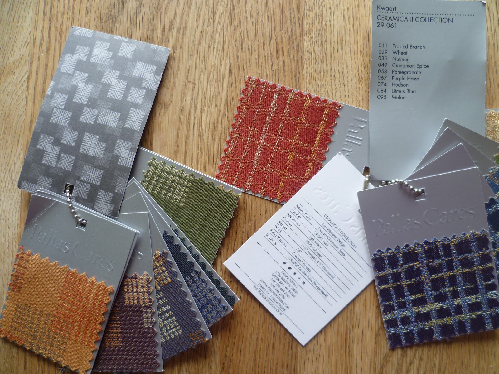
I also acquired two small chained sets of upholstery fabric sample chips from Pallas Textiles. One Jacquard pattern is called Transom and is part of an earthy coloured collection called 'Plantation' that was inspired by aerial views of freshly ploughed fields. The other is a plaid weave called Kwaart, named after the transparent glaze used by Delft potters. It has irregular metallic threads running through representing the high gloss and depth of colour of the Dutch porcelain. Both patterns are 100% polyester but have been treated by a process called Crypton (see video), which makes the fabric a barrier impenetrable to spills, odours and bacteria. It's therefore suitable for settings such as hospitals or hotels where it could be used in headboards, panel or mattress fabrics.

'Crypton' treated upholstery fabrics are impenetrable to odours, spills and bacteria so are ideal for the healthcare sector

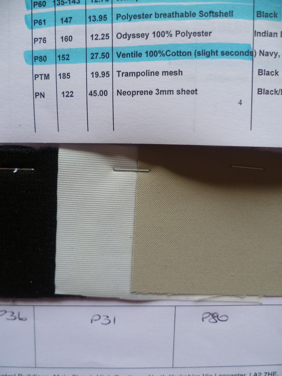
I became more interested in performance fabrics and began to have a look to see what was happening locally. Firstly I contacted Pennine Outdoor Ltd, founded in 1962 in Holmfirth and now in the Dales. They sent me a representative sample selection of their specialist outdoor fabrics. Products range from trampoline mesh, deckchair canvas and fabrics for covers, awning and tents to performance fabrics like neoprene and Gaberdine (which I now know was invented by Thomas Burberry!) and lambskin fleece for clothing and bags. They told me their customers include small businesses, retail shops, schools, hospitals, outdoor activity centres and private individuals interested in making their own gear. As many of their customers use domestic sewing machines, the range of fabrics reflects this need and they also provide accessories like zips and buckles along with patterns and sewing/making up advice.

Outdoor performance fabrics

I decided investigate one of the fabrics from the sample selection in more detail. I chose Ventile which was invented in the UK out of necessity just prior to WW2 when a flax shortage was predicted (flax was then used to make fire hoses and water buckets). I found it interesting that it had such impressive water resistant properties, comparable to modern processed synthetic fabrics, despite being made from 100% cotton. It is the combination of an extremely dense weave and the swelling properties of the specific long cotton fibres when they come into contact with water which prevents water passage. Ventile claims to have unsurpassed breathability and one of its important properties which I'd never have considered previously is its quietness. There is no rustle and it is comfortable, so is an ideal fabric for hunting, nature watchers, photographers and the military.

We are also asked to find out whether there are any fabrics or techniques peculiar to where we live. Yorkshire is famous of course for its production of fine worsted woollen cloth but I didn't know that just down the road, a successful project has recently taken place to ensure that highly counterfeited textiles like worsted can be made uncopyable. I read about the project which had taken place at Huddersfield Textile Centre of Excellence and was delighted when they responded to my enquiries with an invitation to visit.

Technical Manager Craig Lawrance and Training and Learning Team Manager Richard Axe explained a little of the history of the research and training centre. They were interested to hear about the OCA Textile course and explained that often Textile students finish their degree course not understanding enough about the structure of fabric and need further training on entering the workplace. They advised me about TIKP (Textile Innovation Knowledge Platform), a free online resource they launched in November for textile students and anyone in the industry, providing information such as markets, technology updates and a 'knowledge area', explaining the science behind textile materials. (I will be posting details on the student forum.)

Craig took me on a tour of the centre. It was interesting to see the testing lab where materials are tested for the specifications on my samples I've been writing about - pilling, tear strength, crease resistance etc. I was very excited to find out more about the three main development projects they have been involved in: SigNature DNA, the world's first 3D weaving machine and Multiple Laser Surface Enhancement (MLSE).

SigNature DNA
Although I knew Yorkshire worsted cloth is highly prized for its fine quality and is used in Savile Row suits, I had no idea it was enjoying unprecedented demand from the Far East and can fetch up to £5000/metre! Unsurprisingly then, high quality worsteds with selvedge are among the most counterfeited area in Europe and the US, along with 'noble fibres' like cashmere, interior textiles and branded apparel (Burberry being one of the most copied brands). Craig explained that textiles are an easy target. Branded labels are easy to remove and re-fix and it is virtually impossible to spot a 'good' fake without laboratory testing. Provenance is becoming increasingly important to customers in countries like Japan where there is great concern about content and origin. Facts surrounding counterfeiting and the losses it causes are shocking:

'Counterfeit goods entering the European market in the past year have increased by 900%' (source: BBC News, 8 August 2010)

'30% of pharmaceuticals in developing countries have been identified as fake' (source: World Health Organization)

'Counterfeit medication kills an estimated 100,000 people a year and costs the pharmaceutical industry an estimated US$600 billion in global trade' (source: FBI)

Craig explained at the start of the project, which was part-financed by the European Regional Development Fund to assist the local textile industry in protecting their reputation, they purchased vials of botanical DNA from Applied DNA Sciences (ADNAS) in New York. The original DNA, which is from an undisclosed natural plant source looks like a thick cloudy white liquid. It has been isolated, segmented and reshuffled to create a unique marker which cannot be copied. The challenge for the Textile Centre of Excellence has been to perfect cost effective methods of impregnating textiles invisibly, at any stage of the process, without changing the material's quality and properties whatsoever. Forensic authentication needs to be instantly possible, absolute and definite, and detectable in any section of a fabric or yarn. The DNA marker must be robust enough to survive multiple washes and the extreme conditions of any processing.

The DNA marker used now is a clear solution of mostly water and when applied, it's invisible. Although a single vial may costs hundreds, only a very low concentration is needed to be detectable. It's applied using a spray, or in textiles, usually with an ordinary lubricant solution by standard lick roller. The process can be made even more cost effective by considering where to apply the marker, for example in the stripe of a pin stripe fabric. Considering the price the worsted fabric can fetch, the cost of applying the DNA marker is now negligible.

The invisible DNA marker is applied using standard lick rollers.
The marker is in the pin stripe, making it more cost effective.
Top quality Yorkshire woollen worsted is highly prized and can fetch up to £5000/metre.
The suit was made with SigNature DNA worsted at the centre's in-house tailors

3D Weaving
Next I saw the structure, around 5cm deep that the 3D machine had been weaving in a continuous I-shape from glass strands. Craig explained that 3D fabric is fully integrated and loose fibre ends are not all on the same plane. Therefore weak points, that always occur when pieces of 2D material are joined, are almost eliminated. In clothing there is potential for whole garments to be produced without the need for stitching together separate pieces, reducing labour costs. Aerospace and motor industries have been particularly excited by this project as there are possibilities for massive reduction in weight of parts, which then reduces fuel usage and costs. Delamination and impact damage is greatly reduced in a consolidated 3D structure so there is major potential for improving vehicle safety.

MLSE
Craig said that this project was probably the most exciting because of the potential for massively reducing the environmental impact of textile production. Multiple Laser Surface Enhancement uses laser and plasma technology with inert gases in a controlled vacuum environment to make changes to fabric properties. Each required performance characteristic e.g. waterproofing or stain resistance, is achieved by altering the 'recipe' of gases and intensity. Technically superior products can be produced using significantly less time, water, energy and chemicals than traditional processes. (I wanted to know whether DNA markers could be applied with MLSE but not at the moment because the DNA would cross contaminate). Craig showed me some ordinary cotton fabric that had been prepared for dyeing using MLSE. There was no difference to the look or feel of the fabric whatsoever. I can't remember the exact impressive statistics, but when the MLSE treated fabric goes to the client to be coloured, it will be far more responsive to the chemical dye so uses far less and the process is much quicker.

Example of environmental benefits of using MLSE to treat textiles for fire retardance

Thinking about the staggering potential of MLSE to change the future of textile processing is overwhelming. I suggested in 10 years time the industry will be unrecognisable, but Craig said no. Change has started and it will happen much sooner than that. I think, probably like many OCA students with a background in craft and making, I was turned off by the idea of technology. However, after this research, particularly my enlightening morning at the Textile Centre of Excellence, my opinions have completely changed. The future for the textile industry in Yorkshire looks like being as rich and interesting as its past.

(Speaking of the past, the final part of this research point was to visit a local historic house to find out more about the furnishings. I made my visit but am waiting to hear back from the curator as there was limited information available. I'll write about this visit another day.)