I began by cropping an image of a plasma ball that I took at the Catalyst Museum in Widnes when I was collecting design ideas in Assignment 3. (I now keep an inspiration album that I find is particularly useful when I go on workshops when time is limited and I need to make quick decisions on choosing an image to work from.) I used watercolour pencil crayons to recreate the colours I saw as I like how I can layer colour with them, then add water to blend to make new shades. After writing about Kaffe Fassett in my last Research Point, I found myself often thinking back to how he mixes new shades by combining what he has available.
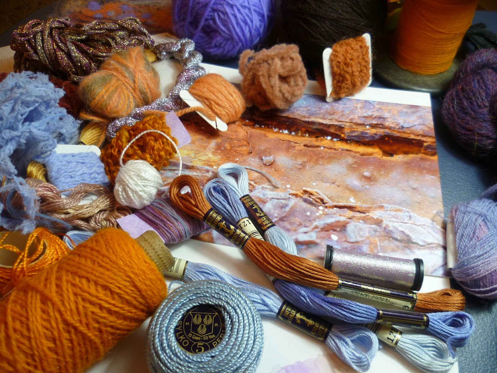
A stack of bobbins that I photographed at Masson Mills Textile Museum in Derbyshire was the second image I chose. When it came to considering yarns for the wrapping, I found it helpful to place the yarns on the image to check that they blended in.
For the plasma ball, which had a lot of variation in tone, I found that despite my large stash, I couldn't match the colours precisely, or I could get the shade but the surface quality wasn't right. So again inspired by Kaffe Fassett, I tried combining yarns to create new shades and texture.


No comments:
Post a Comment