Monday, 20 January 2014

Assignment 5 - Project 10, Stage 2: Focusing on Your Theme Book

For Stage 2, I spent time working in my rust theme book to see which pages held potential. In Slovenia I had begun to photograph manhole covers and ended up with a lot of images.  I cropped these in Picasa to find some interesting areas of pattern and created the photo collage below.  I squared off a page in my book and made line drawings in random boxes until they were filled. 
 

Some of the little drawings generated ideas.


The top two I related to the idea mentioned in my last post about using small interesting areas of rust print.  I was thinking about the shapes of these scraps and how they might be attached or applied. I photographed my fabric and cut out and arranged shapes to see how they might look.  This first one below, I'd like to try with further shapes applied on top.  I like the idea of a simple curved shape contrasting with the straight lines, particularly a large ring that would frame a view and dissect the parallelograms. I think a complicated shape will be too distracting.
 
 
This second one is not as simple as it appears.  The quadrilaterals have no parallel sides and are arranged in not quite straight lines. I cut and arranged the shapes by eye, leaving a border around each that was roughly even and trying to achieve a pleasing colour and pattern distribution.  Working out the maths behind the shapes (are they bicentric?) might help me understand an easier way to make this pattern work. Both I can imagine as some sort of furnishing fabric and I began to think about the scale if used for something like a cushion or curtain panel. 


The bottom drawing I imagined in stitch and I spent some time working out how best to construct it. I stitched a small sample and tried drawing some variations, playing with the length and direction of the stitch components. I particularly liked the uneven rows and the circular design.  This I could see as a round cushion with rows of concentric stitches, becoming huge by the outer row.  The stitch could possibly be embellishment for one of my other ideas and I also picture it used on a small scale, like in Shisha embroidery as a frame for something. 


I then spent some more time working into a page I'd begun a few weeks ago when I was thinking about washers and rivets.  I'd started by making prints using a button stuck to the end of a cork to make rusty washer-like marks and added further layers of circles and rings of different sizes.  As I stuck down the photographs of angled washers at the bottom of the page, I imagined them on a huge scale as sculpture and was reminded of my visit to the Hepworth Gallery and the interesting views that were framed by the holes in Barbara Hepworth's work. Ideas on circles, holes and views are becoming a recurring theme for me in this project.
 
 
I always carry a camera with me now and I've begun to keep my images by theme: glass, moss, beach, Winter etc. These I pulled from my rust folder.  I was interested by the shapes created by the perspective on the pier construction, particularly when I began to lay the images on top of each other.  I experimented with the angles and imagined them simplified as quilt blocks.  I decided though, that what was really inspiring me was the colours, so decided to look at the images and come up with a colour palette for this potential quilt.
 
 
I enjoyed this approach so thought I'd look through my theme book and create some further possible colour schemes for my project based on some of the pages


By now, I felt I had enough potential ideas ready for development into a design during Stage 3. 
 

Assignment 5 - Project 10, Stage 1: Reviewing Work So Far

Ideas for this final design project have been brewing for some time. In this stage we review the work we have done as potential source material.  By re-reading my reflections and taking a fresh look at all my drawings and samples, it's clear that I've particularly enjoyed trying various felting techniques.  I've been reading around the subject recently and watching video tutorials and it's something I'm itching to explore further.


Felting experiments carried out so far
 
Although I found the actual process of creating rust prints unpleasant at times, the anticipation and experience of revealing them some time later was very exciting.  I've been intrigued by some of the colours and marks that have resulted.  Now I'd like to consider ways to use some of these pieces of textile into a more defined piece of work.

Some of the prints I've made by rusting and/or burying objects

One idea I've had, to give the fragile fabric enough stability to be incorporated into a larger textile piece, is to use some of the more open weave pieces as a base fabric for nuno-felting.  I'm imagining that the puckering and gathering this technique can cause might translate some of the rust-like textures I've been drawing. It would also create a more stable surface to stitch into if I decided to highlight some areas.  As nuno-felting gives interesting textures on both sides, this idea could lend itself to something reversible like a scarf.

Gathering information and making notes of my early thoughts about nuno-felting
 

I've been making some notes in my theme book on these initial ideas which threw up some questions and further thoughts such as:
  • Results are unpredictable - how much control would I have on the outcome?
  • Encrusted areas are scratchy - will felting make the fabric soft enough to be wearable?
  • Do I want to shape any edges and how is this done?
  • I could leave holes as viewing areas.  Does it matter if the base fabric is holey?
  • What else might I want to incorporate by trapping between the layers?
  • Do I want borders, or to create any kind of deliberate pattern with the wool?
  • What colour scheme, and should this be rust related?
  • Might the felted piece benefit from further embellishment such as paint, beading or stitch?
Of course, it's also possible that rusting might make the bonding between base fabric and the top fibres more difficult, or even prevent it happening at all, particularly in the encrusted metalized areas.  Some advice I've read to test suitability of the base fabric is to blow through it, and if you feel your breath on your hand on the other side, then it will probably work.  If it didn't work so well, I might need to try sandwiching the base fabric between the wool tops, rather than just layering on top. This might not leave enough of the rust print visible or compromise the design.
As the rust printing process is slow, I'm also aware I only have a limited amount of fabric.  I don't have weeks and months to create more.  Felting will allow me to join patches but the different fabrics may well pucker differently resulting in narrower areas.
 
Clearly I will need to make samples to test the feasibility of the nuno-felting idea. I can try on some non-rusted fabric first to make sure I can get a hang of the technique than try some small areas of the rusted fabric so it isn't wasted.
 
I've been thinking about other ways to use the prints.  Some of the fabric pieces have areas which I find particularly interesting or beautiful.  Maybe I could highlight these small areas by patching them together somehow or cutting out shapes and using one of the applied fabric techniques I tried in Assignment 3?  If I were patching, I can imagine something like a semi-sheer window panel, or perhaps I could apply pieces onto a base fabric. I'm ready now to move onto the next stage, which is focusing on my theme book and beginning to make some design decisions.        

Friday, 3 January 2014

Assignment 4 - Tutor Report & My Thoughts

Below is a copy of my tutor feedback.  Reading it for the first time, I felt deflated and rather defensive.  I'd been happy with the effort I'd put into this assignment and the work I'd sent.  All I could see was where I was lacking, rather than anything I had done well.  However, after a Christmas break, I have much better perspective.  It's time to move on, accept the pointers for the final assignment (due end of Jan), highlight the positives and realise that there are actually plenty of comments to be very pleased about!

Overall Comments
'A group of work which as usual is full of experiment with materials and process. You have pushed your use of existing source material, but taken on board my comments on the need to keep a day to day sketchbook. Your written research, and recording of visits to exhibitions continues to be more to the point, with references to your own practice.  However, you only sent a group of samples in plastic sleeves, with no accompanying explanation, other than labels, which worries me at this stage. It gives the impression that you are still relying on your blog to explain how your project is developing, rather than a series of A3 sheets or workbook. Try to rely less on your blog and spend more time on presentation.'

Assessment potential
'I understand your aim is to go for the Textiles Degree and that you plan to submit your work for assessment at the end of this course. From the work you have shown in this assignment, providing you commit yourself to the course, I believe you have the potential to succeed at assessment.  In order to meet all the assessment criteria, there are certain areas you will need to focus on, which I will outline in my feedback.
I am concerned mainly that although I have asked a couple of times to see your A3 workbook to see how you are presenting the story of the development of your project, once again, you haven’t sent it. It is difficult to advise you if I am only seeing an odd page on the blog.
• By now you should have a working notebook for each assignment, with visuals mounted on each page, not in plastic sleeves.
• Make sure you have annotated each sample to give some explanation of what it is about, where it fits in the scheme of things. Think telling a story. Number the page and link this to any further explanation in the blog. You must not simply rely on the blog to explain the work you have done, the way your idea has evolved. There is limited time in assessment for things to be looked at and for looking at blogs. (I read all your blog because the samples alone did not explain how your ideas are progressing.)
• Show clearly in your working notebook how you have developed ideas, taken risks. (Again, I had to look in your blog to find out. You can't expect the assessors to guess.)
• Note: Your ‘working notebook can of course be separate sheets, but make sure they are attached together in a way which is easy to navigate.
• Continue to find ways of extracting visual information through drawing, colour notes, diagrams and photography'


My Response
I should have sent a better explanation to my tutor on how I was sending my work. Previously she has asked to see all of my work rather than a representative sample so here I'd sent every exercise in order, all cross-referenced with a corresponding blog post. (For assessment I'll select the best work to attach directly to the mount board designed as a story board.)

I do find I am increasingly relying on my blog, but I hadn't thought this a negative thing.  Now that I post regularly in relation to each exercise, it helps to clarify my thoughts and as I add more of my images to it, I suppose it has almost become a 'working notebook'.  For assignment four, the exercises are mainly practical, experimental and largely intuitive: making braids, making a grid structure, weaving techniques etc, so there is far less in the way of design compared to previous assignments.  It made sense to me to note the information I'd collected directly onto the blog post.  I do have an A5 notebook I take everywhere.  It's full of thoughts I scribble as they come to me.  Unfortunately I can't seem to make it neat and beautiful like other people can and it seems like unnecessary duplication to rewrite parts legibly, then reflect again on the blog.

However, I can definitely see the benefit of the separate workbook I have for Assignment 5, where the brief is open and I need somewhere to draw, write and develop related ideas.  Tonight at the Embroiderer's Guild, we had a talk by a recent graduate of Birmingham University who studied Fashion, specialising in Embroidery.  It was extremely interesting to hear her talk about studying a related degree in a physical university.  She had brought examples of her work and how it was presented, with a workbook for each project, each beginning with the brief stuck onto the first page and ending with illustrated examples on how she visualised the final sample being viewed e.g. if it's a piece of textile art, how it might be viewed or framed.  The drawings and books themselves were not always beautiful, but it was certainly easy to follow the journey of her ideas from start to finish, from her images and the written notes she made as she and her tutor evaluated how the project was developing.  Tonight it was proved to me how my tutor's above advice is correct.

Feedback on assignment

Demonstration of technical and Visual Skills, Quality of Outcome, Demonstration of Creativity
This assignment is about creating combining fibres, colours and textures to create tactile surfaces, rather than working into existing surfaces. The focus should be on exploring experimental construction forms using processes such as interlacing, weaving, plaiting and or knotting of yarns, ribbons, torn strips of paper or fabric, plant fibre, wire, etc.

'My first impressions from what you sent was that it was inadequately presented. Then, looking at your blog I realized that you worked very hard – going through all the exercises methodically, without pre conceived ideas as to what would result. I could see that you were finding ways of moving beyond simply experimenting and what I particularly liked was the way in which your practice began to be informed by your research and visits to exhibitions.   Later, (e.g.in exercise 4) you began to see how ideas you were exploring for your theme book could be linked to this project. (Your blog reveals all this, but as yet I haven’t seen much of your theme book – only odd pages in the blog, - but my impression from is that you are beginning to develop a personal line of enquiry.'
 
Analysing colour, texture and proportion

'Here you are asked to work both intuitively and objectively from images and to abstract out colours and tones of colours using paint then yarns, and I can see from the one sheet you sent me, and images from your blog, that this way of working is productive for you.
Particularly interesting was the page in your blog showing interpretation of the rust  experiments, because this shows that you are more and more beginning to bring into the exercises your own particular interests (in this case your line of enquiry about rust for your theme book).  Again, you are reflecting on your research, and letting it inform your design judgements. E.g. After writing about Kaffe Fassett in my last Research Point, I found myself often thinking back to how he mixes new shades by combining what he has available.'
     
PROJECT 8  Exploring the quality of Yarns and experiment with different ways of making structures
You are asked here to show evidence of awareness of different fibres, weights and qualities, including found and recycled yarns and then to undertake various explorations  (weaving, braiding, binding, interlacing).

'You produced a good selection of experimental work. In ex. 3, once again, you were able to refer back to an exhibition you had seen and recorded, ( Liberty and Anarchy) to help you to solve your practical problems, but at the same time you were trying to understand how the artist - Savvas - constructed his pieces.'  

PROJECT 9
The objective, here is to reinforce good practice in working method and enable you to develop personal design ideas around organization and colour. In stage 3 you are asked to experiment with different structures, using different yarns, colours, textures, to tear found materials such as rags, muslin, lace, and to combine different effects. In Stage 4 you are asked to develop visual ideas, making use of work from stages one and two, into a large woven sample.

 
'You say here that you had already made windings, but wanted to push the colour proportions and textural quality a bit further, so made more. Also the image I wanted to use was the same as I'd used in Feltmaking Experiments and one I'm considering developing for my final project.  I thought that the more I study this image and capture it in varying techniques, the more closely I'll be observing and understanding it before my final piece.
Don't simply be content to interpret an image in different materials. Try to push a piece further – take risks – let it change beyond recognition. (Check out how Matisse’s four sculptures of a woman’s back   changed radically from one to the next) Cut up and re-make.'

My Response
I was a bit confused by this feedback as I thought I'd followed the instructions for the approach I'd selected to the letter. Sample 2 involves storyboards and design, but I'd chosen the first option, which is more about developing technical skills: how to transfer an image into tapestry weaving by making and following a cartoon.  The design decisions to make read more about selecting the right colours and textures and techniques to interpret the image and its surface textures but there are no comments on how well I did this. (I should probably check the course manual online to make sure my paper version is up to date as I started the course a good while ago!)        

Sketchbooks
Demonstration of technical and Visual Skills, Demonstration of Creativity

'You sent a small sketchbook. I am glad you took on board my comment about how you needed to try to do some objective drawing. However, you need to be less descriptive in your drawing and more analytical. Use a viewing frame more, Make diagrams, scribble, notes, quick drawings, slow  ones, take several photos of one object from different angles. I have seen evidence that you are looking and recording with camera, but only in your blog so far.'


Learning Logs or Blogs/Critical essays
Context


'A well developed and illustrated learning log.

For Research Point you were to investigate the work of the textile artist and to reflect on textile art in relation to the  other arts such as painting or sculpture. How far has it been accepted.  Choose 2 textile artists – describe their work and also consider how they have used the above elements to express the concepts behind their work.
Chosen textile artists  Kaffe Fassett/Sue Reno (Blog Entry Thursday, 19 September 2013)
I was interested here in the way you began to observe and question how artists and designers describe and title themselves, whether the titles suggest that they see themselves as artists, designers, or makers. I felt it made you look more carefully at the visual language in the work. (You need to keep this in mind in the future when researching). Try to be less descriptive of technique and more about the visual language. (How specifically have your two chosen artists used colour. E.g. Look back at the things you discovered about colour and composition in assignment 2 – that there are ways of putting colour together which make your eye slide over them easily promoting ‘harmony’ or juxtaposing particular colours so they seem brighter, or duller. Also, how dynamic was movement in the composition, and how was it achieved. Your increasing sensitivity to colour is admirable, but try to increase the objectivity of how visual language is used in the work you are seeing, then link it to how you are resolving your own problems.'


Suggested reading/viewing
Context


'In terms of weaving:
Have a look at Riitta-Liisa Haavisto who works with luscious colour tapestries and her daughter Anna-Riita Haavisto (link to online info :

Also Joan Baxter, who works with landscape in tapestry'http://Joanbaxter.com

Pointers for the next assignment

'Your next assignment is the last. The theme book itself, showing research, prep, experiment and backup development work for this final project is a vital part of the assignment. Also, You will have to design your own experiments. Don’t simply do one experiment around an idea – you need to get used to doing lots of different ones before deciding on a particular technique. Allow the idea to evolve. Try to think visually as much as possible in your sketchbook; that is scribbling out ideas from your head; jotting down rough ideas for designs and making colour notes.'


Wednesday, 18 December 2013

Assignment 4: Reflective Commentary & Progress Towards Final Project

Once again I've been surprised by how engrossed I became in the Research Point and am actually disappointed this is the final one.  I'll look forward to seeing what the subjects are when I begin the next course.  One of my highlights was receiving positive and encouraging comments from all of the artists I contacted, particularly the e-mail asking for a link to my blog, which Kaffe Fassett would like to read!  

The research point, and the Imagine arts series I've been watching whilst weaving, also led me to think about my own work and make further investigations.  Kaffe Fassett and Judith Kerr for example, really stressed the importance of being an almost obsessive observer and I enjoyed reading how, though now in his 70s, Fassett is still inspired by his visual memories, even going as far back as his childhood.  Increasingly, I find I'm linking back to something I've seen or done earlier in the course that might not have seemed relevant or useful at the time, such as the Nike Savvas 'Liberty and Anarchy' Exhibition I related to the structures exercise.

Sue Reno, a quilt artist I researched, uses cyanotypes in her work.  I experimented with photograms and sun prints earlier in the course and she inspired me to find out more so I booked a cyanotype workshop. I learnt techniques on how to prepare papers, did further print experiments, identified when prints are ready ('pregnant snow cloud' is a phrase I'll always remember!) and came home with ideas on what I'd like to try in future, such as painting solutions onto silk or cotton and trying substances like bleach or tea to see if and how this alters the colour.  Contacting the Museum of Film and Photography in Bradford to arrange access to their archives to see the notebooks of Anna Atkins is something I'll do next year for myself and other OCA students.

Here's a few shots of my cyanotype prints developing and the results.


Below are some of my photographs, copied onto acetate and held flat with an inexpensive clip frame.  This resulted in much crisper, detailed images than my previous sun prints. 


This last print was created by placing the prepared printing paper under a quick sketch I made directly onto acetate using a black marker.


During this assignment I've really appreciated how important the properties of the materials I'm working with are to my enjoyment of the process.  I've experienced frustration braiding and weaving with scratchy, inflexible yarns.  The sensation of gritty rust dust on my fingers, staining my nails and working surfaces has been unpleasant along with the eye-watering acidic smells when preparing for rust printing.  In contrast there's been smooth silk and soft merino yarns which feel wonderful under my fingers and the excitement and anticipation of revealing the contents of a rusty buried package that immediately makes the disagreeable parts of the preparation stage worthwhile. Opening the parcels feels like Christmas, when you almost don't want to unwrap a beautifully wrapped present as you don't know whether you'll be delighted or disappointed. 

Here's the results of the experiments I began in Project 8, Stage 2, six weeks on. The left package was in the greenhouse in the same polythene packet that I've successfully used for previous rust prints.  The right hand package is freshly dug up after burial.


The outer layer of the buried package was the largest cloth.  I've tentatively planned to incorporate this into my final piece as it has a fairly open weave so should be suitable for the nuno-felting I have in mind. Once I've found out how to do it and made some test samples that is!


I'd wrapped various yarns around each layer that I could use should I decide to incorporate stitching.  Any stitching will be by hand as the rust could damage my machine.   


I love the range of shades; from the subtle peach to strong rusty browns I got from soaking in white vinegar and the lilac/grey that resulted from tea.


These were the cloths underneath.  I was fascinated by the grey silk square that makes me think of some winged creature like a bat or moth.  I've never had a result this dark before. Was this just a co-incidence, or caused by chemicals in the soil?  The cloths here were freshly dug up and soaking wet, so the shades were slightly lighter once dry. I was a little nervous washing the cloths but washing is necessary to neutralise them (and remove the smell!).  Having done it before, I was reasonably confident the prints would remain and they have.  


I also wanted to capture how the grid weaving had changed before I disposed of it.  There's not much left.  It's a very fragile and unfriendly object to handle now - brittle, grainy and sharp.    


This was the greenhouse package ready for unravelling. (Just noticed piece of lace on the right is same one I used for cyanotype print above.)


When I unwrapped the fabric lace layer, something new and exciting was underneath - this sparkling turquoise square! 


Initially I thought the turquoise silk I'd added had bled somehow but then realised it was the caused by that small mystery square of Metaltex I'd popped in.  The square itself also had some beautiful autumnal markings on both sides but it is now very brittle and too crumbly to be useful. 


The interlaced rectangle I had wrapped hadn't changed in any interesting ways itself but I love how the pattern from the nails has transferred onto the fabrics.  
 

I thought there was a good chance the intensity of the turquoise mark would change by washing or over time so took a few more shots to record it. I'm glad I did. As the fabric dried a hole developed in one side.  I've found this often happens as the rusted fabrics dry and shrink.  They become more fragile, particularly the highly crusted areas where there had been close contact with the object and especially if it's a delicate fabric that's been left a long time for a strong print.  I'm hoping that, by nuno felting, as well as adding texture to the patterns and colours, this will give the stability and durability a delicate open weave fabric would need to function when incorporated into a useful object.


Finally I unwrapped the other stitched grid.  Again the most interesting result was the marks transferred onto the silk fabric rather than any changes to the sample.


(I visited the Silk Museum in Macclesfield with the Embroiderer's Guild a few weeks back and my purchases from the bargain bucket of silk samples have come in very useful.)


The tiny dark grey patterns made by the grid itself are my favourites.  I think I should be considering some way of highlighting the most interesting areas of any prints I use.  


I linked some of the other exercises in this Assignment to my theme and this has given me clearer ideas on the direction my final piece is likely to take. In Part 4, Textile Structures, as well as the exercises, I continued experimenting with felt-making and also tried paper-making.  Both are additional methods of creating a surface. (I'll shortly be writing a report on the paper-making for OCASA, along with Letterpress and Bookbinding.  These were a series of three workshops I arranged for OCA visual arts students following a successful application to access the funding pot for student-led activities.  Links to follow soon.)

Below are some of my handmade papers which I've letterpress printed with words found on manhole covers.  Here I was making rust marks on it, trying torn up Brillo Pads and tea. I've also made some papers with snippets of rust printed threads and fabrics incorporated and have begun binding the papers into a book.


My final piece is due to my tutor on 31st January, which is not long at the rate I can manage alongside family and working life, so I'm grateful I've been progressing my theme alongside assignment 4.


Tuesday, 17 December 2013

Assignment 4 - Project 9, Stage 4: Developing Design Ideas Into Weaving

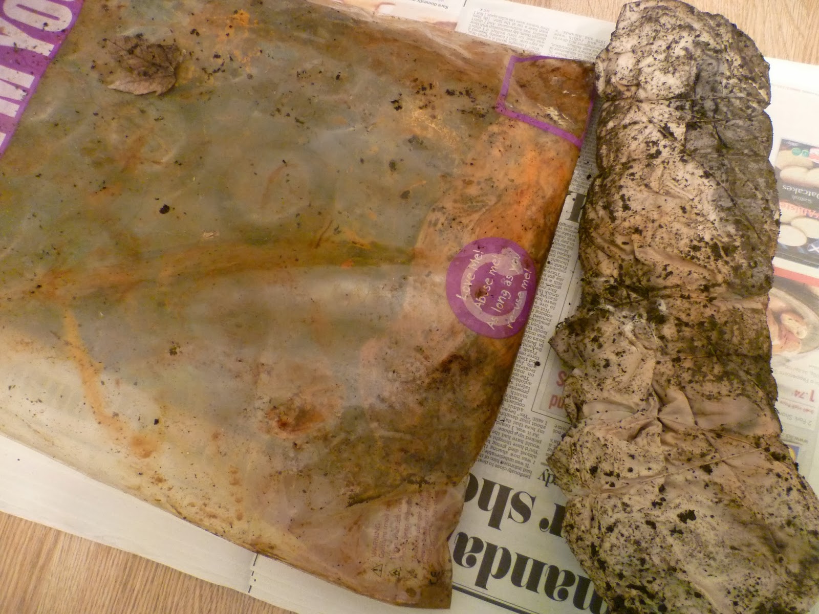
There's a choice of approaches for this stage.  Either linking to the Analysing Colour, Texture and Proportion exercise and transforming piece of source material into tapestry, or working intuitively to describe a word in weaving.  As I felt my first sample was intuitive, I decided on the first option here.  Also the image I wanted to use was the same as I'd used in Feltmaking Experiments and one I'm considering developing for my final project.  I thought that the more I study this image and capture it in varying techniques, the more closely I'll be observing and understanding it before my final piece.

I'd already done wrappings in the analysis exercise.  However once I'd done the graph paper stripes and considered the proportions, I wasn't convinced that there's be enough of some of the yarns to complete the weaving. I also wanted to have some varying thicknesses so I could blend colour in some areas and add more variety of texture.      

 
From my stash I selected alternatives for each yarn and tied them to a numbered card to use as a key.


One idea that I'm really glad I had, as it saved a lot of time looking for the right shade, was to add the yarns to clear bags which I labelled and put in a large box.
 
 
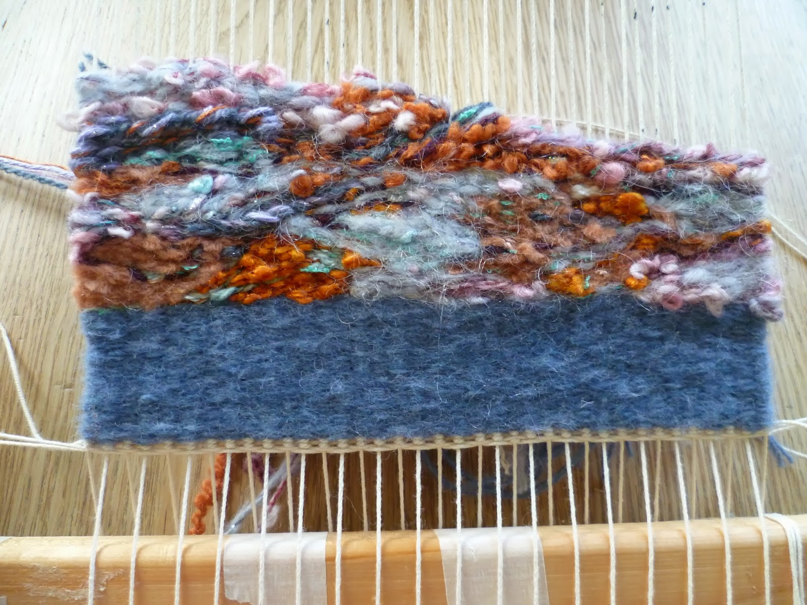
I also found that squared tracing paper was really helpful for placing over the image when planning the design as I had such a large number of colours. I thought that to interpret my design though, I wouldn't have to be too precise with shape placement.  I planned three main bands with the craggier, raised area at the bottom, a slightly smoother central section then a darker upper section.


When I was done, I warped up the loom to the width of the image, using a ruler to make sure the knots were horizontal.  


I completed a few centimetres of plain weave that will be turned back for presentation.  As I was doing this I considered whether I might have rust dyed the warp threads so that they could have deliberately been left visible in parts of the weaving or perhaps knotted and hanging underneath.  However this would have taken days or weeks I did not have.  I've also noticed how my fabrics have sometimes become brittle and holey after rusting so perhaps they would become too weak and break during weaving.  Maybe painting or dyeing them would work better?   


I completed the bottom section with more hairy and slubby yarns using eccentric weave and areas of Soumak, to make it appear raised.  When I began on the central section, I immediately liked the contrast of the texture, which had changed to something flatter with a slight sheen due to the inclusion of a ribbon yarn.  However after a few rows I was regretting the slight variegation in the yarn I'd chosen.  When I began to add the lilac shapes, they weren't standing out as much as I'd hoped.  The background was too distracting and light in colour.  However, I'd gone a bit far to start unpicking, I didn't think I had a suitable alternative yarn at home and the advice in the project guide is to wait until the design is completed before judging it. I did though; decide to make some adjustments to the yarn selection I had planned for immediately above the bumps, to stick with a similar texture for the whole area.  I'm pleased with this decision as I think it makes it more cohesive as a section.      


Before the top section, there's an area of dark, deep cracks where I've used dark brown and purple yarns.  I've varied between single and multiple rows of weave to make the lines look broken in some places, solid in others.  This section also has spots of white which looked right as I was weaving but once pushed down either disappeared, looked flat rather than rounded, or they seemed to end up in the wrong position.  I re-worked some of these by wrapping the warp end a few times.  I'm not sure that this would be the correct technical method to add spots but it seemed to work.  


I added more areas of Soumak to this area to create the ridges and made some gentle curves to follow.   

 
The upper area of the image is mainly blue and lilac with small touches of oranges and turquoise.  The rusting metal has a slight sparkle and here I introduced a metallic thread. I combined thinner yarns and worked with a number of butterflies on the go.  Every so often, I dropped one of the strands at the back and picked up another from a neighbouring weft hoping that this would result in the colours blending rather than standing out as spots.  
 
 
Finally, I wove a few plain rows.  Like the blue bottom border, these will be unseen once folded back and stitched as a hem. This time, I felt more confident that the whole thing wasn't going to fall apart and unravel as I cut it from the loom and trimmed the threads!


Standing back and considering the finished sample, it's not quite how I envisaged.  The three areas which look quite distinct on my image are less clear cut. The central right area that I had concerns about still irritates me and in hindsight, I wish I'd followed my instincts and dealt with it then by picking it out and replacing the variegated yarn with something self-coloured but still smooth - combining some embroidery floss with 3mm ribbon would have worked I think.
 
Though some of my yarns have been stubborn about sitting flat or curving nicely, I'm pleased I managed to select from my existing collection for Project 9, rather than spending on specialist rug wool. Something I learnt from Kaffe Fassett when compiling the Textile Artist Research Point is the infinite variety of colour that can be created by combining what you have available.  I felt weaving is similar to how he describes his tapestry, as painting with wool, though as you can only weave bottom up, it does need some planning if you are following an image.  I was happy with my source material which I could follow fairly loosely and think if I had worked a design with sharp edges that had to be precise, it might feel a bit limiting, like painting by numbers! 
 
I found the graph paper planning tedious, though once I'd started weaving; I really appreciated having the chart to refer to.  There were still decisions to make on sequences and texture, but having the colours already plotted simplified everything.  I'm sure that there's a better relationship to the original image as a result of the planning.
 
Although the central area was not captured quite as I intended, overall I am happy with the sample and its proportions. Having spent a lot of time recently observing rusty objects, for me, it does capture 'rust' in colour and texture, even though I'm using soft materials to convey something hard.  Close up, I can see and feel the change the in texture of each area and I've found I much prefer the dynamics created by eccentric weaving over plain weaving.    
  
It was interesting to weave the same image I used for wet felting and needle felting in Stage 8 and compare results.  Weaving is more predictable and cannot be rushed but it is something I'd try again.  Perhaps because it is winter and it's cosy to sit by the Christmas tree and fire, that it's easier to enjoy the quiet contemplative time and I liked getting into a rhythm on the larger sections.  Handling so many fibres has improved my understanding of their properties and I've particularly enjoyed making unusual combinations and seeing how differently a yarn can appear once beaten down and condensed.