Monday, 14 October 2013

Assignment 4 - Project 8, Stage 2: Experimenting with Structures, Exercise 1

In this exercise we are asked to weave with strips of thin paper or card, and then explore some other possibilities such as varying the materials or the size and shape of strips.  For each exercise in Stage 2 the advice is to, 'Concentrate on developing interesting structures, colour combinations or contrasts of texture.'

To begin with I tried a regular weave of magazine pages, to get a hang of the technique.  The strips were positioned randomly so there was little sense of the original whole image.  If I were to do this again, I would try keeping the strips in their original order and be more selective about the images.  For instance, I would like to see the effect of trying images which had strong colours in the centre becoming paler round the edges. I imagine that using paper that graduates in colour could be used to create optical illusions, particularly if the weft was made at a diagonally, instead of at a right angle. 

 
Next I cut strips from a mark-making exercise in Assignment 1 and this time I did keep them in their original order but I made the warp strips thicker than the weft.  I liked the resulting sense of movement and I then tried altering the angle of the weft strips to increase the energy as much as I could.   
 
 
Next I wanted to try weaving with patterned papers.  I tore strips from a striped paper bag, so the width of strips varied naturally but the weaving still felt too regular.  When I tore further narrower strips and posted them under both the warp and weft I really liked the more natural basket effect created by the torn edges and the unevenness of the stripes which reminded me of branching twigs.   

 
For the next weaving I used a rotary cutter to cut strips with scalloped edges and wove a third patterned paper diagonally at random.  The first weave limited the angles of the diagonals and gave a kind of overlapping grid effect.  


The possibilities were endless but I was ready now to try a different material and found some metallic foil sheets designed for embossing.  These were easy to cut with a craft knife and as I began to weave I began to really enjoy handling the pliable material.  The warp strips could be lifted and stayed in place while I wove and bending them backwards produced a tight weave.  The edges were simply folded back and everything held nicely in place.


Trying a softer material against the metal was something I wanted to do next.  I can't remember exactly what it was (possibly Lutrador?) that I'd once painted, heated and backed with Stayflex to create a book cover.  However, it cut easily and as I'd put a little gilding wax on, this gave a shimmer that I felt, along with the paint colours, complemented the copper coloured foil. 


I tried one final combination using this combined with two shades of foil. (Being so reflective, it's difficult to get an accurate representation of the colours.) 


The foil is a material I've enjoyed and would like to explore further in future. The woven surface feels considerably stronger than the original sheet and the surface created can be folded and curved to become three dimensional.  
 
I tried heating the sheets over a flame to see if the surface colour would change but nothing happened besides a toxic smell!  I imagine drinks cans could work well and introduce colour and pattern, or cleaned out tomato paste tubes which I have tried embossing and heating before.  (Heating them created a wonderful rainbow effect that reminded me of oil on water.)  Using recycled materials appeals as the foil sheets are very expensive and would limit my scale.  Embossing or distressing the metal before or after weaving could be interesting as this would affect the reflective qualities.  Perhaps I will try some of these ideas to link into my 'Rust' theme.

Friday, 27 September 2013

Assignment 4 - Project 8, Stage 1: Making a Yarn Collection

For me this exercise was about reviewing my yarn collection rather than making one, as I probably have enough existing yarn and thread to open a shop.  My stash has been acquired over many years.  Some of it is leftover from craft projects, much has been donated or inherited, some of it I have recycled by cutting old clothes etc into strips.  To the amusement of my friends, some I have bought for no better reason than it's unusual or I've liked the colour or texture.  It's not a shameful, dusty abandoned collection though, I know exactly what I have and dip into it regularly.  Whereas some people see a project they want to do, then buy the materials, I look at what I've got to see how I can use it.

Large cones and balls of yarn stored by colour
 
Storing all this is quite a challenge, especially as a good deal of what I have is not labelled. Through experience, I can usually identify natural fibres by sight and touch. Man-made and fibre mixes are more tricky.  I've found, after trying various systems, that what works for me, is grouping my yarns by colour in see-though lidded plastic boxes, in the same way I store my fabrics. Smaller reels or skeins are grouped by type, with the occasional impostor! 
 
Clockwise from left: Pearl cotton & cotton crochet threads, miscellaneous variegated threads, strings of beads, rayon (viscose) machine embroidery threads, tapestry and space dyed wool, lace reels, more machine embroidery threads.

Stranded cotton and metallic polyester embroidery floss

Any small amounts left over I wind onto bits of card and keep them in a portable box for a good variety that I can take with me on workshops.


In a similar way to making fabric colour bags, sometimes I keep a variety of yarns grouped by theme for inspiration. 


For Project 9, 'Woven Structures', we need a good selection of yarns of different fibres and textures.  I've prepared the seascape-inspired collection below.

Wednesday, 25 September 2013

Assignment 4 - Analysing Colour, Texture and Proportion

This exercise asks us to choose three images we admire for colour and texture, then try to represent accurately all the colours we can see in small patches of paint or crayon.  From our yarn collection we match as accurately as possible the colours, and if possible try to find yarns that also interpret the texture and surface qualities.  The yarns are then wrapped in proportion on a card strip.

I began by cropping an image of a plasma ball that I took at the Catalyst Museum in Widnes when I was collecting design ideas in Assignment 3. (I now keep an inspiration album that I find is particularly useful when I go on workshops when time is limited and I need to make quick decisions on choosing an image to work from.)  I  used watercolour pencil crayons to recreate the colours I saw as I like how I can layer colour with them, then add water to blend to make new shades.  After writing about Kaffe Fassett in my last Research Point, I found myself often thinking back to how he mixes new shades by combining what he has available.       


A stack of bobbins that I photographed at Masson Mills Textile Museum in Derbyshire was the second image I chose.  When it came to considering yarns for the wrapping, I found it helpful to place the yarns on the image to check that they blended in. 


For the plasma ball, which had a lot of variation in tone, I found that despite my large stash, I couldn't match the colours precisely, or I could get the shade but the surface quality wasn't right. So again inspired by Kaffe Fassett, I tried combining yarns to create new shades and texture.   
 
 
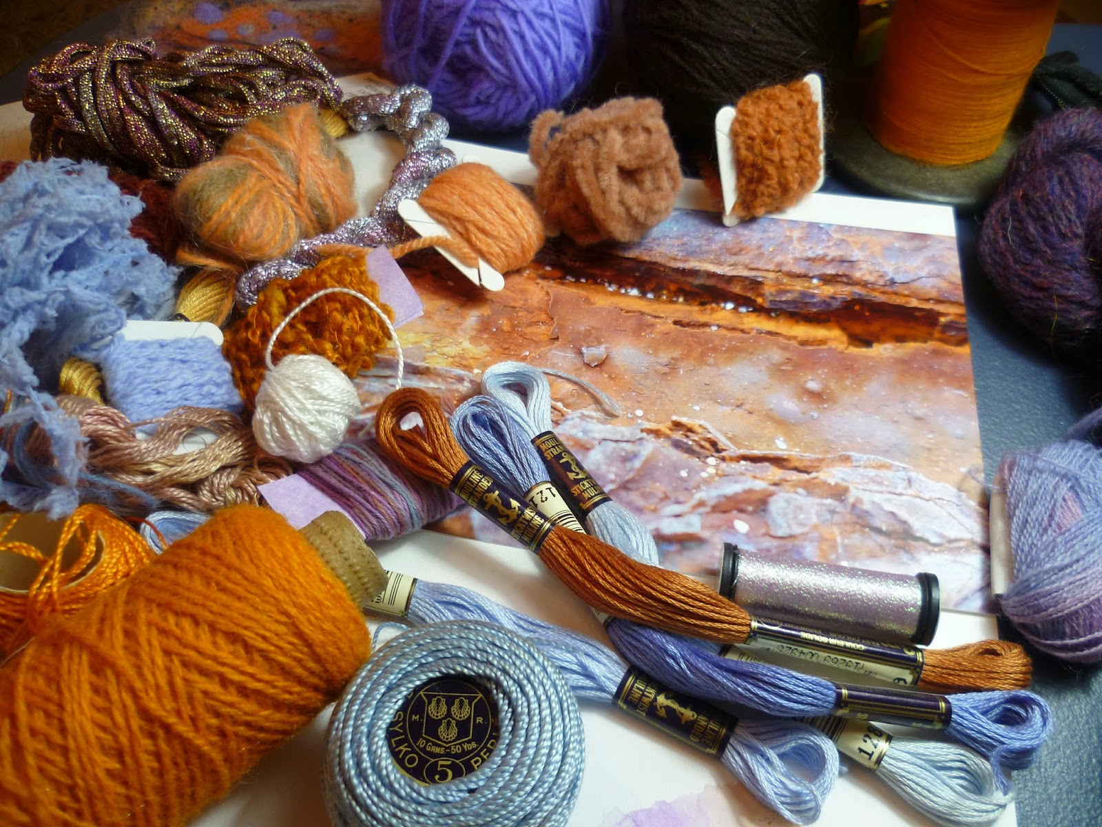
For the final image I chose one of my close-up rust shots that I intend to develop and have added the winding to my theme book.


Thursday, 19 September 2013

Assignment 4 - Research Point: Textile Artists

This final research point asks how we think the work of a textile artist differs from the designer, designer-maker or the craftsperson and whether there is any crossover.  We are also asked to describe the work of two internationally-known textile artists, consider whether we view textile art in the same way as other art forms and whether it has become acceptable as a medium for fine art.  

If I am forced to place these occupations into boxes, it's with reluctance, as I believe there are too many confusing crossovers.  However, here are the simplest dictionary style definitions I could come up with to describe the differences:

Craftsperson: A skilled person who makes or repairs bespoke, as opposed to mass-produced, items that may be decorative but tend to be functional.  The pattern or idea is usually provided by someone else. Textile crafts are extremely diverse and include quilting, spinning, dyeing, basketry, tailoring and methods of fabric production such as weaving, felting, hand-knotted carpets, needlepoint and knitting.

Designer-Maker: Self-explanatory and similar to a craftsperson but the template or idea is also their own.

Designer: Creates the pattern or idea for bespoke, or often mass-produced, textile items. Production is carried out elsewhere.  Well-known textile designers include homeware and fashion designer Orla Kiely, and Amy Butler, who specialises in prints for home-sewing.

Artist: Creates works that may be functional, but are more concerned with aesthetics than utility.  Textile artists incorporate fibres somehow.

However, there are no essential qualifications to give yourself any of these titles.  A few weeks ago, I went to the contemporary visual art fair, Art in the Pen and as I picked up business cards, I noticed how exhibitors described themselves.  I considered two exhibitors there. Both were using wet felting techniques to create items to hang on your wall, yet one, Angela Barrow, described herself as a 'Feltmaker', the other Valerie Wartelle, a 'Fibre Artist'.  I liked both their work yet I felt that there was a difference here, above the obvious difference in inspiration and style.  Not necessarily down to any level of skill, but according to the descriptions above, I would say Angela is a Designer Maker, whereas Valerie's work I felt was art. Partly I thought, I was influenced by how Valerie's work is viewed - framed and behind glass.  (Often textile art is left unframed so that the textural qualities can be appreciated.)  Valerie's work also is very painterly and though it's described as contemporary, it has traditional fine art qualities and subjects, portraying realistic, highly atmospheric landscapes. Her sewing machine needle has been used like a paintbrush.  I found it aesthetically beautiful though it was really the level of expression I felt that made the difference.

Artfelt by Valerie Wartelle's 'Earthlungs #4' 79cm x 34cm
(Used with permission of the artist)
 
Of the four different titles above I found 'Designer' easiest to categorise whilst struggling with the boundaries of the other three.  I came up with a theory about the route into textiles making a difference and assumed Valerie had a fine art background.  When I asked her though, I was wrong - her background is in textile design. So you can definitely move through one category into another or be in more than one at a time which explains why, in the exhibition catalogue, very few of the statements say what the exhibitor is, rather it describes what techniques they use and what their inspiration is.

By now I was questioning whether titles really matter.  I've read cover to cover Kaffe Fassett's autobiography 'Dreaming in Colour' recently, as he is one of the textile artists I've chosen whose work inspires me.  I've concluded, it is impossible to categorise someone like him, who simultaneously paints still life, illustrates, knits, does needlepoint and mosaic whilst designing fashion knits and quilting fabrics and I was relieved to read this refreshing quote:

"The distinction some purists draw between art and craft doesn't exist for me.  So many artists today seem to be able to use textile making in their work that the barriers are softened.  I always try to make my textiles as beautiful as I can manage imbuing them with all the efforts of a work of art.  It's up to others to describe, if they have to, what it ends up being". (Fassett 2012:113)

(I particularly like the use of the word softened, which seems so appropriate for textiles.)

grt_dixter-2201-landscape.jpg
Cover photo for 'Dreaming in Colour'
Image courtesy of Kaffe Fassett Studio
 
There are many examples throughout Kaffe's story, illustrating the 'barriers' - the struggle for acceptance of textile art.  Until relatively recently, big shows of crafts the average person could do were still rare. 'Don't dabble in the crafts if you want to be a serious painter.' (Fassett, 2012: 113) was a piece of advice he ignored at the time.  He describes the 'Abstract Design in American Quilts' in Whitney New York 1971 as a key event when the art world began to take notice of textiles.  He always felt it was only a matter of time.

In his one man show in 1988 his exhibition at the V & A was the 2nd most successful in history, doubling the usual number of visitors, yet there was still negativity. 'Why is the great V & A stooping to have an exhibition of knitting patterns?' (Fassett, 2012:158) one newspaper asked. When a Rowan rep suggested he try patchwork in 1987, Kaffe himself said, 'isn't patchwork just cutting up old clothes and sewing them back together?  (Fassett 2012:190). It's interesting to read that he found the prejudices towards textiles seemed to be greatest in the US, the home of the art quilt. While other countries clamoured for the exhibition on its world tour after the V & A, he was still struggling to get serious museum exhibitions there. Even in the '90s when he queried a curator, the telling answer came, 'We talk about you in museums in the US, but we feel you are too popular. But don't give up on us'! (Fassett 2012:195) 

So it seems acceptance of textile art may vary by location. In Scandinavia, (Fassett, 2012:159) Kaffe suggests, it is perceived quite differently.  Most people can sew, knit and embroider to a high standard.  Although the techniques are simple and something everyone can do and can therefore relate to, they appreciate the worth in the excitement of the colour and texture combinations, harmony of placements and proportions.  He describes in Stockholm how sympathetic curators, painted walls and gathered complimentary antiques from the archives while the public formed long queues to get in and how touching the tactile exhibits was quite normal. 

As for describing Kaffe Fassett's work, it covers so many areas that here I've concentrated just on needlepoint and knitting.

Kaffe Fassett

Materials: Mainly wool with cotton, silk and mohair to provide a texture change.

Scale: Big and bold. Large scale patterns and large needlepoint panels.

Suzani Wrap
Image courtesy of Kaffe Fassett Studio
Techniques: The stitches are all very simple: tent or bargello stitches for needlepoint and stocking stitch for knitting with a rib or occasionally garter or crocheted edging.  Colour is incorporated using Fair Isle and intarsia techniques. Circular needles are used to hold a large number of stitches and often items are knitted cuff to cuff depending on the design, which occurs directly on the needles or canvas. In his knitting books, often only two or three colours are used in a single row but the colours change so frequently, it appears more complex. The stitches are simple but it is the sympathetic placement and layering of pattern and colour and the blend of yarns that is key.  Fine yarns are combined together for infinite variations in tone and texture. He has sometimes described his work as painting with wool. If a colour doesn't exist in yarn, he mixes it himself.

Lidiya Felted Tweed for Rowan Knitting Magazine 48
Image Courtesy of Kaffe Fassett Studios

Colour: Unapologetic. From rich, intense reds, hot pink, blues, oranges, greens and yellows to lavenders, rust tones and everything in between. 'When in doubt, add twenty more colours.' (Fassett 1985:8) Colour Influences have included paintings by Odilon Redon, Piere Bonnard , Edouard Vuillard and Severin Roesen and places as diverse as New York rubbish piles, Scottish landscapes, the markets of Portobello Road, Gaudi's Barcelona, Hyde Park flower beds and lines of laundry in India. Kaffe pulled out of art school when they began to study colour theory seriously in a scientific way. He believes (Fassett 2012: 49), colour is instinctive and is learned by constant observation and playful exploration.  

4 Large Flower Cushions at Ehrman Tapestry
Image Courtesy of Kaffe Fassett Studios

Imagery: Foliage and flowers, fruit and vegetables.  Cabbages, auriculars, pansies and big blousy blooms like roses and peonies come to mind.  Natural forms like shells feature and ceramics are a big influence as well as geometrics.  Circles, stripes, chevrons, lattice, Islamic arches and stars are often seen in layered patterns.  I was surprised and delighted to find out that he can still be inspired now by strong visual memories of experiences many years earlier.

Shells Carpet at Ehrman Tapestry
Image Courtesy of Kaffe Fassett Studios

Sue Reno is the other textile artist whose work I chose to describe.  I'd made a shortlist and the images of Sue's work drew me in, just like Kaffe Fassett's, by its vibrant colour, particularly the combination of reds and greens next to the cyanotype print indigo.  Having recently done some basic sun print experiments, I was interested to see more of its possibilities on fabric.  Finally, as Sue is one of the best known Art Quilters in the world I was interested to consider when a quilt becomes an art quilt.  I imagined that a quilt artist would face additional challenges in altering perceptions of a quilt as something other than a functional object, particularly in the US with its strong domestic roots.

My sun print experiments


I watched this YouTube interview with Sue a couple of times and found out that Sue from a young age was making clothing and traditional quilts.  It was interesting to hear how she made the move from a hobbyist crafter who needed an avenue for expression away from her day job as a carer, to a dedicated professional art quilter.  When asked how, she simply said that she 'declared it'. The move was all about re-invention and a change in mind set, exploring her core processes further and deeper.  Art was now her priority - a job, not play and she learned to be assertive and disciplined, taking her studio time and schedules seriously. She explains how the timing of her decision coincided with the start of the Internet explosion and social networking and how she took advantage of this by learning the technology to promote her work and connect to her audience.

Sue also gives good advice in the interview about considering the various locations to exhibit your work.  Like Kaffe Fassett who found his most welcoming reception in Scandinavia, Sue also found that her work was accepted and 'fit' better in some places than others

When asked about how her art form is perceived, Sue talks about the need to educate in where fibre art has gone.  She says she has been lucky, in that when she joined a group of artists working in different disciplines, none of them ever questioned her use of fibre.  To them, it was just another medium like painting or sculpture.  She says there is still the tendency for women in particular, to undervalue their work and discount their labour and talent. To price her work fairly, she keeps detailed records of her time and materials. One piece can take several hundred hours to design, cut and stitch. Despite being one of the most successful art quilters in the world, Sue still has an unrelated day job to make ends meet.  (I wondered now whether Kaffe Fassett would have enjoyed the same success had he been born female.  He says himself that he was a source of interest, even a 'freak' (Fassett 2012:143), partly because he was man who knits. For me though, alongside his talents, it is his optimistic engaging personality and the encouragement he gives in his teaching that is the draw, regardless of gender.)

I contacted Sue to ask her how she felt about the acceptability of textile art as a fine art medium and was delighted when she took the time to send me this reply:

'I submit work in a variety of venues, ranging from traditional quilt shows to fine craft venues to mixed media /all media exhibits at universities and mid-level museums.  I find that my emphasis on good design, original content, and excellent craftsmanship is increasingly welcomed and rewarded.  I think some of the bias against textiles and fiber arts as "women's work" is finally eroding, and it is an exciting time to be a fiber artist.'

Sue Reno

Materials: Indian silks, wools, cotton prints and recycled fabrics saved from decades of home dressmaking. Seldom buys fabrics - paints existing stash as necessary. Does buy PFD (prepared for dye) fabric from speciality suppliers like Whaleys (as mentioned in previous Research Point: Textile Diversity).  

Scale: Prefers to make large scale, one-off, high end, labour intensive quilts for gallery exhibiting.  

Techniques: Starts with the idea and colour scheme generated by photographs and collected subject material displayed on studio design wall. Uses Photoshop and digital printing directly onto fabric using freezer paper and archival ink. Also uses image transfer sun printing techniques on fabric (cyanotype and heliographic).

Components are prepared: 'Flip-and-stitch' technique is used to make foundation strips (similar to how I made background for my Roman Urn panel in Assignment 3 - Applied Fabric Techniques).  Elements are combined by machine to create a surface cloth.  Works quickly and intuitively using simple tools: a large table and a machine somewhere between a domestic and industrial model. Prefers the intimacy of a domestic machine but her model has a longer flat-bed allowing more room to manoeuvre the bulk of the quilt. 

Cloth is layered with batting before depth, texture and movement is added with hand or machine stitch.  Hand beading or fabric paint is sometimes applied if required.


Ginger Cyanotype on Silk, Indian Silks and Machine Stitching
Image used with permission of Sue Reno, all rights reserved

Colour: Shades of indigo blue often feature, typically with bright apple green, reds or yellows.  Also purples, greys and sometimes other pastels and muted shades.


Fox and Hackberry Cyanotypes on cotton, monoprints on silk, artist painted fabric, commercial fabric, vintage crochet and stitching. Image used with permission of Sue Reno, all rights reserved
Imagery: Architectural structures, flora and fauna (particularly skulls).  Sue likes to hike, has an extensive organic garden and interprets her outdoor experiences - the leaves or glimpses of small mammals - into textiles.

Silk Mill #3 Screen prints on cotton, digital images on silk, artist painted and commercial silk, cotton and wool fabrics, machine stitching.  Image used with permission of Sue Reno, all rights reserved.
Completing this research point and noticing the similarities between how these two artists work has made me understand some of the reasons why I was drawn to choose them, beyond a mutual love of extravagant colour.  Their drive is not money or fame, but comes from a need to express themselves in a tactile, colourful medium. Both create work with a strong graphic appeal that draws you in to appreciate the incredible detail.  Learning about their way of working has also been inspiring.  As someone easily seduced and overwhelmed by new ideas, tools, materials and techniques, I admire how they also become excited, yet not distracted. Both use extremely simple techniques and set limits.  Vast arrays of colours can be created by using what they have available - fabric is painted or yarns combined. Once they have an idea, they work with intense focus, instinctively and directly placing shape and colour and their inspiration is by way of constantly, almost obsessively observing and banking the world around them.

Reading List:
Fassett, Kaffe (2012) Dreaming in colour: an autobiography. New York: Stewart, Tabori & Chang
Fassett, Kaffe (1985) Glorious knitting. London: Century Publishing
Hunt, Zoe & Fassett, Kaffe (1989) Family Album: knitting for children and adults. London: Guild Publishing


Monday, 12 August 2013

Assignment 3 - Tutor Report & My Thoughts

Part three : Creating shapes and three dimensional forms
In this assignment, you are asked to manipulate fabric in different ways : to use your own sketchbook as the starting point for ideas and to  experiment with shapes, colours, textures, using techniques such as collage as development tools.

Overall Comments

'You undertook a good deal of interesting experiments, attended craft workshops to improve your skills, undertook useful OCA study days and have made you blog more easy to navigate. It is highly reflective and revealing of your thought processes. You have also looked at different areas for source material. You are beginning to find a way of working which involves experiment with materials and process in parallel to developing ideas from source material, You need to make sure that you don’t rely on memory alone, but collect enough source material to work with. In addition, make sure that you are not simply reflecting in your blog at the end of the project, but keeping a visual and written diary on a more regular basis in your on-going working notebooks.'

My Response
I'm glad that my tutor agrees that the time I've spent on workshops and study days has been beneficial.  I'm also particularly pleased that she's found my blog easier to navigate. This was one of the main concerns following feedback from my previous assignment.  I've added labels and standardised the post titles and I find it much easier to find content myself, as I regularly refer back to previous posts.  I really enjoy reflecting on my work here now - I find it really helpful to gather my scribbles, photos and thoughts and organise them in a more meaningful way for future reference. With regard to source material, I have no problem finding inspiration or ideas but I do procrastinate when it comes to stopping to sit and record.  I think this is partially due to lack of confidence in my drawing skills.  I've just come back from a holiday in Slovenia where I've had a little more time. There I made a concerted effort to draw most days. It still feels uncomfortable, not yet a habit, but at least I have begun a sketchbook which is chronological and more portable than the A3 hardback book I was sticking my loose drawings in. 

Feedback on Assignment  
Project 6 - Manipulating Fabric
Stage 2: Developing Ideas
You were asked to select 6 interesting drawings or other source material; abstract out colours, patterns and textures shapes. To develop these radically into designs by working  with copies – cutting, cropping, developing these radically through collages.


'I think here, you were ingenious in finding source material which would inspire you – using the limitations of having to take your children with you forced you to look beyond the obvious – and you began to make connections, collecting interesting source material both various events – eventually focusing on glass. You were, in parallel, exploring new iridescent materials – and I think you began to see links and ways forward to develop ideas. I think this way of working, for you is very productive. Sometimes the materials lead you forward – promoting ideas, at other times ideas lead you to search for techniques and materials to explore them. Basically, you are finding that you need to do both alongside each other to successfully produce a body of work, you need to understand and to explore materials in order to know which is the most appropriate to choose to realize an idea. You are also now aware of how to develop designs from source material (even if they don’t always work to your satisfaction).'

Stage 3: Applied Fabric Techniques
Here you were asked to amass a quantity of experimental samples showing exploration of different techniques such as bonding, using dissolvable fabrics and fabrics which can be manipulated by melting such as Tyvek.


'Some of the early fabric design developments seem a bit laboured; an arrangement of flat shapes of glass bottles and you were obviously seeing what you wanted to express, but unable to realise it in the materials effectively. I think that the problem here is that you are working from shape and colour rather than looking at a small section. I suggest here that you could develop this idea by drawing a highly reflective glass bottle, or jar half filled with water, but forgetting the ‘object’ or outlines and simply drawing the colours reflected in the glass. Use a viewing frame to take several small sections from the subject. You could even try photographing these sections. The most successful experiments were made with  Angelina fibres (none labelled). I felt that something really interesting was happening with one or two of these and have made notes on the pieces.'

My Response
I'm pleased with the Stage 2 comments because it seems my tutor has noticed how I'm relating my explorations with fabric manipulation to drawings I already have to generate ideas.  With regard to Stage 3, I was aware that the early applied fabric design developments were not as successful.  I mentioned in my learning log how I attempted to rework them and how, though they improved, without being sure what the problem was, I was still not entirely satisfied.  They just felt a bit flat and contrived compared to the samples I made with unpredictable materials like Tyvek and Angelina. Pat, my tutor has suggested going in with the scissors and re-assembling them to see what happens, which I'm happy to do.  I will definitely use viewing frames and/or photograph and crop my drawing in future. The note about Angelina fibres confused me as I presented all my Angelina experiments in a book fully labelled.  I've now realised that the samples Pat has described as 'exciting', are actually thin snippets of shiny ribbon rather than Angelina fibres, trapped between layers of organza by bonding with the tip of a soldering iron.  However as I'd only described these as 'burning and heating' with no more than a sentence in my learning log, this is what Pat is referring to when she advises above to 'not simply reflect at the end of a project......keep a visual and written diary on a more regular basis'.   

Stage 4: Raised and Structured Surface Techniques
Try gathering, folding, pleating, tucking, tearing, fraying and slashing; quilting, stuffing, moulding.

Lots of experimental practical work here, with some well executed geometric fabric relief based on origami twists, and some cut work . There was also some 3d work.

You are asked to develop the final sample from drawings –choosing carefully one which suggests a three dimensional quality. To develop the drawing further by enlarging, masking out, etc or cutting and reassembling. You are asked to use plain fabric 30 cm square – possibly self colour stitches so that they disappear into the fabric structure, become part of the fabric structure.

You worked here from ‘memory and imagination’ and went straight into working on the piece rather than from thinking ahead and planning. The problem with this approach is that it leaves no margin for error or going back and redoing – short of cutting the piece up and reforming, recycling it. You were remembering something you saw – no problem with that – providing you have collected enough information as an ‘aide memoir’ to work from. If not you have to rely on invention and embellishment to hide things you cant quite remember. (Be very careful of over embellishment) We all have to rely on memory sometimes, especially when conditions don’t allow us to draw, but it leads to weak compositions. You were asked to use plain fabric but you dyed and patterned much of it. The objective – to reinforce the 3d effect has been lost. You made a different kind of piece. Nothing wrong with being free, but sometimes it can cause you to go over the top. You wanted to show lots of different techniques, but there are too many conflicting shapes, materials stitches and colours.  I can see what it is you were aiming for, but too much is happening in one piece. You need to be more selective – more restrained. This many different elements might have worked in a plain fabric, but by using lots of different patterns together the effect is over the top.

My Response
The experimental part went well but yes, I'm guilty of not planning the final sample.  I think that, as I been disappointed with the flat samples I'd developed from my bottle drawings, that I'd spent a lot of time planning, I wanted to create something more lively and spontaneous here.  I'd hoped for better feedback as I rather liked my sample when I sent it off (I still do!) but seeing it again now with fresh eyes, I agree that I threw everything at it and it feels a bit like a kids collage.  I've decided I'll re-do this stage before assessment.  I intend to develop drawings of my glass bauble for inspiration and create a sample with Angelina fibres or film. Hopefully, this will give me a more successful balance of planning and spontaneity.
 
Project 7 :  Your theme book
A book of visual information based around a theme of your choice which will provide you with the starting point for part 5 of the module, in which you will design and make a piece of your own.


I think you are on the right track with your theme book. I have seen nothing practical from it so far, but your blog explains your reservations and concerns about the choice – that it has no obvious source material. However, you began to look at the occupations of your family , and where this has led you seems to be in a direction which is inspiring you. You need to make sure that you have a cohesive theme. If it moves away from your original plan, don’t worry, but make sure that the visual research in the theme and the practical outcomes can be justified.

My Response
Due to my reservations mentioned above, after much consideration and a conversation with my tutor, I've decided to pursue a different theme, 'Rust', for my theme book.  Work on this has begun and a blog post will follow shortly.  I'm confident this is the right decision. 

Sketchbooks
'Next time I would like you to leave your working notebook for the project with me so I can have a good look at it. I know you don’t like leaving this, but for the final project your working notebook will be a separate theme book.'

My Response
This should be no problem for assignment 4 as my new sketchbook is much smaller and lighter for posting.  Maybe I should think about scanning pages from the old overflowing one for assessment to keep within the weight limits? 

Learning Logs/Critical Essays
(Research Points)

As a background to the work in this assignment, you were asked in Research Point 1 to start a collection of examples of furnishing or fashion fabrics of any technique to illustrate diversity of fabrics which are popular and available – contemporary or traditional.
In Research point 2 You were asked to survey craft based techniques – from individual designer makers who concentrating on small production runs to those who make art based textiles. You are also asked to look at the relationship of the crafts to industry – consider how new technology has influenced the crafts, and how crafts have inspired those designing for industry.


'I have not seen any evidence that you have completed this work - only a file of scraps. It is really important that you do this and put evidence of Research Point 2 on your blog which I will look at with the next assignment.'

My Response
I contacted my tutor regarding this as I was really concerned that she had not seen the research points on my blog after I'd spent such a lot of time and effort on them.  (The 'scraps' were just the samples, leaflets and magazine I'd collected in a file when researching.)  I'd had a similar comment after Assignment 2 when I'd also completed the research point but the tutor hadn't found them.  I thought now I'd added labels for 'Research Points' they could be now easily found on my blog.  I since received the following update:

'Many apologies. Sometimes these blogs are really difficult to navigate.  I had read the Glass piece before and never twigged. You did them all so well. I was particularly interested in the Centre for Textile Excellence - and Ventile - my husband had a tent of Ventile in the 60's which kept us dry in Scotland in 1966, then disintegrated into holes after about 5 years. Since the report has gone to OCA the best thing to do is to simply make sure that the links are prominent when you submit - and make a note of my missing the research point. What matters is that they see it. (I will make a note in the next report about this). I think rust is a great idea. Good luck with it.'

I'm really not sure at the moment how to make the links any more prominent. Having looked at other student blogs, I think those on Wordpress have much clearer indexes because you can have subheadings. Blogger has some limitations but when I looked up how to migrate my blog, I've discounted it as this would throw up a whole new set of issues (but I will start a new Wordpress blog when I start Exploring Ideas.)  I have thought about printing out all the Research Points and binding them together into a document.  Or maybe I need to send a cover sheet which clearly documents where to find all my work. 

Suggested Reading/Viewing Context
Check out Susie Freeman, who weaves and traps objects between translucent fabric.
http://www.pharmacopoeia-art.net/about/susie-freeman/
Dorothy Cauldwell : in good repairhttp://www.textilemuseum.ca/apps/index.cfm?page=exhibition.detail&exhId=62
Also
www.auburn.edu/academic/other/geesbend/explore/.../index.htm
www.bookarts.uwe.ac.uk/banlists.htm
The Book Arts Newsletter is published at the CFPR, edited by Sarah Bodman.

Pointers for the next assignment
The next assignment is about combining fibres, colours and textures to create tactile surfaces. The accent is on experimental construction forms using processes such as interlacing, weaving, plaiting and or knotting of yarns, ribbons, torn strips of paper or fabric, plant fibre, wire, etc. Project 9 in particular is important and  involves developing visual design ideas into sample pieces with the objective of reinforcing good practice in working method, enable you to develop personal design ideas around organization and colour.

Tutor name:  Pat Hodson
Date: July 4th 2013
Next Assignment Due: October 2013


To summarise, I think the comments are positive and encouraging overall and I have a clear idea of what I need to work on for the remainder of the course.