Showing posts with label Colour. Show all posts

Wednesday, 25 September 2013

Assignment 4 - Analysing Colour, Texture and Proportion

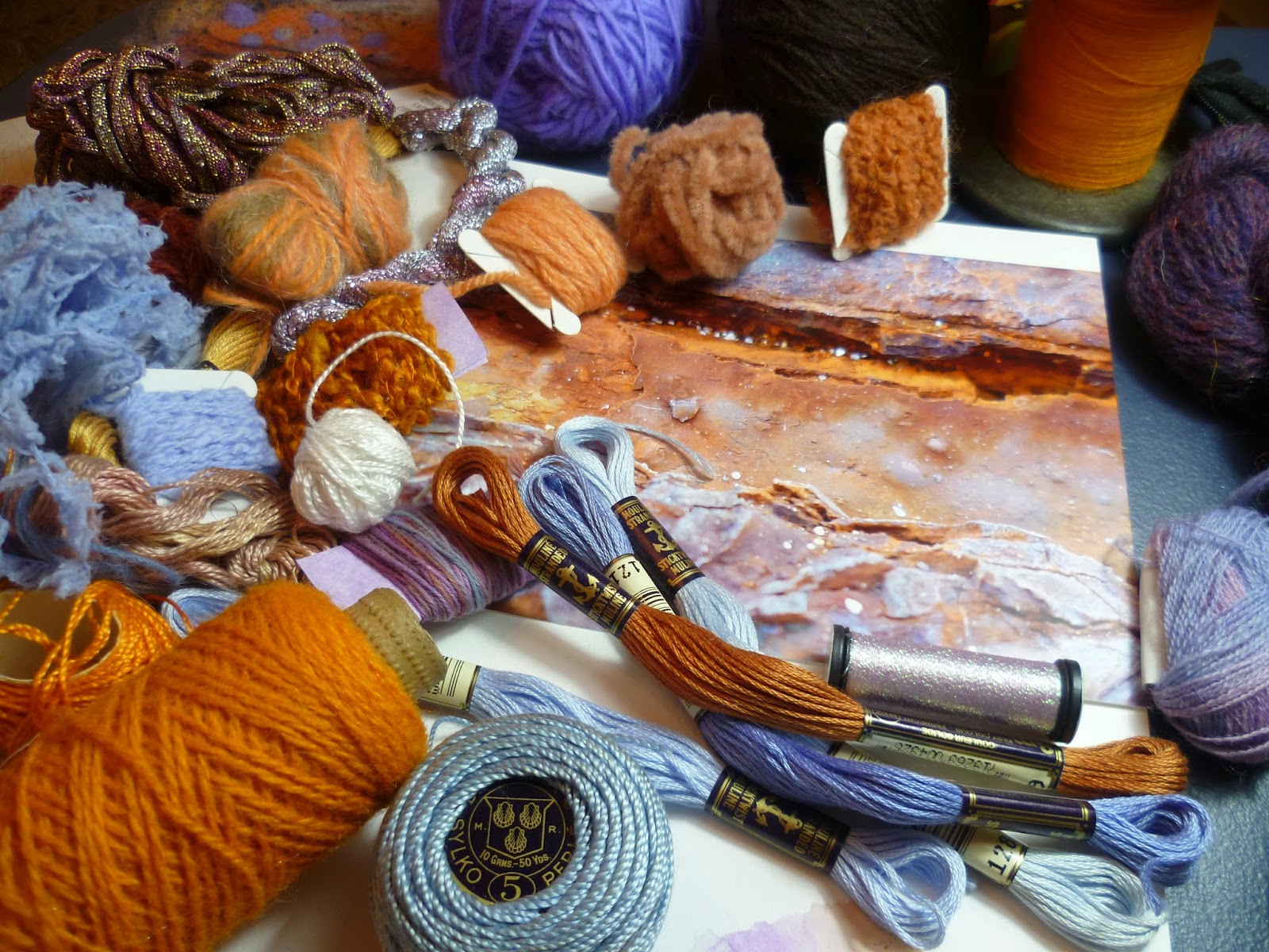
This exercise asks us to choose three images we admire for colour and texture, then try to represent accurately all the colours we can see in small patches of paint or crayon.  From our yarn collection we match as accurately as possible the colours, and if possible try to find yarns that also interpret the texture and surface qualities.  The yarns are then wrapped in proportion on a card strip.

I began by cropping an image of a plasma ball that I took at the Catalyst Museum in Widnes when I was collecting design ideas in Assignment 3. (I now keep an inspiration album that I find is particularly useful when I go on workshops when time is limited and I need to make quick decisions on choosing an image to work from.)  I  used watercolour pencil crayons to recreate the colours I saw as I like how I can layer colour with them, then add water to blend to make new shades.  After writing about Kaffe Fassett in my last Research Point, I found myself often thinking back to how he mixes new shades by combining what he has available.       


A stack of bobbins that I photographed at Masson Mills Textile Museum in Derbyshire was the second image I chose.  When it came to considering yarns for the wrapping, I found it helpful to place the yarns on the image to check that they blended in. 


For the plasma ball, which had a lot of variation in tone, I found that despite my large stash, I couldn't match the colours precisely, or I could get the shade but the surface quality wasn't right. So again inspired by Kaffe Fassett, I tried combining yarns to create new shades and texture.   
 
 
For the final image I chose one of my close-up rust shots that I intend to develop and have added the winding to my theme book.


Thursday, 28 March 2013

Assignment 2 - Silk Painting, Batik and Wet Felting

Back in Assignment 2, 'Experiments with Printing and Painting' there is an optional section on silk painting.  I'd seen that my local adult education centre was offering a 4 week textile class that included silk painting so I decided to wait and try it there rather than buy all the expensive materials.  Other techniques we were going to learn were feltmaking and batik.

We began with batik which is essentially drawing with liquid wax.  The wax hardens to create a resist before colour is added.  After looking at photographs, handling some stunning pieces of batik textile and pinning our cotton fabric tightly to a frame, we had a quick demo and a practise on paper.  I discovered that the controlling the flow of hot wax was a tricky business, particularly with six of us all dipping at arms length in a communal pot.  Too hot and there's a constant dribble, too cold and the tjanting tool would clog.  With this and the limited time frame in mind, I looked through images for a simple source of inspiration where the unintentional blobs could be part of the design.  Silver birch trees with a lovely wintry light seemed appropriate, especially as temperatures outside were freezing.


Conscious of timescales, I was working in rough lines quickly and freely, and it didn't take long for the wax to harden on the fabric when I put it outside in the cold temperatures.  Even so, it could have done with a bit longer.  When I scrunched the wax, attempting to create the cracked texture of the bark, it wasn't quite brittle enough in the thicker areas.  Next I painted on the coloured dye which needed to be worked in really well with the brush to get into the cracks. Once the piece was completely dry, it came off the frame and was ironed between sheets of blank newspaper to remove the wax (protect iron with extra sheets of newspaper).  Every time I thought all the wax was out, because there didn't seem to be anything more coming onto the paper and the fabric felt soft, it would cool down and stiffen again.  The tutor said running under warm water might get the wax out completely, though there was a risk of some colour coming out if wasn't fully fixed. Some colour did wash out so the end result was less vibrant.  I wouldn't use warm water again but I've still got a good background for embellishing.
 
 
On the second session, the batik wax was out again and we could begin a piece that would be dip dyed in three different colours.  I'd brought an image of a glass paperweight I particularly liked from my inspiration file and hoped I could achieve something of the colour blends and transparency. I needed to think back to Assignment 1 and colour theory to work out which areas to wax out for the first dip.  It turned out to be a large area and I soon gave up with the tjanting and tried brushing and spooning the wax on.  Next I plunged my piece into a bucket containing a tepid solution of yellow dye (Colourcraft Procion) and salt. The fabric had to be soaked for at least 30 minutes. Mine was first in and had an extra 15 minutes over the others and resulted in a noticeably deeper colour.  It looked most unpromising as I rinsed it out using the cold tap until the water ran clear.  The soggy fabric was left to dry until the following week when the wax could be ironed out ready to start again.


By week three, we were ready to prepare the batik for a second dip in red.  I spooned wax  onto the circular shape which was to be mainly green, blue and yellow, leaving much of the background that I'd decided would be mainly red. This time my fabric was last in the bucket and I was disappointed that the red looked wishy-washy.  However the tutor explained that the first dip is always most vibrant and when I ironed out the wax the pink shades began to look redder.


On the final week I wanted to be seeing a definite difference between the marks on the background and the paperweight shape. I used the tjanting to draw in little veins and used a spoon and brush to thickly cover the background, working quickly so the wax would have as long as possible to cool and I could give it a good scrunch before plunging it into the final blue dye.  I rinsed it and gave it a waft with the hairdryer before taking it home to dry properly.  After the previous experience I was more patient ironing out the wax and was pleased to see the colours looking bright.  I'm not sure that the result was what I was anticipating - I was expecting to see more definite marks - but I really like how the colours have blended and I definitely get the feeling of glass and transparency from the original image.


While the batik was drying and dyeing, I had time to experiment.  I waxed another piece and had a play with painting on colour again, this time trying to let the vibrant colours bleed and blend into each other. I thought in future I'd like to try combining the dip dye and painting and also try batik on patterned fabric.


We were all given white merino wool tops to have a go at wet felting.  There were some small amounts of colour we could add.  I decided to choose seascape colours so I could add the felt to the colour theme bag that I made in Stage 4 of Assignment 2.

 
First I pulled apart the wool tops and layered them at right angles to each other inside a bubble wrap sandwich (bubbles up to increase friction).  This was placed in a shallow plastic tray (cat litter tray would do) with a piece of thin cotton fabric on top.  Washing up liquid was squeezed on followed by very hot water.  Wearing rubber gloves, I worked this well into the fabric and as the wool began to felt, I used a rolling pin and spud masher to agitate everything more roughly. Every now and again I topped up the hot water and turned the felt over. After a more than half an hour of constant mashing and bashing, the fibres no longer came away with a gentle tug, the felt was ready to squeeze out and leave to dry.
 
 
Below is the finished felt, along with another smaller piece I made from some leftovers.  When I looked at the reverse, it reminded me of the waterfall drawings I did and I think I should try to develop the drawings into felt samples.    
 
 
Although the felt is quite thick, because the landscape outside is bright and snowy, I found  the fibre network quite beautiful when held up against the window.  I would never have associated something so woolly with the transparency but it's similar tonally to the tissue and dye on acetate drawing I did of my polished blue stone.
 
 
Finally, silk painting. First I tried out the paints on a piece of silk with a pre-printed outline that was really effective at keeping the paint within the design.  Essentially it was colouring in, but it was a good way to start something that was completely new to me. I found only a tiny amount of silk paint went a very long way and that the paint dried paler than I was expecting, so two or three layers were needed. To get a paler colour the paint was simply diluted.  I enjoyed mixing my colours, which seemed to stay fresher and clearer when mixed than the acrylic paint I am used to. On the larger areas I found it quite difficult to get a flat colour.  If I used too much paint it would flood over the boundaries of the design but if I tried to go slower and more carefully, the colour would start drying and I'd end up with a kind of watermark where the wet and dry areas met.  I tried sprinkling coarse sea salt on the wet silk.  The salt soaks up some of the paint to give a mottled effect.  However I wasn't sure how to get the salt off again.  Maybe I had too much paint on but it seemed to stick to the surface.  When I tipped it my paint ran.  In the end I waited till it was dry and brushed the rest off.


Next I had a go drawing directly onto silk with a tube of gold gutta.  I'd been to see the Lion King at the theatre, which was a wonderful visual experience and I wanted to create an African style design to remember it by.  Like the batik wax, I found it difficult to control the flow of gutta.  Getting a regular thickness on my line was tricky and once it dried and I started painting I realised my lines were broken in places as the paint was bleeding through.  I also noticed that where I'd pinned the silk to the frame there were runs in the silk.  Altogether I enjoyed felting and batik much more and found my experience of silk painting frustrating, unforgiving and fiddly.  However, I'm not ready to discount the technique yet as I think it would lend itself to the watery seascapes and transparency I love. The adult education centre is hoping to run a silk painting class soon so I've signed up.  I've invested in some specialist 3 point silk pins and found plenty of online video tutorials.


Tuesday, 15 May 2012

Project 3 Review - Colour

12 Colour Wheel machine embroidered on soluble fabric
Were you able to mix and match colours accurately?
I wanted to understand why it's almost impossible to paint a colour circle from only three colours so I tried it.  I started with the primary colours, then mixed these together to get the secondary colours then filled in the segments in between to get a 12 colour circle.  I found it tricky to get the get the proportions right as it wasn't just a matter of using the paint 1:1. For example, to make green, I needed mostly yellow and just a little blue.  The graduation of the wheel wasn't quite right.  I had a too big a jump from yellow to yellow-orange then all the segments from here to red-purple were too close.  I also had real trouble mixing a purple so after the wheel I tried all my combinations of red and blue and found from my paints the best combination probably would have been scarlet + cobalt, whereas vermillion + cobalt gave a brown.
Colour wheel painted with acrylics: Scarlet + Ultramarine+ Lemon Yellow

I read some good articles on colour theory and particularly liked this one by artist Peter Straub: Colour Theory Simplified. It's a really well presented all round explanation of the principles of colour theory and I learned the difference between value (lightness or darkness) and intensity (brightness or dullness) as something can be dark and bright or light yet dull.

Portrait artist Roger Simpson gives some good explanations of how warmer colours like reds and oranges appear to come towards you while cooler blues and purples tend to recede. For example, the nose and cheeks on a portrait would need warmer colours to give the impression they protrude than the ears, which recede.  The artist points out that generally there are more cool colours in a portrait and he thinks this is also true of landscapes.  He talks about the importance of achieving the right overall balance of warm and cool colours to give relief and contrast.

Peter Saw gives a detailed tutorial for mixing watercolours. Like the course material, he recommends adding a complementary colour to produce a more natural dulling effect, rather than grey or black, to keep colours fresher.  He gives an example of adding a little orange to green if you wanted to paint a blue green tree. This tutorial also gave a more detailed explanation of why it is difficult to produce a full spectrum of colour using a single red, blue or yellow. Most contain traces of pigment from one or both of the other primaries so are not actually pure primary colours.  If a mix contains a significant trace of all three primaries it will be subdued, whereas only two primaries will produce a bright colour.  As my palette was too restricted, it would be impossible to produce full spectrum of colour.  An 'optimised palette' should have a warm and cold version of each primary.  For example if I mixed cadmium red with ultramarine, my purple would not be bright enough.  Cadmium red is warm with a trace of yellow pigment.  Ultramarine is also warm with traces of red. Therefore, as all three primaries are present, there will be an element of dulling.  If I added Alizarin Crimson (a cold red with traces of blue) to Ultramarine, I should get a brighter purple as only red and blue pigments are present.

So (after spending considerably longer than the hour suggested for this preparation exercise!), I went onto the matching paint exercises.  The time spent however seemed to pay off as I could then confidently mix my colours.

Matching paint to a fabric

Matching paint to an image

Matching paint to 3-D objects

Were you able to use colour expressively?
I tried to use a combination of marks and colour to express feeling, then quizzed my nine-year old on what the marks made her think of.  She got them bang on, so I think that was a success!


Gloomy/Cheerful

Soft/Sharp

Calm/Excited

Can you now see colour rather than accepting what you think you see?
I've spent a lot of time recently peering closely at objects and asking my family, 'Look, can you see the purple in that?'  I think it's the first time I've given much thought to how backgrounds can take on a tinge of the object and drawn them in.  I tried drawing some clematis outside on a changeable day, and drew in the shadows that were clearly, and surprisingly purple on the white page.  Frustratingly, they kept lightening and deepening as the sun came in and out.


Noticing shadow

I really enjoyed putting the colour bag together, because I had real pleasure closely observing the seascape images I was strongly drawn to, with their jewel-like sea greens. Had I filled the bag from memory, I don't think I would have put in the bright oranges or cool dusky pinks that I clearly saw when inspecting them closely.


Making a colour bag for a seascape 

I don't know how clearly this will come across on the photos but on Colour Perception exercise one, I observed that green, pink and turquoise looked much lighter on the red background than yellow.  Most noticeable was pink that looked so much paler on red than any other colour.  Comparing pink on red to pink on orange, the pink looks almost purple on an orange background.  Pink on a purple background looks far warmer, and more yellowy.

Effects of changing a background colour

Next I repeated the exercise using olive green and scarlet small squares.  Again the yellow background made the smaller squares appear darker.  The olive green looks fresher and brighter on purple than yellow.  The small scarlet square looks orange and bright on the deep red background, dirtier on peach and even more so on orange.


On the little grey square immediately I could see the violet tinge on the yellow background.  Then I looked harder and began to notice that they were certainly all different and the more I looked, the more I saw: first a reddish tinge on green, next bluish on the peach, then I saw it on orange, then I saw yellow on purple.  


During the squares exercise, I noticed I seemed to be more responsive to changes concerning yellow and began to wonder, does everyone see colour the same as me? I found an interesting website on colour psychology by the company Colour Affects.  They say that the answer to my question is unknown but there is a theory that the effect of colour on us is caused by the energy entering our body.  There have been experiments where blind people have all been easily able to identify colour with their fingertips and colour-blind people have proved to be sensitive to colour psychology.

The page on colour psychology explains that there are four psychological primary colours – red, blue, yellow and green.  It goes on to describe the positive and negative psychological properties of eleven basic colours.  For example with red, positive characteristics include courage, strength, friendliness, energy and excitement.  Negative are defiance, aggression and strain.  It describes the property of red that makes it appear closer than it actually is and how being the longest wavelength makes it a powerful colour which grabs our attention.


Although red has the longest wavelength, yellow is the most visible and emotionally stimulating and the strongest colour psychologically, which explains why I was drawn to this colour.  Color Matters says that the yellow family of colours gets our attention faster than any other colour and 'lateral peripheral vision for detecting yellows is 1.24 times greater than red.  The colour is most visible under dimmer conditions.  School buses and many road building machines are yellow.  They are safer as more easily seen in bad weather.    My dad says that the yellow green golf balls are easiest to see, which you maybe wouldn't expect on green grass.  Last year I changed my yellow car for a dark purple one and now no-one in town waves to me anymore!
Did you prefer working with watercolour or gouache paints? What was the difference?
I chose not to buy new gouache paints specifically for the project so I tried acrylics for the colour wheel, watercolours for recording colours accurately and a mixture of media for expressing colour moods including chalk pastels and some of my children's left over 3-D fabric paint. I usually prefer acrylics as I tend to paint quickly but I found that they dried too quickly when I was trying to get the colours right for the colour wheel.  Then I had trouble mixing up an identical colour.  I noticed that the three different colours I used behaved differently.  Lemon yellow applied smoothly and evenly to give a flat surface whereas ultramarine was very grainy and I had to layer it to try to get a flat finish. For accurate colour mixing I preferred watercolours.  They did not dry too quickly, and I found it easier to get accurate shades as I could dilute them with water to lighten as well as mixing.

Mixing watercolours

How successful were the colour exercises in stages 5 & 6?  How did they compare to the painting exercise?


Observations of the stitches on black were that the background fabric definitely makes the blue and red seem darker; and when I look at the densely packed areas of stitch such as the French knots, the colours look much more vibrant than in the sparser areas.  A line of blue stitching between rows of red stands out more than a line of blue on it's own.  The pastel colour knots look far more effective on the black background than the blue, red and green, which look rather dirty.  Varying the distance between stitches and the size of stitch seems to give more energy and movement than areas of even stitching.  I tried using a strand of each colour for some of the French knots which I thought was an effective way to graduate colour. I decided I'd done quite enough knots by then and thought I'd try the alternative machine embroidery exercise for my sample.

I tried two types of fabric.  There was Romeo, a heavyweight transparent film and Aquatics Aquasol.  I preferred the Aquasol as it was a more stable surface to stitch on and my threads tangled less often.  On the other hand, with the Romeo I could see when the threads had tangled underneath and deal with it straight way without so much unpicking. Romeo was also better for trapping fibres as I could see what was where. Aquasol dissolved in water much more readily and with less residue than the Romeo, which was rather gloopy and sticky.  Which is best, depends on your project.   


First I worked with primary colours on the Aquasol with the stitch width and length set to zero, using the pedal and moving the hoop backwards and forwards to control the direction and speed.  I added secondary colours, then black and white, tried zig-zag stitch and experimented with different colours on the bobbin to the reel.  As I became more confident with the technique I began to make more deliberate marks and had a thoroughly good time creating this sample.  After dissolving the background and drying the sample, I placed it on different coloured backgrounds to see which colours seemed to pop out.

I gradually became more confident with the technique and was able to control the stitches better

Black thread on reel and red on the bobbin using a zig-zag stitch.  Effect was different depending on whether I moved the hoop backward and forward or side to side.

Ready to dissolve

I trimmed the Aquasol close to the edge and it dissolved very quickly under cold running water


Trying different coloured backgrounds


Next I had a go trapping some threads and semi-opaque fabrics between layers of Romeo and using a metallic thread.  The thread kept breaking so this spoiled my enjoyment.  The sample turned out OK and looks best placed against the window.  The lacier areas are more successful and I quite liked the effect of the trapped organza ribbon that was snagged by the stitches.

Threads and translucent fabric were trapped between layers of Romeo and machine embroidered with metallic thread

I decided to try to make a stitched 12 colour wheel using 6 threads.  I had to work systematically, going round in a circle, changing the bottom thread for the second segment, then the top for the next, then the bottom and so on to make sure I got the right proportion of colour.  I also found that if I stitched too slowly, too much of the bottom thread showed so it was a bit tricky to control the stitches near the centre, having to work quickly in a small area. I was quite pleased with the final result and the colour graduation.  Perhaps it could have done with a little more purple on the blue-purple but not too bad overall. 

Working systematically


Choosing an image for a sample proved difficult as I realised that I don't really do pastels, most of my images have strong colours.  I found a old drawing I did of my Dad's watering can rose and decided to try this.  Unfortunately my machine thread stash was rather limited so I had to improvise with the colours.  I think the stitches represent the chalky, mottled texture with ridged circles quite well, although the colours are deeper and there should be more contrast between the can and the holes.


I had a bit of Aquasol fabric left so I decided to have another go working from a photo I took of the salt marsh at Parkgate last month. I wanted to get a contrast between the movement of the grasses and the total flatness of the still water.  I found some slate blue organza ribbon with a slight shimmer for the water and took a trip to the haberdashery to try to find some sewing thread colours.  There were plenty of greens to choose from but  I couldn't find anything near to the pinkish beige of the grass (although the photo does look a lot more pink printed than the original image) so I had to choose something of a similar tone. I used a back and forwards motion slightly varying the direction to try to emulate the dense grass, making sure the edge of the ribbon was covered.  The ribbon had to be sandwiched between two layers of Aquasol as when I tested it laying on top, it created a horrible tangle as soon as I tried to stitch over it.  The final sample is quite different from the other lacier pieces but I found the soluble fabric was a good way to stabilise the stitching surface of a delicate background fabric.      


Is there anything you would like to change or develop?
I would like to combine hand and machine stitching on soluble fabric.  In the salt marsh sample for example, I think some long random stitches and some loose ends on the surface would give movement to the grass.  I would also have a much better choice of coloured thread.