Showing posts with label Assignment 2. Show all posts

Thursday, 28 March 2013

Assignment 2 - Silk Painting, Batik and Wet Felting

Back in Assignment 2, 'Experiments with Printing and Painting' there is an optional section on silk painting.  I'd seen that my local adult education centre was offering a 4 week textile class that included silk painting so I decided to wait and try it there rather than buy all the expensive materials.  Other techniques we were going to learn were feltmaking and batik.

We began with batik which is essentially drawing with liquid wax.  The wax hardens to create a resist before colour is added.  After looking at photographs, handling some stunning pieces of batik textile and pinning our cotton fabric tightly to a frame, we had a quick demo and a practise on paper.  I discovered that the controlling the flow of hot wax was a tricky business, particularly with six of us all dipping at arms length in a communal pot.  Too hot and there's a constant dribble, too cold and the tjanting tool would clog.  With this and the limited time frame in mind, I looked through images for a simple source of inspiration where the unintentional blobs could be part of the design.  Silver birch trees with a lovely wintry light seemed appropriate, especially as temperatures outside were freezing.


Conscious of timescales, I was working in rough lines quickly and freely, and it didn't take long for the wax to harden on the fabric when I put it outside in the cold temperatures.  Even so, it could have done with a bit longer.  When I scrunched the wax, attempting to create the cracked texture of the bark, it wasn't quite brittle enough in the thicker areas.  Next I painted on the coloured dye which needed to be worked in really well with the brush to get into the cracks. Once the piece was completely dry, it came off the frame and was ironed between sheets of blank newspaper to remove the wax (protect iron with extra sheets of newspaper).  Every time I thought all the wax was out, because there didn't seem to be anything more coming onto the paper and the fabric felt soft, it would cool down and stiffen again.  The tutor said running under warm water might get the wax out completely, though there was a risk of some colour coming out if wasn't fully fixed. Some colour did wash out so the end result was less vibrant.  I wouldn't use warm water again but I've still got a good background for embellishing.
 
 
On the second session, the batik wax was out again and we could begin a piece that would be dip dyed in three different colours.  I'd brought an image of a glass paperweight I particularly liked from my inspiration file and hoped I could achieve something of the colour blends and transparency. I needed to think back to Assignment 1 and colour theory to work out which areas to wax out for the first dip.  It turned out to be a large area and I soon gave up with the tjanting and tried brushing and spooning the wax on.  Next I plunged my piece into a bucket containing a tepid solution of yellow dye (Colourcraft Procion) and salt. The fabric had to be soaked for at least 30 minutes. Mine was first in and had an extra 15 minutes over the others and resulted in a noticeably deeper colour.  It looked most unpromising as I rinsed it out using the cold tap until the water ran clear.  The soggy fabric was left to dry until the following week when the wax could be ironed out ready to start again.


By week three, we were ready to prepare the batik for a second dip in red.  I spooned wax  onto the circular shape which was to be mainly green, blue and yellow, leaving much of the background that I'd decided would be mainly red. This time my fabric was last in the bucket and I was disappointed that the red looked wishy-washy.  However the tutor explained that the first dip is always most vibrant and when I ironed out the wax the pink shades began to look redder.


On the final week I wanted to be seeing a definite difference between the marks on the background and the paperweight shape. I used the tjanting to draw in little veins and used a spoon and brush to thickly cover the background, working quickly so the wax would have as long as possible to cool and I could give it a good scrunch before plunging it into the final blue dye.  I rinsed it and gave it a waft with the hairdryer before taking it home to dry properly.  After the previous experience I was more patient ironing out the wax and was pleased to see the colours looking bright.  I'm not sure that the result was what I was anticipating - I was expecting to see more definite marks - but I really like how the colours have blended and I definitely get the feeling of glass and transparency from the original image.


While the batik was drying and dyeing, I had time to experiment.  I waxed another piece and had a play with painting on colour again, this time trying to let the vibrant colours bleed and blend into each other. I thought in future I'd like to try combining the dip dye and painting and also try batik on patterned fabric.


We were all given white merino wool tops to have a go at wet felting.  There were some small amounts of colour we could add.  I decided to choose seascape colours so I could add the felt to the colour theme bag that I made in Stage 4 of Assignment 2.

 
First I pulled apart the wool tops and layered them at right angles to each other inside a bubble wrap sandwich (bubbles up to increase friction).  This was placed in a shallow plastic tray (cat litter tray would do) with a piece of thin cotton fabric on top.  Washing up liquid was squeezed on followed by very hot water.  Wearing rubber gloves, I worked this well into the fabric and as the wool began to felt, I used a rolling pin and spud masher to agitate everything more roughly. Every now and again I topped up the hot water and turned the felt over. After a more than half an hour of constant mashing and bashing, the fibres no longer came away with a gentle tug, the felt was ready to squeeze out and leave to dry.
 
 
Below is the finished felt, along with another smaller piece I made from some leftovers.  When I looked at the reverse, it reminded me of the waterfall drawings I did and I think I should try to develop the drawings into felt samples.    
 
 
Although the felt is quite thick, because the landscape outside is bright and snowy, I found  the fibre network quite beautiful when held up against the window.  I would never have associated something so woolly with the transparency but it's similar tonally to the tissue and dye on acetate drawing I did of my polished blue stone.
 
 
Finally, silk painting. First I tried out the paints on a piece of silk with a pre-printed outline that was really effective at keeping the paint within the design.  Essentially it was colouring in, but it was a good way to start something that was completely new to me. I found only a tiny amount of silk paint went a very long way and that the paint dried paler than I was expecting, so two or three layers were needed. To get a paler colour the paint was simply diluted.  I enjoyed mixing my colours, which seemed to stay fresher and clearer when mixed than the acrylic paint I am used to. On the larger areas I found it quite difficult to get a flat colour.  If I used too much paint it would flood over the boundaries of the design but if I tried to go slower and more carefully, the colour would start drying and I'd end up with a kind of watermark where the wet and dry areas met.  I tried sprinkling coarse sea salt on the wet silk.  The salt soaks up some of the paint to give a mottled effect.  However I wasn't sure how to get the salt off again.  Maybe I had too much paint on but it seemed to stick to the surface.  When I tipped it my paint ran.  In the end I waited till it was dry and brushed the rest off.


Next I had a go drawing directly onto silk with a tube of gold gutta.  I'd been to see the Lion King at the theatre, which was a wonderful visual experience and I wanted to create an African style design to remember it by.  Like the batik wax, I found it difficult to control the flow of gutta.  Getting a regular thickness on my line was tricky and once it dried and I started painting I realised my lines were broken in places as the paint was bleeding through.  I also noticed that where I'd pinned the silk to the frame there were runs in the silk.  Altogether I enjoyed felting and batik much more and found my experience of silk painting frustrating, unforgiving and fiddly.  However, I'm not ready to discount the technique yet as I think it would lend itself to the watery seascapes and transparency I love. The adult education centre is hoping to run a silk painting class soon so I've signed up.  I've invested in some specialist 3 point silk pins and found plenty of online video tutorials.


Monday, 11 February 2013

Assignment 2 - Some Thoughts on Feedback

 
Assignment 2 took me forever. I found I had to re-read the instructions again and again.  Whenever I'd put away my work, (usually in a rush because I was on a roll but the kids where starving and we needed the kitchen table) I'd get it out again and wouldn't be able to find my drawing or sample.  Was I on Project 4, Stage 2, Exercise 3? Or was that Project 3, Stage 4, Exercise 2?  I'd grumble about why the whole course couldn't just be labelled Exercises 1-50.  Some days I would look at the confusing pile and just go away and read one of my beloved textile books, check the OCA forum discussions, strip some wallpaper for my studio-to-be or go to an exhibition instead. I felt justified because what I was doing was related to the course; I was constantly thinking textiles, producing plenty of work and learning a great deal.

However, I can't continue at this distracted rate simply because I will never complete the course, let alone achieve a degree.  My tutor has been extremely encouraging about my work and helpful with her advice.  In summary, the content of my work, my ideas, reviews and reflections are all developing well.  However, I need to organise, label and cross-reference between my sketchbooks, development work and blog to keep my work in context. 

Learning Blog

My tutor recommended looking at another student's well labelled blog. I saw straight away, just by keeping consistency in the titles of the posts, that this makes it much easier to navigate.  At the start of the course I had photographed all my work, consistently and carefully labelled all the exercises and posted them onto the 'folders' section of the OCA student website. Mistakenly, I believed that this was how tutors and assessors kept track of your work.  If I had posted them to my learning blog in this way instead with my thoughts, rather than generally reflecting on things every month or so, I'd have saved a lot of time.  Part of me thought that if my systems genuinely work for me, then that is fine.  However as the volume of my work increases, my systems are not working so well.  Not only does my tutor find it difficult to navigate (she hadn't even been able to find the research point post I'd done!), I've been struggling myself to find information when I wanted to link back to a previous thought.  I've found myself trying to remember what time of year it was when I went to a particular exhibition for example.  Then I'd have to scroll through the posts about that time to find what I wanted!

I've now added labels such as 'Assignment 3', 'OCA Study Visits', 'Galleries and Exhibitions' and 'Research Points' to my blog.  I will try to be consistent with my post titles and make shorter posts more often to correspond with each stage of a project rather than saving it all up for one long post. 

Sketchbooks

My tutor was pleased to see some more observational work which was in the Assignment 1 feedback and wants me to continue with this. Again, the main issue is labelling and organising my work.  I've been wrestling with my sketchbook formats for various reasons. I began the course with an A6 (too small) so then I chose a just-less-than-A4 sized book.  The size suited me very well as it was portable but not too small.  However, I soon discovered the recycled paper was really poor quality and the pages soon began to get damaged and fall out.  Perhaps because I'm left-handed, the ring binding annoyed me as my hand rested on it.  I wouldn't feel right working from back to front so I've abandoned that book.  

I moved onto loose sheets which work well for me as I've found I'm increasingly enjoying experimenting on and with different coloured and textured papers, depending on the subject, technique and medium.  However this has left me with a large pile of loose drawings. I bought a binding hole punch with the intention of adding these sheets into a good quality A3 sketchbook which I could also draw directly in. I wanted to make some pockets to add in for my stitched samples. Unfortunately the 'adjustable' punch with binding machine I bought wasn't adjustable enough and the holes not compatible with the sketchbook binding.  I resorted to sticking my drawings in and stitching my samples with invisible thread which seems to be working reasonably well. I like the large format to keep everything together and to see related drawings over a double spread. My problem now, as I haven't kept my loose drawings in order, is that they are out of context. I need to begin attaching and labelling everything as I go.  

(For future, I could consider compiling a book per project containing all my related research, ideas and stitched in samples. I can keep everything in order in a clear pocket display file until the end of the project then use my binding machine to make the project book.) 


Increasingly I like to experiment on and with different papers rather than directly in the book.
This leaves me free to try more techniques like folding (as in photo above top), stitching (as in the Angie Lewin inspired collage above) etc.  
Thankfully, having read through Assignment 3, it looks more straightforward.  Having kept up to date with the discussions on the textile student forums and Facebook page and meeting other students regularly, I realise the issues I've struggled with are not exclusive to me and we all have walls to break through. 

Wednesday, 30 January 2013

Assignment 2 - Design and Print A Sample Review

Do you feel you made a good selection from your drawings to use as source material for your design ideas?  Which interpretations worked best and why?
Yes, I'd tried screen printing as part of 'Experiments with Printing and Painting' so I knew that the bold shapes with clean edges would work well.  I'd decided to select a square design so that I could use it to make repeats.  Initially I enlarged the squares and selected the two that I though would work well together as the lines seemed to flow from one shape to the next.  I then altered them by hand so the thicknesses matched and there were no 'cut off' edges.  Now, whichever way the squares were orientated, the shapes would flow seamlessly.


Which fabrics did you choose?  What particular qualities appealed to you?
I was keen to layer the prints so wanted a plain light background that would not be distracting or distort the colour of the ink on this occasion.  I did try a patterned background in my experiments but preferred and reverted back to plain.  The fabrics were cotton and linen.  I liked the closely woven cotton for a single print which the ink soaked into to give clean lines, flat colour and a clear contrast.  For layering the prints I liked experimenting with a slightly more open weave as the colour beneath would show through and create texture.  It was interesting to notice how the surface became less porous with each layer and how some fabrics required more pulls with the squeegee to get a good print.


(Reflect on some of these questions)

Is the scale of marks and shapes on your samples appropriate to the fabric?  Would any of your ideas work better on a different type of fabric - for example, sheer, textured, heavyweight?  Why? Do the marks seem well placed, too crowded or too far apart?  Were you aware of the negative shapes that were forming in between the positive shapes?  What elements are contrasting and what elements are harmonising in each sample?  Is there a balance between the two that creates an interesting tension?
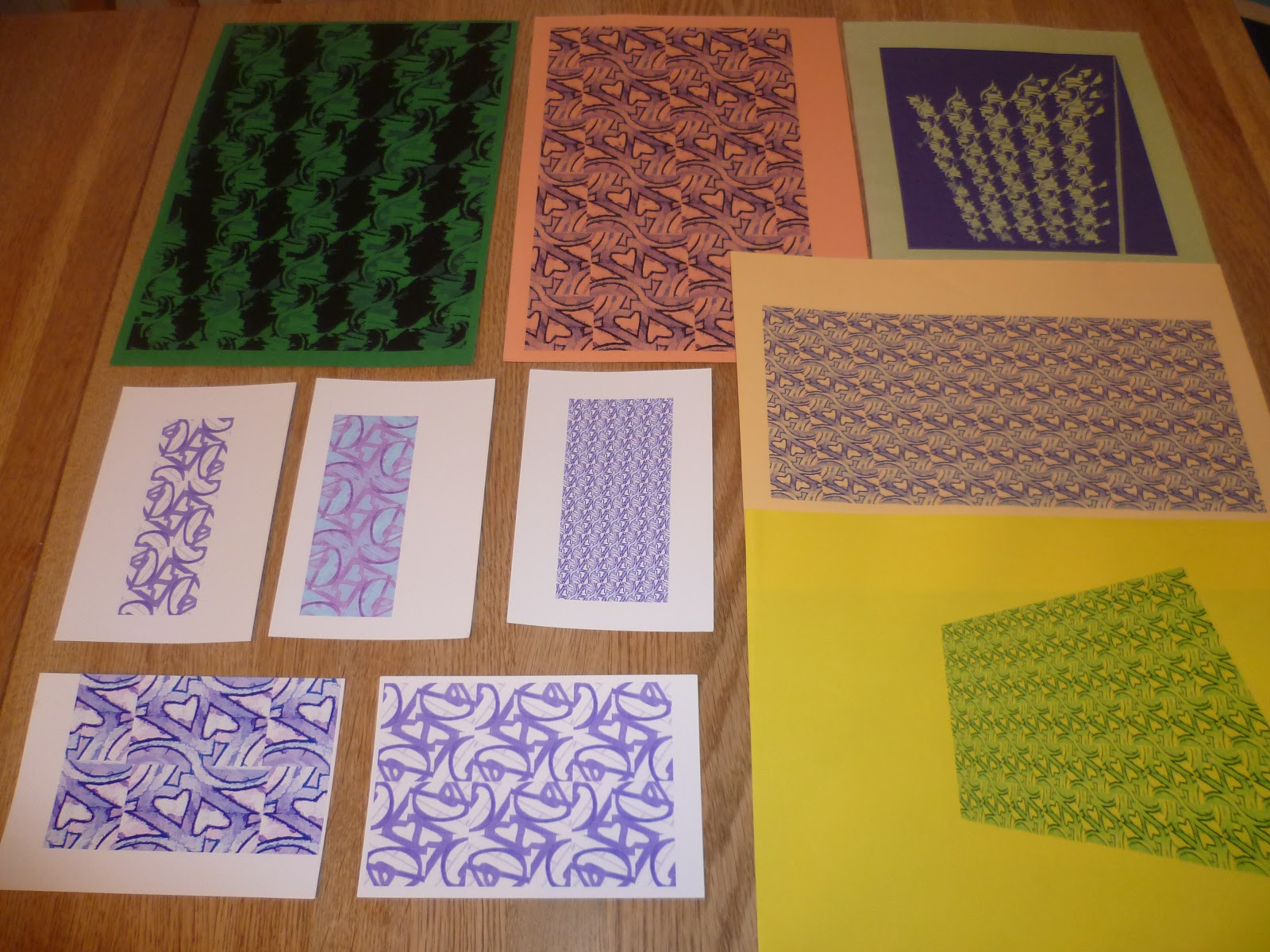
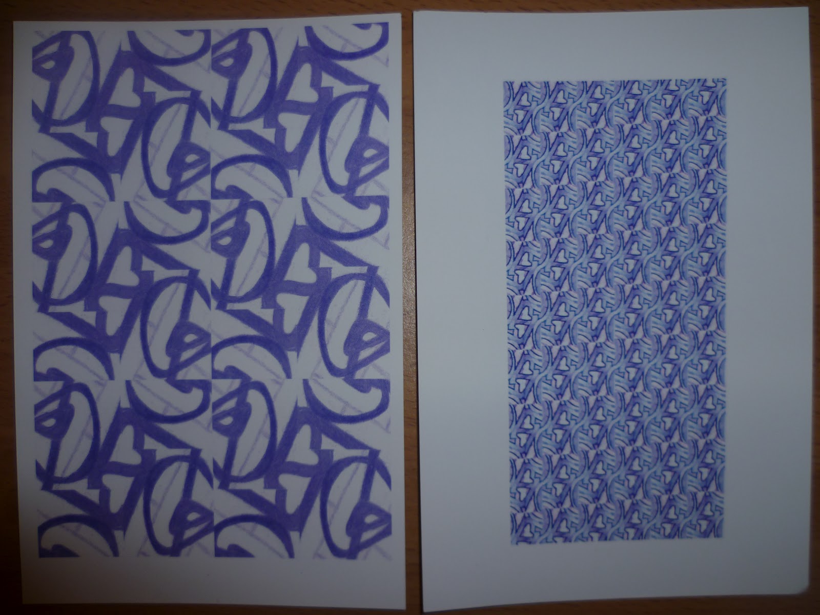
I think that for the size of the square, the bottom right print shown above appears to be on the right scale and has a nice balance  whereas the top two would need to be in a block of at least four adjacent to each other to feel right.  The bottom left does not have enough negative areas to make the shapes clear.  It made for a good background but when this was used on top of another design, it obscured it far too much.  I was aware of the negative shapes appearing, particularly in the bottom left as they looked like little hearts.  The repeating design on this is slightly on the diagonal which creates some tension but I feel would be better either square or with a more slope rather than somewhere in between. I don't know enough about screen printing techniques yet but it might be interesting to repeat the bold designs on a sheer fabric.  I can imagine the same scale being used for a long curtain with the light coming through the negative areas. 

Layering prints - the large patterns (top middle) still look exciting and have a good balance of negative space but look at the print below it where the original is almost completely obscured

How successful do you think your sample is?  Do you like the design?  Have you recreated or extended your ideas from the previous sample so that there is a visible development between the two?  Does your repeating design flow across the surface, without obvious internal edges, or do the shapes and marks in your single unit sample relate well to the size and shape of the fabric?  Do they make an interesting composition on this larger scale?


I like elements from all four samples on the top right.  I like the scale and the clear colour contrast of the orange top middle print, however the repeats only flow seamlessly in one direction rather than both which is slightly irritating. I like the movement and the colour combinations in the print below it.  It feels happy and reminds me of the big prints of a 1970s summer. This is the one I would like develop further if I had time, sticking with the colours but butting and rotating the original design to make a larger screen. 

In the print to its right (more vibrant in real life!), I like how the ink has translucence and the colours have mixed so the original negative areas from the bottom layer have turned red or orange


This final sample I like overall, the scale as it is, the colour balance and the formation of new shapes.  It evokes memories of cutting out shapes to make paper snowflakes as a child.

Project 4 Review - Developing Design Ideas

Did you manage to make space move?
Yes.  Compare the static Pictures 1 and 4 with the energy of 2 and 3.  In 1 and 4 the arrangement of black squares is more 'peaceful'.  Energy is centred because of the symmetry and regular sized gaps between the squares.  Also because the edges are parallel to the large square.  Pictures 2 and 3 have movement. It feels like you want to put back and stack the shapes escaping out of the box like a box of cards that's been dropped.  The eye wants to move around the space in the square.  The same applies with the lines. 


What are your thoughts about the drawings you did in Stage 3?
I was pleased to be able to find more potential in the original garden gate stitched sample that I had reworked in the Stitched Collage Workshop. Now that I was happier with improvement in the texture, I wanted to further explore the dynamic shapes that I had always liked, created by the curved lines crossing straight. Using differently shaped viewing frames, I decided I liked the balance better in the circles and squares and thought that the squares had most potential as I could create so many variations in repeats.   


Were you able to use your drawings successfully as a basis for further work?  Are there any other things you would like to try?
Yes.  I scanned the drawing which was really helpful to experiment with.  I could quickly create repeats and change the scale and colour. I wanted to try prints and was about to do a 'Make a Mark' workshop at West Yorkshire Print.  This would be an opportunity to develop the drawings and work toward a final screen printed sample for this assignment.  My drawings would be my starting point.


Now that you have a good working method, do you feel confident that you can carry on working in this way independently?
Yes, I've found that I can now 'see' shapes and interesting compositions more quickly and easily.  The drawing below of a sliced shell at the Turing exhibition was selected from a series of 1 minute sketches.  Though I'm not always getting it quite right yet, I've been trying to apply the principles I've learnt to practise arranging some of the drawings in my sketchbook in a more interesting way. 


Wednesday, 5 September 2012

Workshops, Developing Design Ideas to Create Samples

Recently, I've been finding that social networking sites can be a useful way of keeping up my focus and enthusiasm, and discovering what's happening locally in the arts.  I've been able to discuss assessments and presentation with other OCA textile students on Facebook and chatrooms and found out from one of them about a free textile workshop in Manchester.  It's inspired by Alan Turing and looking at patterns in nature.  We'll be creating a textile piece from a sketch so this will be relevant to the next part of my assignment.  There's also been an arts festival in my home town.  By liking the festival Facebook page, I was first to hear about events and I booked to learn needle felting.  Today the kids are back at school.  Mixed feelings about this as it's been lovely spending time with them and not having school runs and homework to deal with but it's been very difficult to get any coursework in amongst all the entertaining, feeding and bickering.  Doing workshops and getting creative with the kids has kept me smiling.  We did some knitting and lino printing and decided to join in with the Blood Bag Project - the community project that I mentioned in my degree show post.  Below are the links to the bags we created.  We'll be looking forward to seeing them displayed at the Lawrence Batley Theatre this weekend as part of the HOST Artists Open Studio Trail.  

 
Needle felting was another of Anne Brooke's workshops.  She began by demonstrating 2-D and 3-D techniques and explained how to work safely before letting us loose with the needles.  She showed us how to pull a small handful of fibres from the bags of merino wool tops and layer them (cutting gives a harsh edge that is difficult to work in).  2-D pictures could be created by stabbing the fibres at right angles onto a pre-felt background.  Fine, open weave fabrics like organza can also be worked in, also Angelina fibres to give shimmer.  No stitches are needed unless you want to embellish the final 'drawing' at the end.  Sometimes, just felting in part of the fibre and leaving ends trailing can look very effective, particularly with tops from the interesting curly fleeces.
 
High density garden kneelers were a good low cost substitute to protect the table.  Although they did start to crumble a little after a while, the tiny foam crumbs were easily brushed off the work. I tried a single 32 gauge general purpose needle (for fine detail 40 would be better). Purpose made tools that hold multiple needles can be bought to speed up the process but Anne told us that three needles held together with a hair bobble works pretty well too.  3-D pieces can be started by taking a ball of fibres in your hand, moulding it to the general shape then continually stabbing, moulding and rotating it. The ball will shrink considerably, to perhaps about half the original size, and even a ping pong ball size could take an hour to felt.  Shapes can also be made by putting the fibres in moulds like ice cube trays.  I tried simply laying the fibres in a cookie cutter, which was a good way to protect my fingers - many plasters were used that day. 
 
First attempt at needlefelting, using a cookie cutter
 
I would stab at the fibres for a few minutes, then turn the whole thing over and stab from the other side.  Gradually the wool fibres mesh with each other and go from soft to firm.  When the shape felt solid, I worked just inside the edges of the cutter to firm up the edges, then took out the piece and carefully worked at right angles into the edges. 
 
The merino fibres are beginning to mesh together
 
I chose some organza to work in and found I needed a few wool fibres over the top to hold it in place.  Wrapping the organza around the edges helped to firm up the sides of the shape.  It's tricky to know when to stop but Anne suggested it's when you can't pull fibres out easily.
 
I began to add some snippets of organza.  Shape has lost definition, more like a 3 horned cow than a reindeer
I attached a hanging loop and collar by taking a few fibres, beginning to felt them separately into a little strip then placing the strip over the loop on the back and stabbing through both.  I had to be careful not to go right through to other side as the red fibres would have begun to poke through the gold collar.
 
Finished creature with it's angel friend 
 
Anne has more photos and posted about the workshop on her blog.  It shows the wide variety of samples created.  It's a diverse technique with many possibilities that I'd like to look into further in future, particularly after my trip to Texere Yarns last weekend where I picked up a load of half price bags of interesting fibres that I could felt with. I also have some mulberry silk and cocoon strippings with the idea of making some paper to stitch into following my stitched collage experiments and some I haven't a clue about yet but really couldn't resist - some possum and a bag of camel hair!
 
Lots of new fibres to play with, including possum and camel!
 
Texere were having the second free yarn giveaway.  This free stuff is often fine yarn on single cones, perhaps of a dubious shade or smell but for an experimenting textile student that's no problem.  Unfortunately I saw a flash from a speed camera in my excitement to get there and overspent on other sale items, so had some explaining to do by the time I came home!  Here are some of my purchases.

Purchased for the bobbins but I'm sure I can find a use for the thread!
I have many large skeins of this and it's slightly scratchy so considering a rug

Will these be featuring in my work any time soon?
Many of the yarns were 1p/g. The shiny threads I bought purely because I loved the big wooden bobbins but these were pretty heavy so I'm not sure how much of a bargain that was.  There were large quantities of the slightly scratchy beige stuff that I thought would work well for further experiments making rugs with my giant needles now that my seaside rug (remember that?) is finally finished. There's some linen that I thought would be good if I tried netting or string bags again and yarns I'd like try together to see if I can create anything unexpected.  
 
The seaside rug shortly before I finished

Trying some unlikely combinations


Empty cones are not something I'd usually spend money on but I bought these as the surfaces felt interesting and I want to try printing with them.  The idea came to me because of some mark making on a recent workshop.  Last month, I'd spotted on the West Yorkshire Print Workshops Facebook status that they were hosting an event for the Lawrence Batley Theatre, who have been awarded a lottery grant to deliver a massive programme of events for the community.  The two-day workshop was 'Make a Mark' and this was the description:

'Work with textile designer Laura Slater on this two day workshop and explore creative approaches to drawing, mark making and simple block printing techniques to develop into screen printed textiles. A great workshop for beginners to gain experience of the design process through experimentation with drawing, mark marking tools and media. Further develop your inspiration through both stencil and photographic screen printing techniques onto cloth.'

The timing was ideal for my current project, which is all about developing design ideas and printing experiments. The subsidised cost of the workshop made it affordable so I booked straight away.

Make a Mark Workshop


After introductions, we started with a bit of mark making using a variety of tools and found objects with black ink and paint, similar to the exercises in Project 1.  I found that the ink (Brian Clegg Waterproof Drawing Ink) left nice painterly marks but was too grey and would not be opaque enough for transferring to acetate to make a kodatrace for screen printing.  The paint on its own dried very quickly so the marks were scratchy. I knew from the Introduction to Printmaking Course I did a few months ago that marks for screen printing need not necessarily be crisp, but tonal images don't work well.  Mixing a little paint (System 3 Acrylic) into the ink gave the qualities I desired. 

Mark making

Thinking about 'making space move', two effective tools that I hadn't used before were a plastic hair comb dipped in paint and rocked back and forward and the cardboard inner tube from sellotape.  With the edges inked up and used as a stamp, the ring could be squeezed and manipulated and the overlapping shapes made a dynamic design.

Next we had a go at block printing.  Before the workshop, I'd done some preparation, working from the garden gate sample.  The original sample hadn't worked well texturally but I did like the shapes.  This was the same starting point I used last month in the stitched collage workshop and I wanted to explore it further.  I used different shaped viewing frames over the sample. 

Using viewing frames to isolate interesting areas

We used a product called 'Safeprint' (also called Press Print).  This came in tiles that could be cut to shape and it looked and felt like the polystyrene disc you get under a home cook pizza. It was very easy to carve lines into it or to press items into it.  It only took a few minutes to impress my design, using a pencil for the lines and the end of a skewer plus a plastic coffee stirrer for the differently sized holes.  It's harder to get clean lines than with lino and the surface is slightly textured, so the uncut areas do not print a totally flat colour. It's not easy to control the depth of your lines and there are none of the carving marks that can be desirable with lino chiseled at varying depths. Also as it's pretty thin, it was tricky to lift small blocks off the paper without getting inky smudges. Safeprint is a cheaper quicker alternative, though I found the tiles are not very hardwearing for repeats.  They had a tendency to split along my carving lines after a few prints. Once this started to happen, I decided to cut along some of the lines to make irregular shaped blocks. This created some exciting shapes with infinite possibilities of arrangement and repeats. 

Inking up the pressprint tile
To ink the tile we used water based block printing ink rolled out onto a large piece of plexiglass. The surface seemed slightly porous compared to lino and I needed to roll the ink on the tile quite thickly to get a good print. I found that pressing the paper onto the tile then using a clean roller on the back of the paper gave the best quality prints.

Experimenting with repeats and cutting up tiles along shape lines
After lunch we began working on designs for screen prints.  I scaled up two of my square designs, left out the backgrounds and just concentrated on the bold shapes on the foreground. I decided to extend and curve some of the lines so that any side of the tile could be placed next to the other to create a continuous design and I could experiment with patterns.  When I was happy, I redrew the shapes and painted them in with black acrylic.  Some of the edges looked a bit feathery so I used a black permanent marker to make them crisper for screen-printing.  The black areas are where the paint will penetrate the screen.


Extending shapes and re-drawing so that any side of the first square can be placed adjacent to the second to make a new continuous pattern  

As I wanted to try layering some of my prints, I thought I'd stick the same theme but change the scale.  This was a good time to photocopy the two square designs onto acetate creating the kodatrace.  I could then place them above my other drawings and make decisions on what I thought might work.   I chose an area of the block printing I'd done, photocopied it twice, stuck the pieces together, copied this onto acetate and trimmed it down to the same size as the other squares. 

Block print copied and transferred to acetate for Koda trace

Before leaving for the night, we were handed screens to prep ready for the morning. Wearing gloves and using a squeegee, we spread the green gooey light-sensitive emulsion (think brand was Speedball) evenly over our screens. You need to work fairly quickly so that the screen doesn't begin to expose and you can scrape the excess emulsion back into the pot to save waste.  As soon as the screens were covered, we put them in a dark room to dry overnight. Laura thought I could squeeze another design on my large screen so I went home to see what I could find.

In preparation, I had already scanned my original gate drawings and spent some time experimenting with pattern by cropping, rotating and mirroring the images and adjusting the colours and scale.  I decided to use one of the resulting prints.

I scanned my drawings, cropped, copied and pasted
Selecting designs to work on


I chose the image on the left above, copied it using a pencil and light box, deciding to reverse the light and dark areas, which I coloured in with a black permanent marker. Back at the workshops next morning, I photocopied the image twice, adjusting the scale a little until it felt right then copied it onto acetate.  On the acetate, some of the joins between the paper showed up as a thin black line but Laura said we could correct this by painting them out with a little of the light sensitive emulsion after the screens were exposed.    

I made a negative of the drawing I selected
Once I trimmed my design, I cleaned the glass vacuum table in the dark room with glass cleaner so that no specks of dust would spoil my screen.  I carefully arranged my four acetates centrally on the bed (remember black areas will block out the UV and that design goes right way up - esp. important for text).  We made sure the light was off then removed our screens from the dark drying room. We were working fairly quickly under low light with the door closed as we didn't want exposure to begin yet.  The screen was laid over the top of the acetates, mesh side down and we adjusted the positions to make sure there would be enough room around the edges to spread the ink without it bleeding through the design.  We also wanted to make sure we had a squeegee narrow enough to fit inside the frame and wide enough to cover the whole design in one sweep.  Once happy, we brought the cover down, locked the edges and pressed the suction button to remove the air, creating a vacuum effect that would hold the screen in place.  As it's a 1970s bed, the rubber is getting slightly worn in some places so there was an extra tube to place on the screen frame to help remove the air.  Once the screen was securely in place, we rotated the table to face the light source.  It took two people to hold the heavy bed as we tilted.  Levers and brakes helped to control the movement. There were guide lines on the floor showing exactly where to position the rotated screen.
 
We left the room (so as not to get sunburnt!), shut the door and turned on the light and timer for precisely 3 minutes.  Laura warned us that 10 seconds either side of this exposure time could ruin our screens so we stayed close ready to switch the UV light off.  A red light alerts others that a screen is being exposed so that they don't enter. You can see that it's working by the glow of light under the door. After three minutes, we re-entered, needing to make sure that we'd pushed the bed back, tilted it till flat and put the brake on BEFORE turning off the vacuum!
 
Fortunately everyone's screen seemed to have exposed well and next we had to wash off the excess paste using water from a jet washer (low setting NOT power wash).  You could see the residue washing away to reveal the yellow silk of the screen.  The screen must be thoroughly cleaned on both sides and completely dry before use and between each print so we put the screens back on the drying room while we mixed the paint.  (Used a hairdryer to speed up drying of screen and prints when we wanted to layer.)
 
Washing off the light sensitive emulsion with a pressure washer
While the screens dried we mixed our paint.  This was System 3 Acrylic paint which comes in a very wide range of shades and dries quickly. It also seemed to give a slightly translucent effect which could look really good when layering. We mixed it roughly 1:1 with Textile Medium.  Ironing heat fixes the print so that it becomes washable and colour fast.  As these were experiments and I was concentrating more on shapes, I didn't think too hard about which colours to use and chose quickly.
 
Mixing acrylic paint with textile medium
Screen all clean, dry and ready to use
Once dry, the screens were finally ready to use after we'd masked the underside to help prevent leaks.  The table was protected with a tight neoprene waterproof covering.  Two layers made sure there was a little 'give', necessary for the ink to really push through the screen and give a clean print.  We selected fabric.  I started with some plain white linen that I taped to the table as taut as possible to avoid the fabric wrinkling. If I do it again, I might prepare the night before by spraying the fabric to dampen it, hoping it will shrink a little as it dries.  We made sure there were no stray threads or bumps under the fabric that could affect the printing.  The screen was placed over the fabric and the ink spread with a spoon in a thickish layer at the top.  Either you need someone to hold the frame still for you or place extremely heavy weights on while you dip the squeegee in at a right angle.  Rock it slightly then tilt the top slightly towards you.  Pull firmly and quickly backwards and forwards.  About three times was right for this paint and fabric combination but other fabrics needed six pulls and pushes. Some of my earlier prints were not as even as I'd have liked.  Experience tells you how much ink to use and how many times you will need to pull the the squeegee. Lifting the screen off was really exciting, seeing how well they've worked.
 
My first print
 
Next it was a matter of putting the excess pigment from the screen and squeegee back in the pot (tilt and pull lip of yogurt pot up flexible edge of squeegee), drying the fabric, cleaning and drying the screen and working out what to try next.  Firstly I wanted to rotate the screen and try different scale prints on top each other, then try some colour combinations.  I had a few hours to try as many as I could but could have continued almost indefinitely.  I was pleased with the variety of samples I produced and liked that if something didn't look quite right you can just overprint and improve it.  Although if I was doing it again I'd have maybe measured the distances between them more accurately, I think squares worked well for experimenting as it enabled me to produce more samples in the time I had.  By moving the frame along for the second set, I overprinted 2 of the original 4 so had 6 prints to work with.  When I came to add a third colour, I had more options on where to place my frame.  As the layers built up, if three out of four squares looked good, I could simply cover up the one that I didn't like and tape down a new piece of fabric over the top   I ran out of time to try butting the prints up to each other and try some repeats but maybe I can play with this later in the course.  The endless possibilities of pattern combinations, layering and colour combinations was quite overwhelming.  For future, I would initially limit my colour palette, find the pleasing shape combinations first before even beginning to experiment with colour.      
 
Second prints - top middle was exciting but bottom middle almost totally obscured print underneath
Third prints - did not want to obscure bottom right so decided to tape over and try some calico
More combinations - introducing new fabrics including a patterned background
Close up of final sample that came alive with the final layer